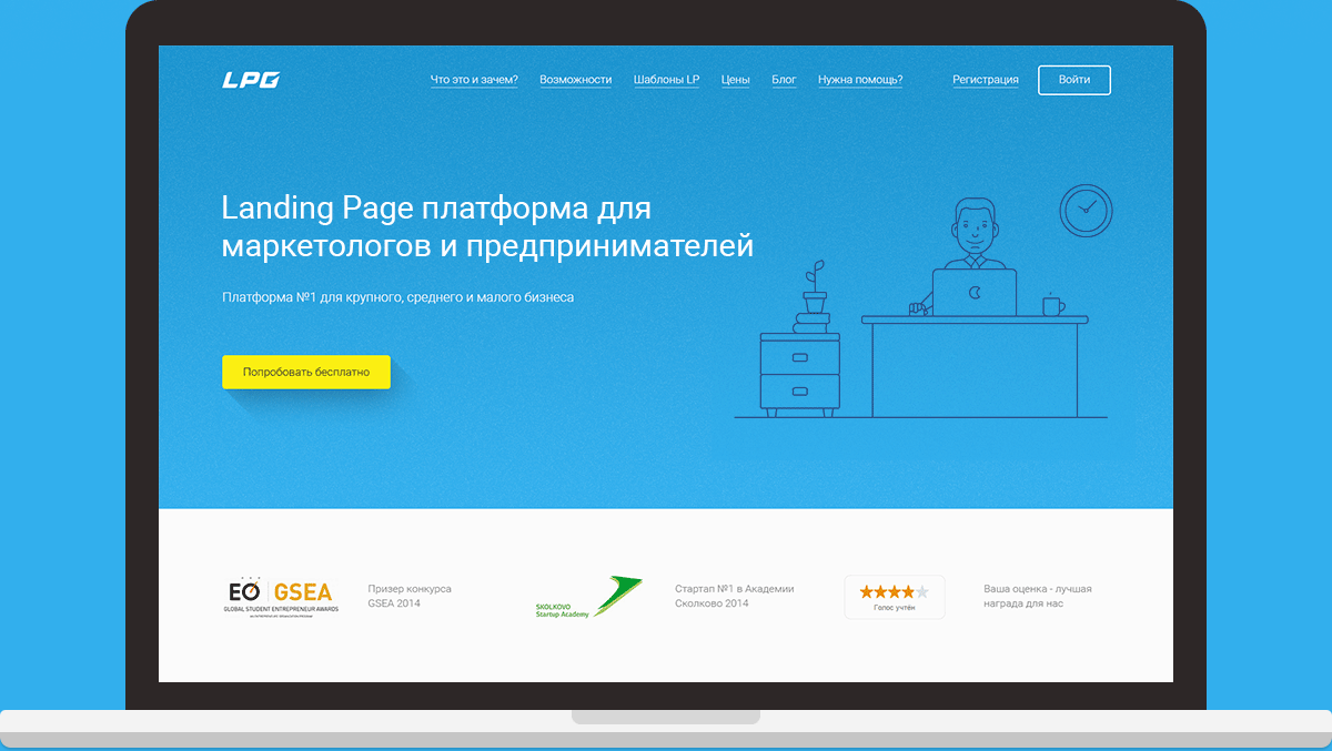
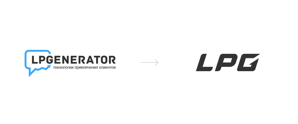
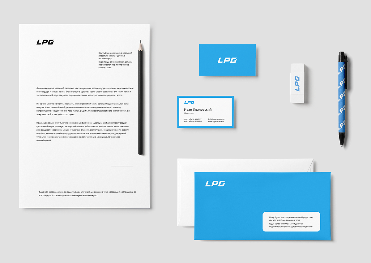
Our version of the branding redesign of lpgenerator platform. The logo is trying to combine: the continuity of the old logo, an arrow, a symbol of growth, at the same time simplify the logo to read, make it readable in all sizes and all colors.
Присоединиться к Behance
Подписаться или Войтичтобы просматривать индивидуальные рекомендации, подписываться на авторов и пользоваться другими возможностями.
или
Присоединиться к Behance
Подписаться или Войтичтобы просматривать индивидуальные рекомендации, подписываться на авторов и пользоваться другими возможностями.
Our version of the branding redesign of lpgenerator platform. The logo is trying to combine: the continuity of the old logo, an arrow, a symbol o Развернуть