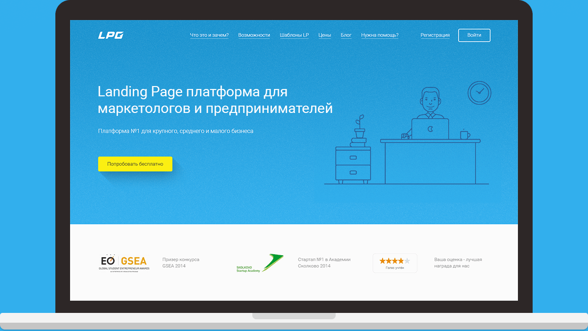
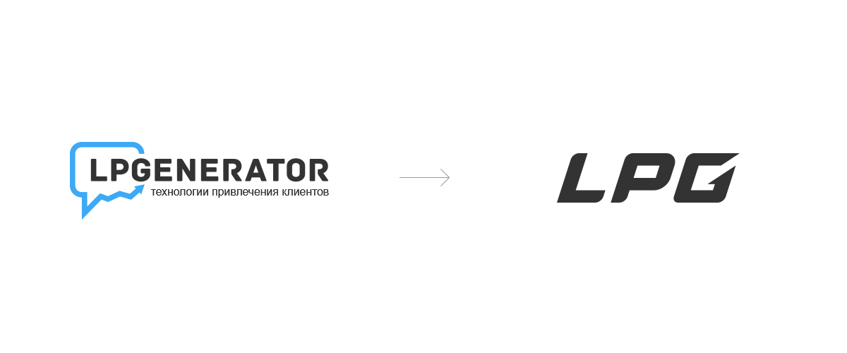
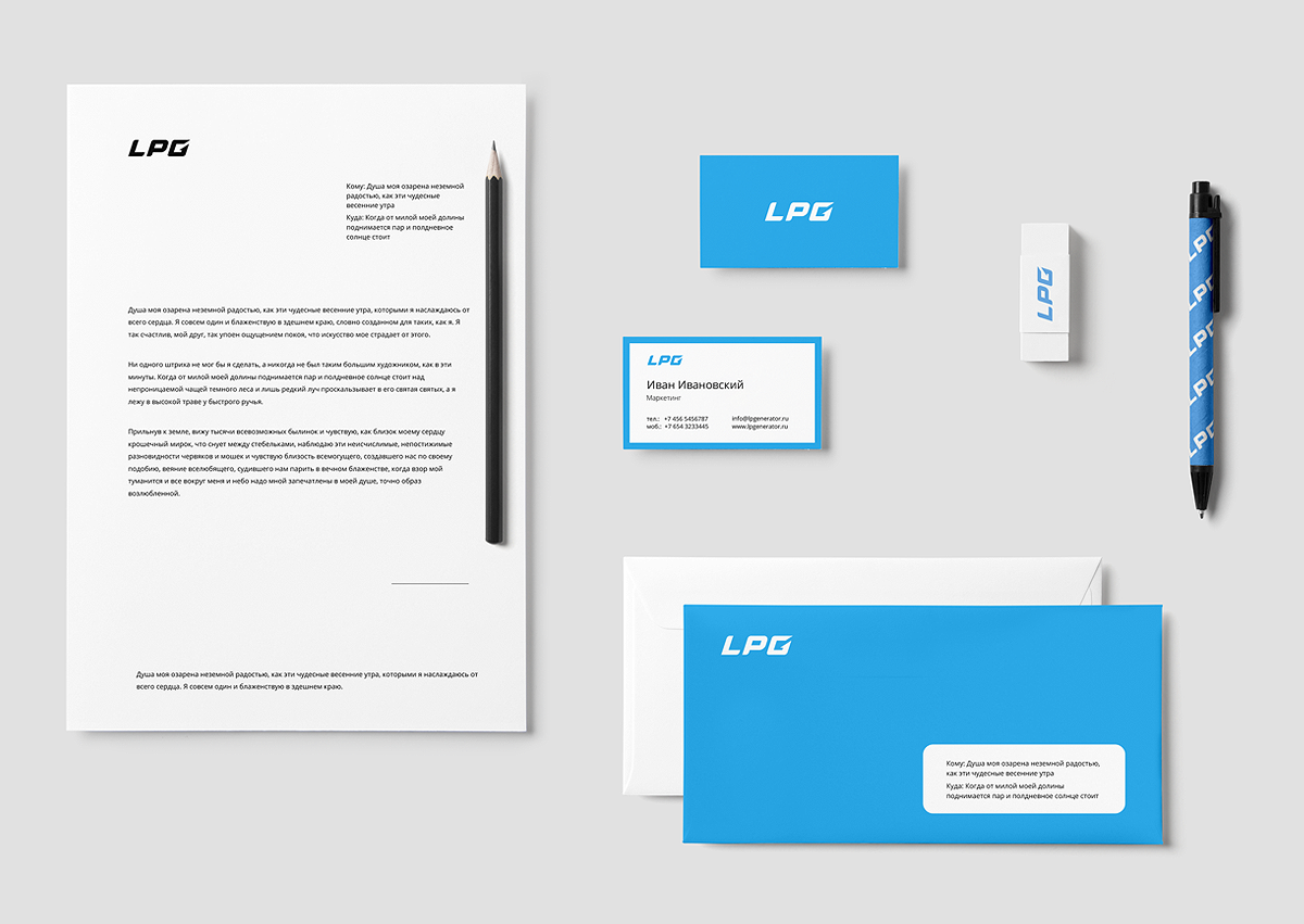
Our version of the branding redesign of lpgenerator platform. The logo is trying to combine: the continuity of the old logo, an arrow, a symbol of growth, at the same time simplify the logo to read, make it readable in all sizes and all colors.
Our version of the branding redesign of lpgenerator platform. The logo is trying to combine: the continuity of the old logo, an arrow, a symbol o 자세히 보기