The Hearing Association of New Zealand
This non-governmental organisation provide help for people with hearing issues. They have multiple branches across New Zealand to ensure that their services are provided to those who would benefit. They provide them with the right support and networks so that they receive the help that they need.
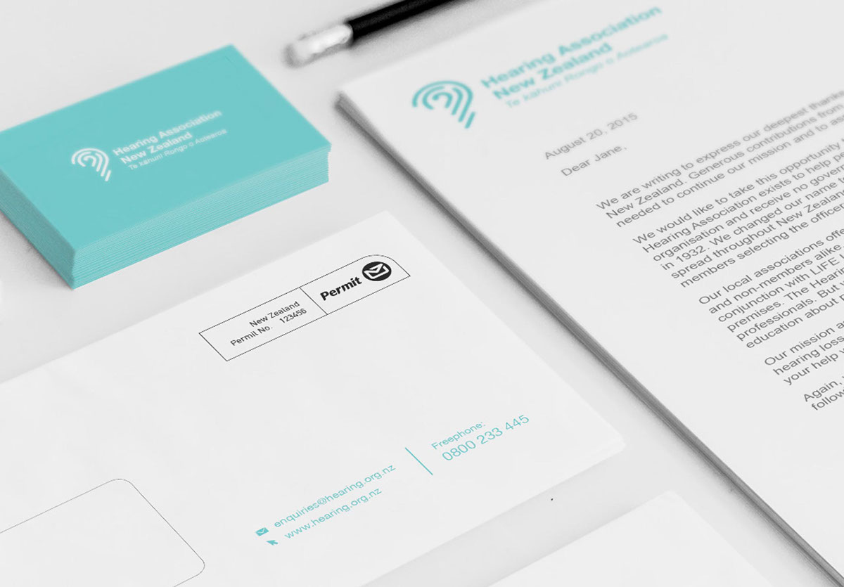
The logo contains the main blue that is used throughout every aspect of out brand. We thought the colour reflects the association's welcoming and caring nature. The colour turquoise has connotations of being refreshing, calming, sophisticated, energetic, loyalty and wisdom. These values are what the brand is about. The logo is simple and uses line to show the form of an ear. The Koru inside the ear represents Maori culture.