

Logo Design: Public Health Law Center
The client, a prominent legal think-tank specializing in public health issues, was in the process of rebranding itself from the 'Tobacco Law Institute' to the 'Public Health Law Institute'. Their previous logo was a vignetted photograph of cigarette smoke against a black background, clearly representing only tobacco-related issues. The client was seeking a logo which would represent several facets of public health law, including nutrition, safety and tobacco. Additionally, the new logo would be easily reproduced in a one color process, allowing it to be quickly recognized and read both up-close and from a distance. Through subsequent discussions it was established that there was a preference for a logo with three elements which would represent these major areas- albeit enigmatically. I began the design process by presenting to the client a grouping of extant logos from organizations that relate to health, wellness and legal studies. From these we identified themes, shapes and colors which were emblematic of the ideas the new logo design should convey. The next step was to produce several rounds of comp designs based upon ranked preferences expressed in the initial meetings. Once a logotype was chosen it was tweaked to provide several options for color and orientation, etc.
The final design as it appears on printed materials from PHLC.
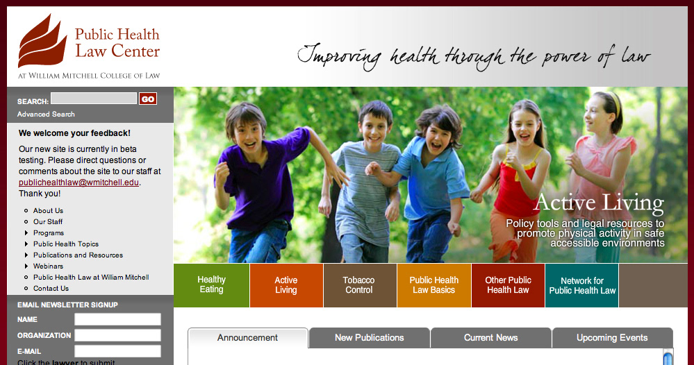
The logo as it appears on the PHLC website.
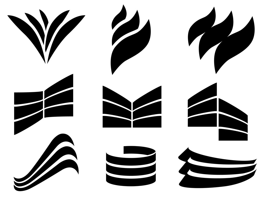
Several rounds of comp designs showing different preferences expressed by the client in focus group meetings.


