Derringer Cycles repositioning.
We were contracted by Los Angeles based Derringer Cycles to reposition the brand to help increase sales and and areness. The challenge with brands that sell potentially dangerous products such as vehicles is that poor branding can make the product itself look poorly made and dangerous. This is not the case with Derringer.
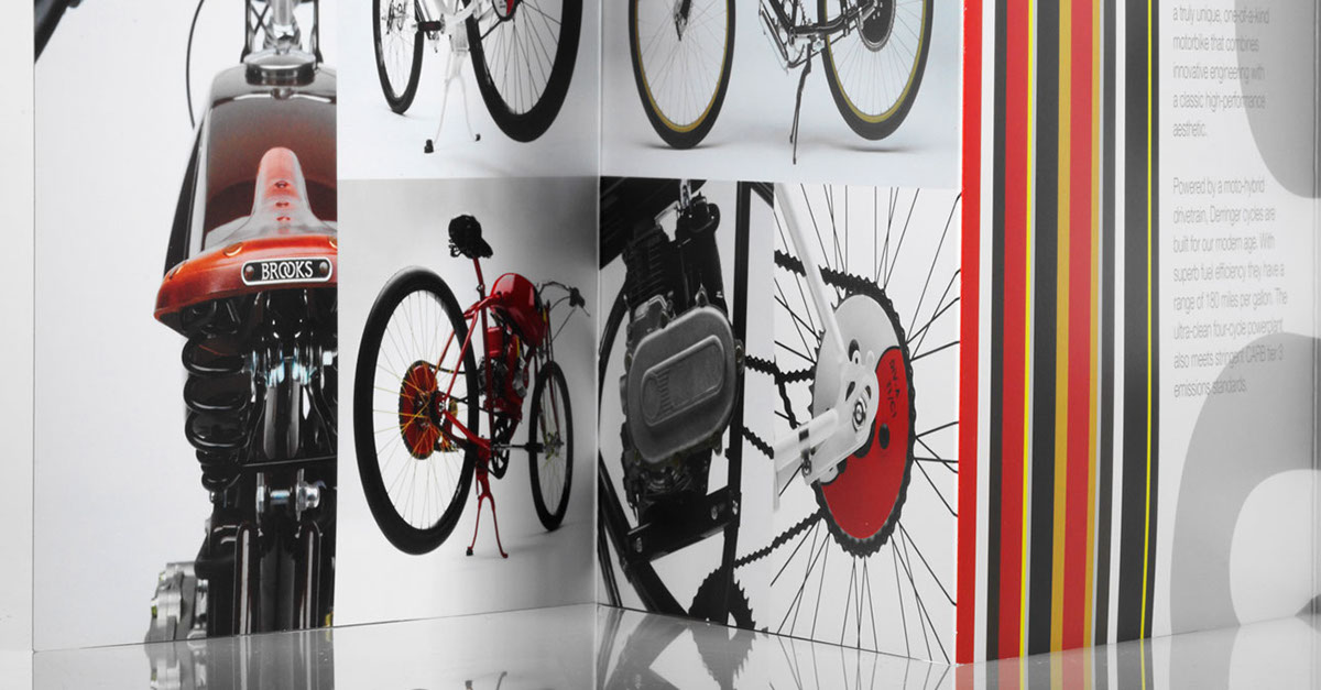
As with most of our work - it is photography driven as this is the quickest and most effective way of changing perception of a product-based brand. It is especially true when the product is beautiful like the Derringer.
We worked closely with founder Adrian Van Anz, who designed the D in the logotype. We normalized the curves on the D, and added a contemporary typeface to the logotype. We also clarified the tone and manner of the brand with new copy written by our amazing writer.
The results have been dramatic. Derringer quickly closed a deal with Restoration Hardware for 200 bikes (the deal fell through due to liability issues) - but the increase - according to Van Anz "have been through the roof."
We will update this and all of our presentations in the coming weeks.
In the meantime, please visit our site.
In the meantime, please visit our site.