
We want to present to you the photos of works that we made for the exhibition The Desingn of Words by Calligraphy Masters and Acqua su Marte.
The task was following:
Event makers sent to each of 20 members of Calligraphy Masters team (and to all who wanted to participate) three Moleskine Sketchbooks — A3 and A4 Sketchbooks with watercolor paper and also notebook for sketches. There were no limits for techniques or style, each was able to create in the way he wanted.
From March 2-4 and till March 28 each artist was working on his Sketchbook and as soon as Sketchbooks were ready they were sent back to event makers. It is worth to say, that the event makers took care of the participants – they sent the curriers to come to each participant on the particular day to take their Sketchbook. It allowed the artists not to think about details.
But we were unlucky to receive our new Sketchbooks on 21 of March. That meant that we had only 10 days to paint A3 Sketchbook on 30 sheets.
Unfortunately, we had not enough time to calligraph all the pages (it was physically impossible), there left a few empty pages. Althought it contradicted with the rules, but event makers made concessions for us, because it was not our fault that we receive the Sketchbooks so late.
Is seems that I am making excuses, but that is how we work — the more time we have the better result is :)
The hardest thing was that here and now we have to fill the white and empty Sketchbook with something beautiful.
But these white and empty sheets are beautiful as they are!
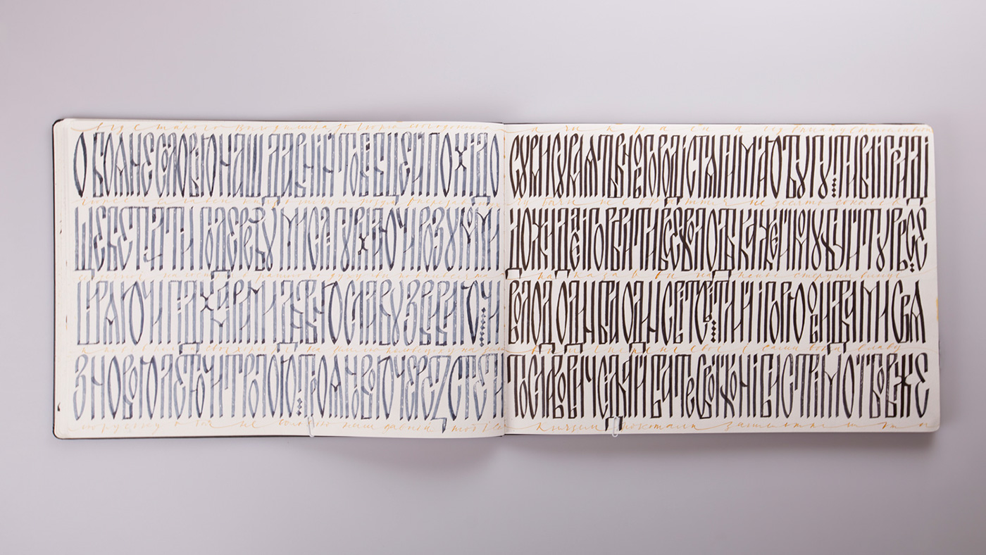
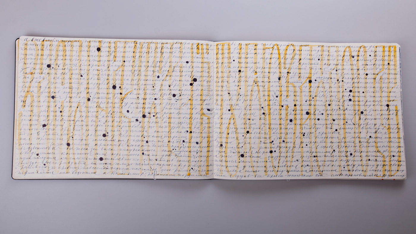
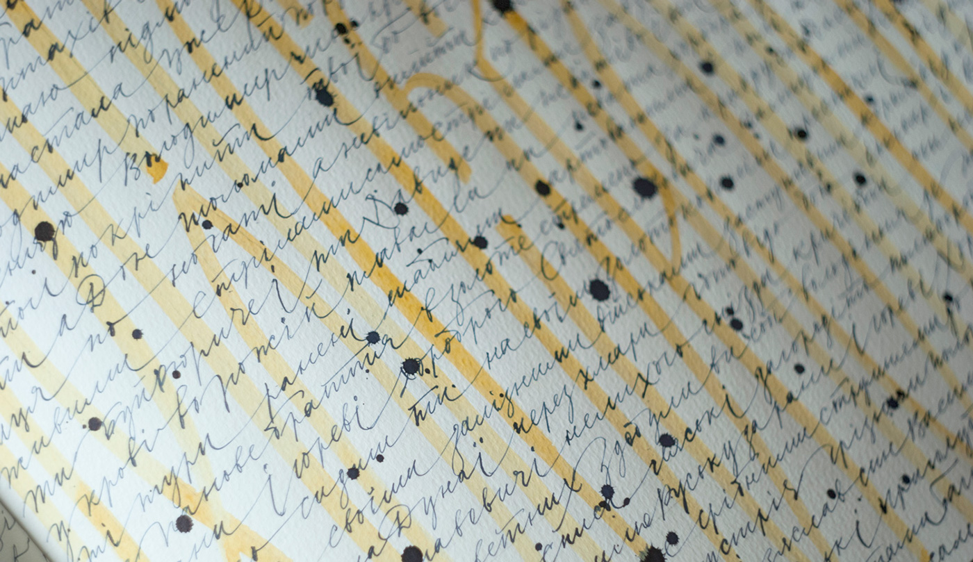
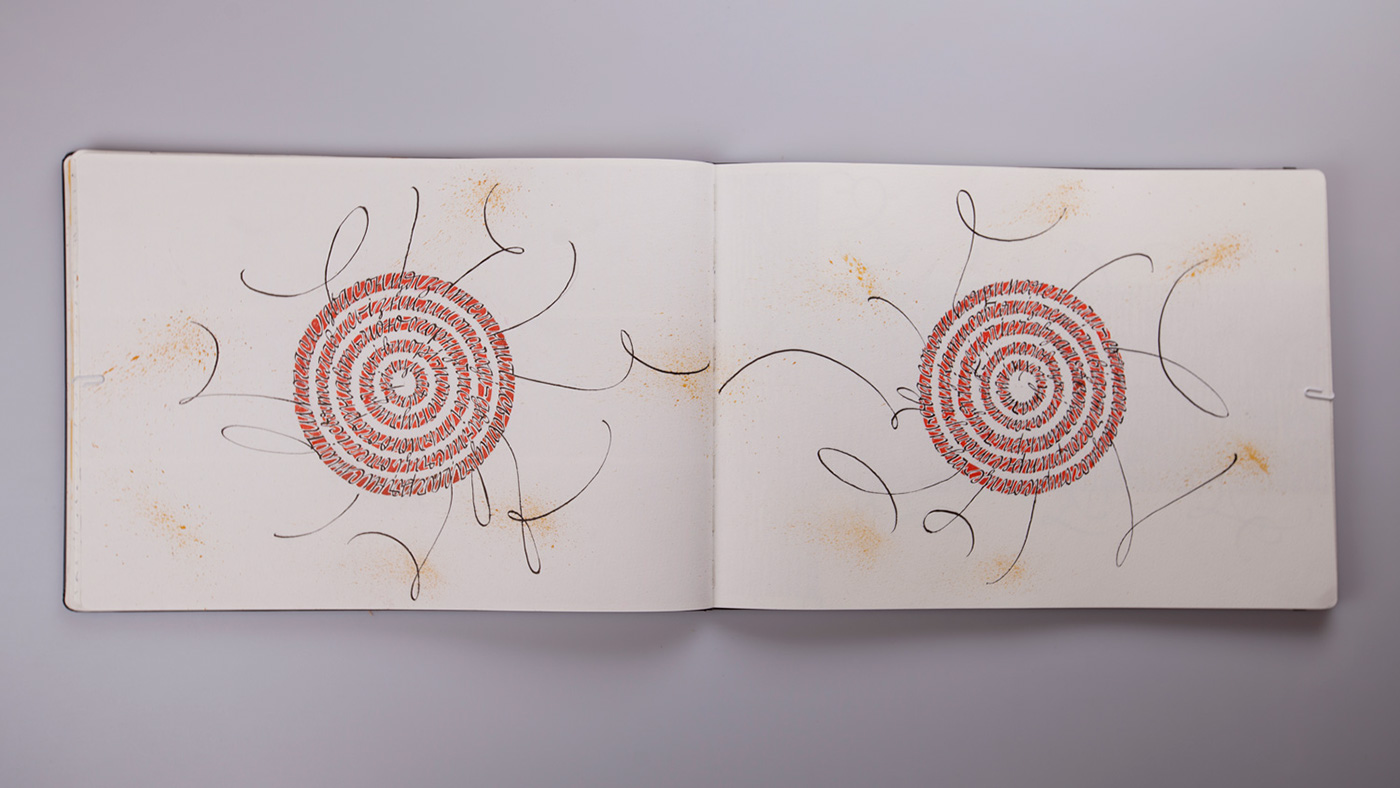
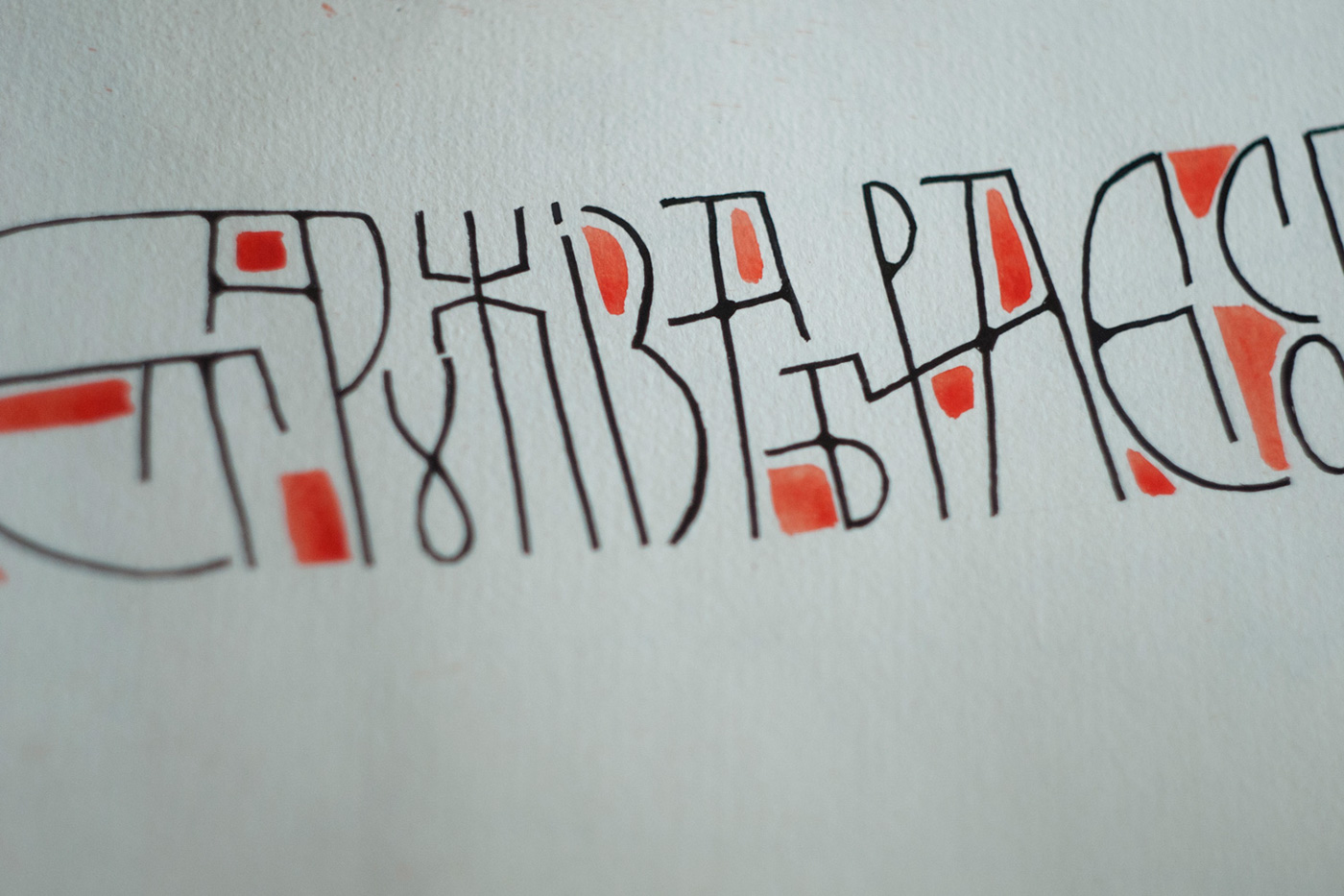
Type selection did not take much time, and we started to think out composition. We take as a basis old and favorite forms of Cyrillic handwritings — old slavic ligature (vyaz’), slavic cursive and slavic half-uncial.
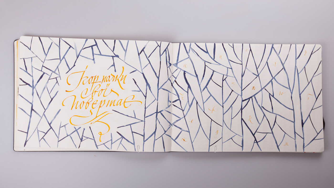
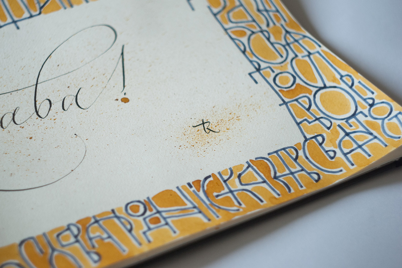
As the old Cyrillic handwriting matches well with the ancient Slavic texts, we decided to write and illustrate well known written work from the time of Kiev Rus — Lay of Igor’s Warfare. It was written in about 1200, presumably in Kiev, in Vydubychi monastery.
We hope you would not consider the choice as pompous and it could be more simple… We love Kiev and we love its history, that is why this choice is not random. For example a photo where I am standing with a notebook against the temple is also not coincidental — on background is ancient monastery and famous scriptorium Sophia Cathedral, a monument was build on the beginning of the Kiev Rus existence. The temple is also mentioned in the work of Lay of Igor’s Warfare.
We wish we had more time! We would like to write two or even three such Sketchbooks! Well, I will do it on my spare time.
We hope the result will be interesting for you.
//////////////////////////////////////////////////////////////////////////////////////////////////////////////////////////////////////////////////////////////////////////////////////////////////////
Хотим представить вашему вниманию фото работ, которые были сделаны на выставку The Desingn of Words by Calligraphy Masters и Acqua su Marte.
Задача состояла в следующем:
Организаторы каждому из 20 участников группы Calligraphy Masters (и всем, кто хотел участвовать в этом) прислали по три блокнота MOLESKINE — блокноты с акварельной бумагой форматов А3 и А4, а также для зарисовок блокнот А5 формата. Два или один из которых за кратчайшие сроки нужно было расписать, но MOLESKINE A3 формата обязательно. Ограничений по технике и стилю не было — каждый выбирал то, в чем он силен.
Примерно с 2-4 марта и по 28 каждый художник трудился над своим блокнотом и после того, как блокноты были сделаны отправляли заполненными обратно организаторам. Стоит отметить, что организаторы позаботились об участниках — договорились с курьером, чтобы тот в конкретный день пришел за блокнотом, этим самым дали возможность художникам не тратить силы на второстепенные действия.
Но нам, увы, не повезло и мы получили свои новые блокноты только 21 марта. То есть было 10 дней на роспись блокнота А3 формата, в котором целых 30 разворотов!
Увы, не хватило времени физически заполнить все развороты, осталось несколько пустых. Хоть это и противоречило условиям участия, но организаторы пошли на уступки, так как не по нашей вине мы так поздно получили блокноты.
Похоже, что я оправдываюсь. Но у нас всегда так — чем больше времени, тем лучше результат :)
Сложнее всего было то, что белый чистый блокнот здесь и сейчас нужно заполнить чем-то красивым. А ведь это белое и чистое пространство листа и так красивое!
Долго не думая над выбором шрифта, приступили к придумыванию композиций. За основу была взяты старые и любимые формы кириллических почерков — скоропись, вязь и немного полуустав.
Так как старые кириллические почерки очень хорошо сочетаются с древнеславянскими текстами, решили писать и иллюстрировать каллиграфией очень известное произведение со времен Киевской Руси — Слово о Полку Игореве . Написано оно было примерно в 1200 году, предположительно в Киеве, в Выдубицком мужском монастыре.
Надеюсь, вы не подумаете, что много пафоса в этом выборе, что можно было бы и проще…Мы очень любим Киев и любим свою историю, поэтому выбор не случайный. Например фото, где Вика стоит с блокнотом на фоне храма тоже не случайное — на фоне древний монастырь и известный скрипторий София Киевская, памятник с начала существования Киевской Руси. Храм тоже упоминается в произведении Слово о полку Игореве.
Если бы было больше времени! Очень бы хотелось расписать два, даже три таких блокнота! Чем, пожалуй, займусь в свободное от основной работы время.
Надеемся, результат вам покажется интересным.


Homemade video with our sketchbook
Thank you for your attention. And we are thankful for event makers for the great memories!


