


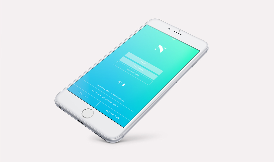
We ensured that the app is appealing to the target audience, whilst providing an easy and efficient user experience.


The video that we produced shows the benefits of the product whilst respecting the sensitivity of the illness


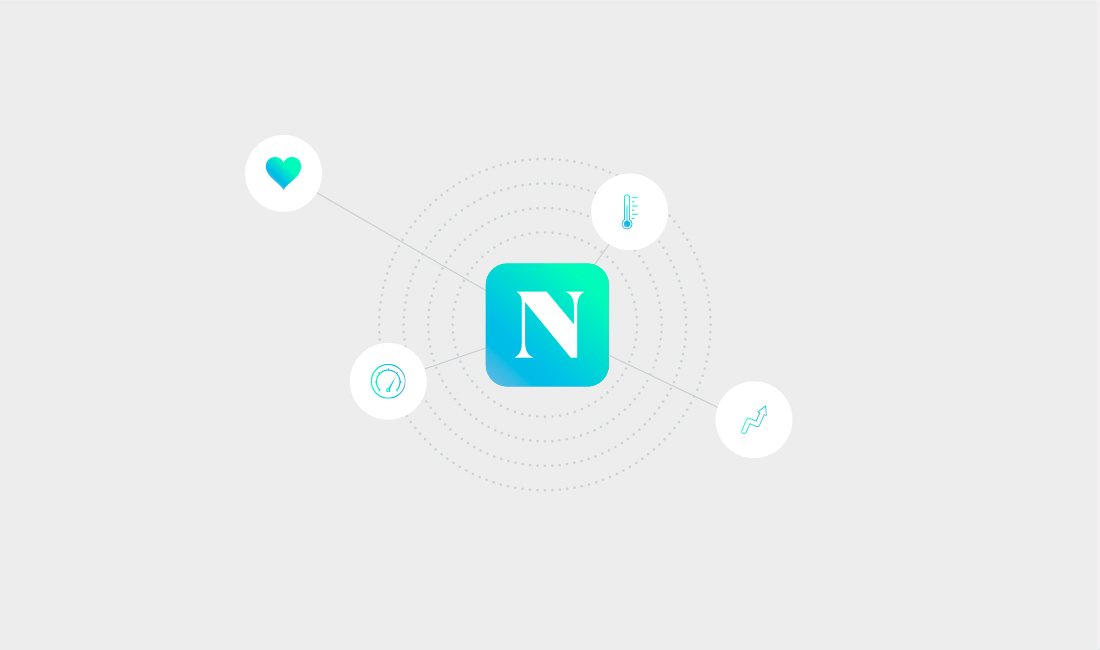
Noho is a medical device company that has invented a technology that allows people who suffer from lymphedema to dynamically reduce the swelling caused by the disease. This is done via a special compression stocking that the patient has full control over via a mobile app.
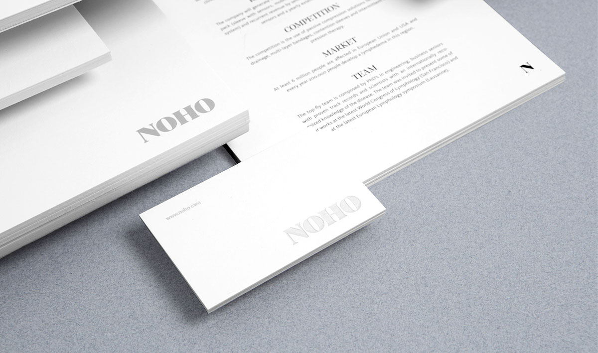
We developed a unique visual identity that reflects the company’s innovative product and positioning in the medical device market. We created all aspects of the company’s branding – including the logo, stationary, promotional videos and communication tools.
The concept was based on creating a unique twist to the standardised branding of medical companies, which can be toneless at times. This was achieved by creating a visual identity that resembled that of a beauty brand rather than a medical brand. The priority was to showcase the product and its benefits to the patients – whilst respecting the sensitivity of the illness.
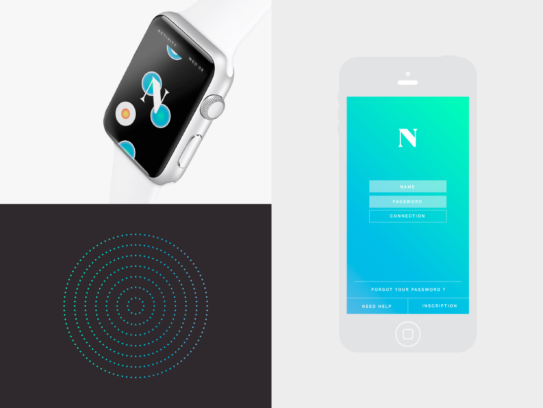
A bespoke typography was customised, which was initially based off of a classic serif font. Two colour schemes were developed for the logo. One logo in black and white for all of the stationary elements. The other logo incorporated flashy colours for a more modern look, which was used for the application and website.
Pictograms and visual cues were specifically designed for the application to ensure that consumers have an appealing, yet easy and efficient user experience.
An animated video was produced to help consumers understand the product and its benefits. We took ownership of the entire production of the video – from the storyboard to the music.


