

The Rig is a fictional energetic nightclub located in Oklahoma City, Oklahoma. The concept is the rise of energy because oil and energy are significant parts of Oklahoma. The logo displays this with energy booming out of the word "Rig." The font was inspired from oil rig architecture and gives the viewer a sense of elevation.
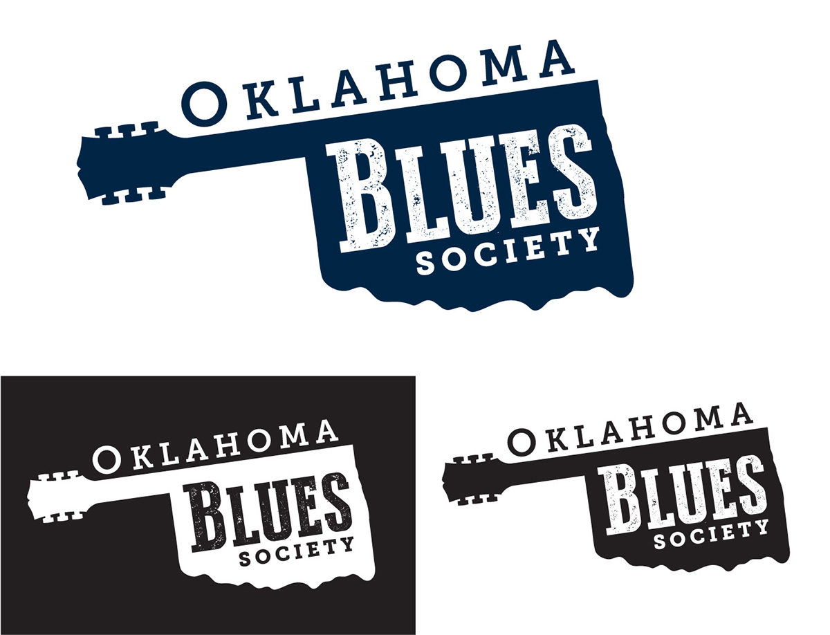
Concept: Uniting Oklahoma Blues
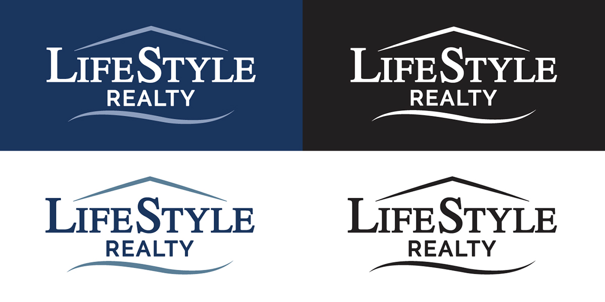
LifeStyle Realty's logo invokes the message of making house buyers comfortable when purchasing a
house and to feel like a dream home that truly nurtures their lifestyle
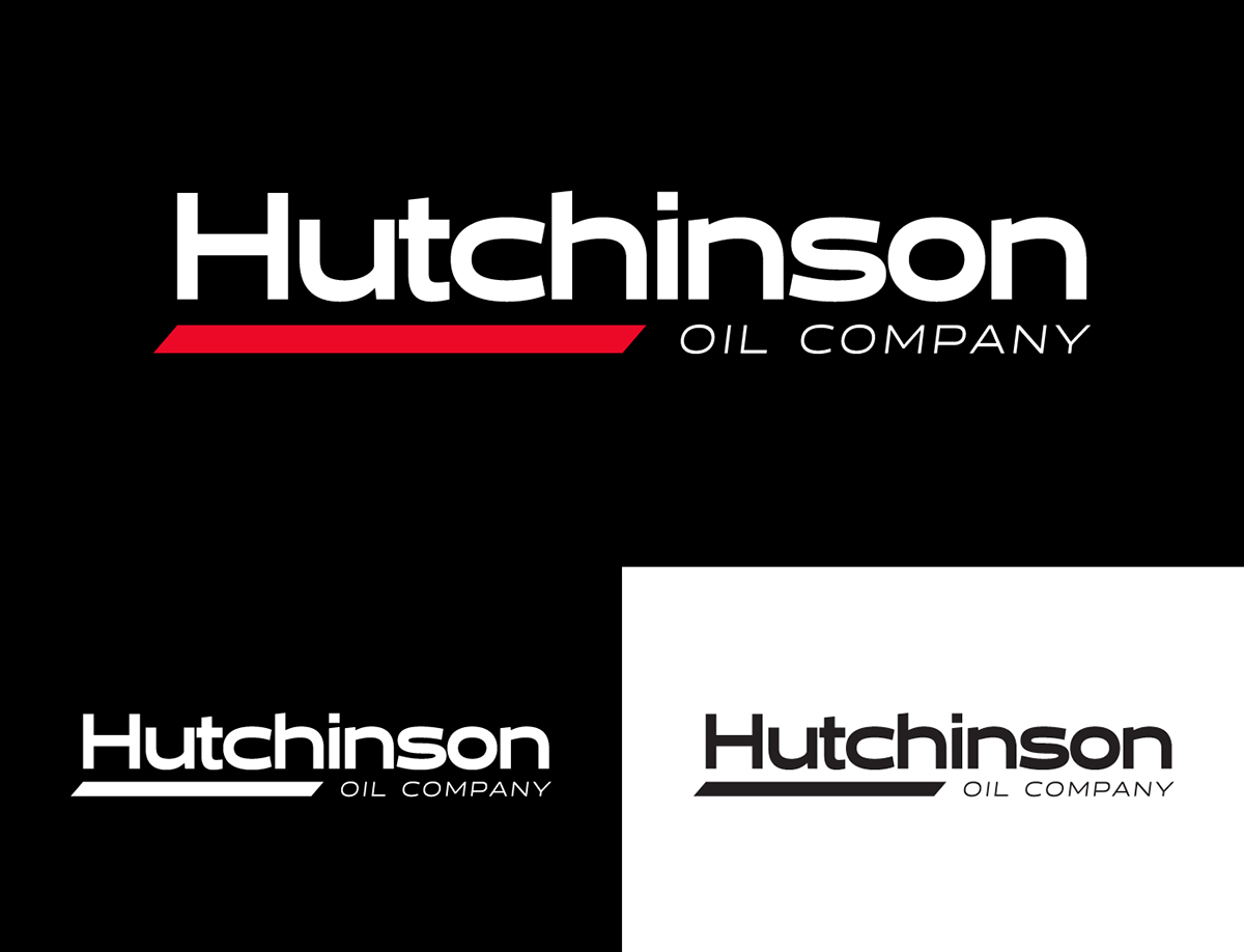
The modern, yet dependable logo defines the constant movement Hutchinson Oil Company pushes forward with in the industry. The red stroke creates a subtle sense of moving forward. It also highlights “Hutch,” to tie with the chain of Hutch’s convenience stores and is the main component for the company. Hutchinson Oil Company strives every day to expand its services. The extended typeface creates this feeling of expansion.
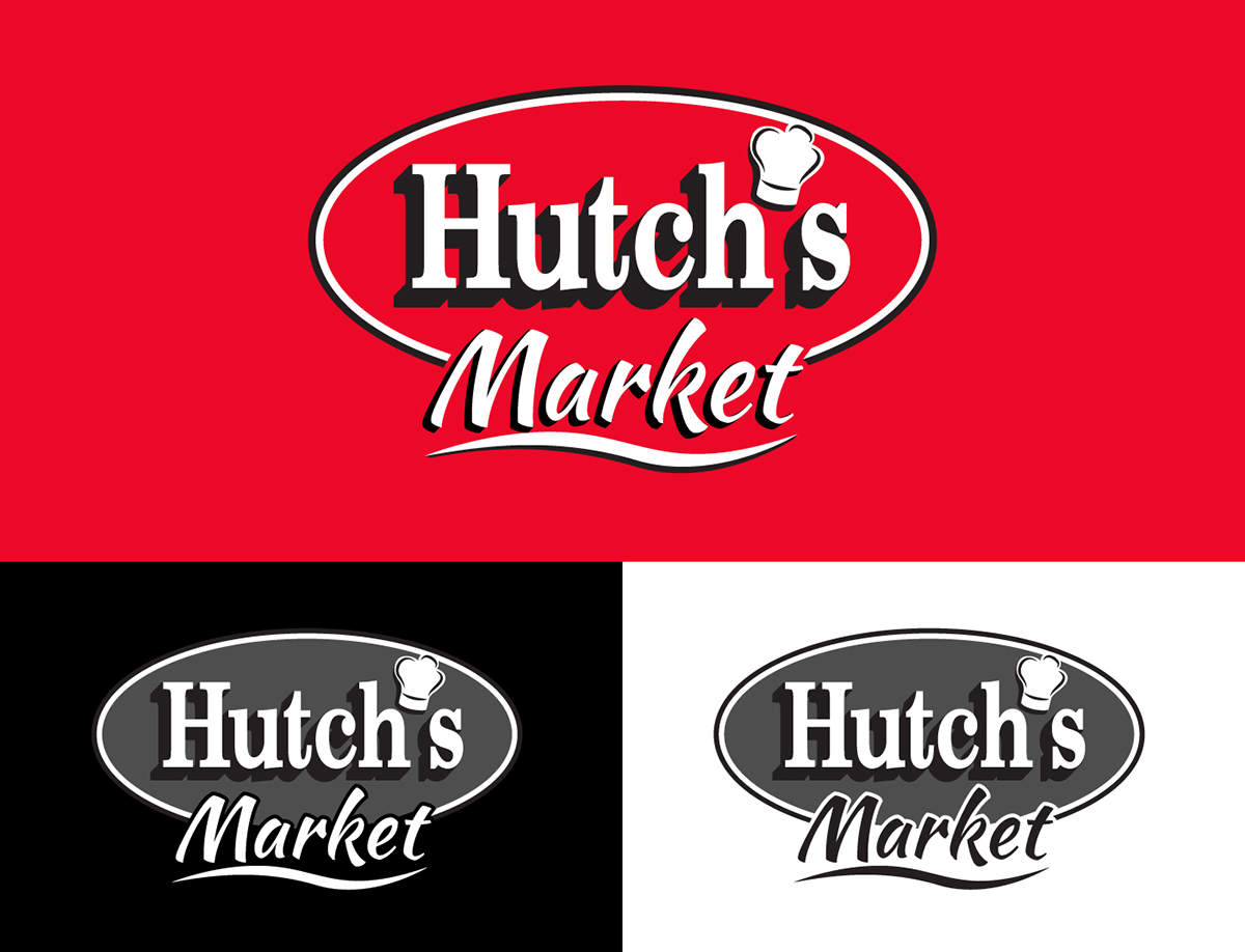
Hutch's Market is the in-store deli at participating Hutch's convenience stores.


