Sinsemilla Corporate Identity Manual 2016
Here I gave the iconic image of the cannabis leaf a modern update. It's graceful lines embossed effect, and earthy colors serve to elevate its social status.

Logo Use

Primary Fonts
Using Caviar Dreams as the primary typeface speaks to the sophistication and elegance of the brand.

Secondary Fonts

Primary Colors
The subdued jewel tone colors of spices draw you in and feels very rich and warm.

Letterhead Guidelines

Envelope & Business Card Guidelines
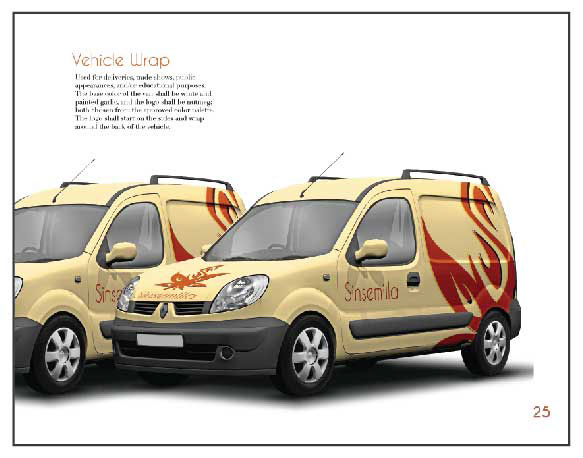
Vehicle Wrap

Monument Sign

Trade Booth Display


