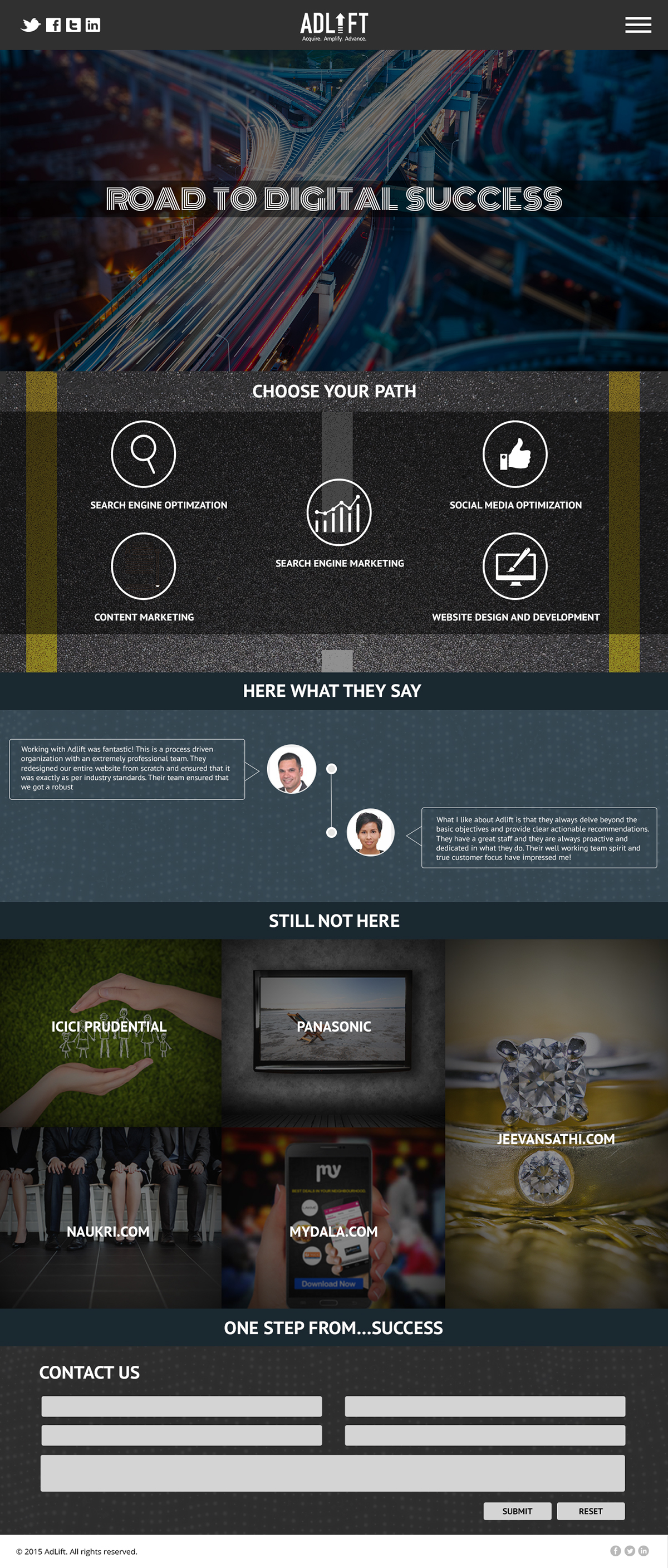
A entire ux design to showcase Road to Digital success as the project was for Seo Based agency Gurgaon they want to show the traffic how a traffic on a website is good so to communicate that i have used several design elements like road in a digital way. The header of the mock communicates Road to digital success.
Second most important part of the project was their services so to communicate that we have used choose your path which means in what service you wanna hire the company so to communicate the service i have used the icons related to the services which they provide.
Then the testimonial of the website the review of the client we have used Here what they say as the term to communicate the review of the client.The visual used in the background are dots used in a manner to communicate digital as it is a digital seo based agency.
Then Still not here section to communicate the clients visual used are related to the identity of the clients in the section.
Then the form is used in a manner to show one step from success as this is the last step by which you can become digitally successful in your business.
Then the second page was designed to communicate about adlift the banner used is to communicate about the team of Adlift the visual used is the map where you can find all the team of the adlift as map is used for searching things then the description about the company and board of director of the company and about the ceo of the company.
On the header of the third page we communicate about the specific team member which we got inside from the map used to communicate about the team of adlift.
4 page is about search engine optimization the visual used is related to key as seo is about keyword Research then different service of seo.then footer communicating about we will help your site to achieve traffic and the visual used is a client walking on a stairs and rising in the business.
Then the 5 page is about Pay per click strategy and about a clear insight of the competitors so the visual used on header is a abstract that showing a height and the target then mid section is used to show different pay per click strategy and to communicate that icons are used related to the strategy.
Check out the pages