This brand identity project has been done as contest for the famous crowdsourcing platform Zooppa.
Farmacisti Preparatori is a network of pharmacists that helps and promotes health caring, they also have their own line of cosmetics and nutritional supplements. It was mandatory keep a connection with the traditional chemist's cross.
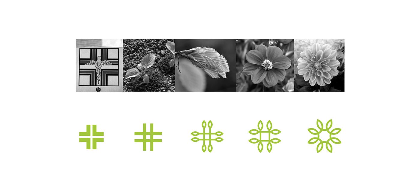
The logo comes from the traditional chemist's symbol, where the lines come alive starting to sprout up. The natural germination makes the arch rotation and turns it to a flower like shape, communicating the nature's perfect health and balance.
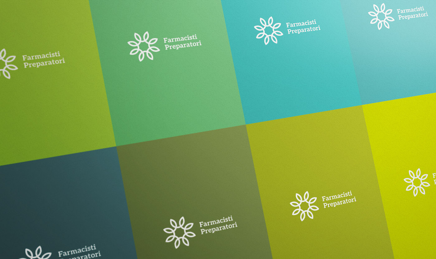
I used a green palette for the logo recalling the strength and wellness of nature and linking to the traditional color of medicine. The logo can be used in one color or with the full green range, I conceived both a vertical logo version and an horizontal one to suit different communication contexts and media.
The traditional symbol has become alive in a new logo merging together two different sides: the rational, scientific one and the natural, genuine one.
Farmacisti Preparatori is a network of pharmacists that helps and promotes health caring, they also have their own line of cosmetics and nutritional supplements. It was mandatory keep a connection with the traditional chemist's cross.
The logo comes from the traditional chemist's symbol, where the lines come alive starting to sprout up. The natural germination makes the arch rotation and turns it to a flower like shape, communicating the nature's perfect health and balance.
I used a green palette for the logo recalling the strength and wellness of nature and linking to the traditional color of medicine. The logo can be used in one color or with the full green range, I conceived both a vertical logo version and an horizontal one to suit different communication contexts and media.
The traditional symbol has become alive in a new logo merging together two different sides: the rational, scientific one and the natural, genuine one.