[Concept] [Prototype] [redesign]
BBM - Android Blackberry Messenger
Saya mencoba mendesain kembali UI/UX dari aplikasi Blacberry Messenger (BBM) Android. Desain ini berdasarkan standar Google Material Desain. Secara garis besar sebenarnya sama saja dengan tampilan asilnya. Saya hanya menghilangkan icon, mengganti icon dengan teks, atau memindahkan posisinya. Semua itu dilakukan dengan harapan tampilan akan lebih "bersih" dan ada lebih banyak space kosong sehigga tidak "memberatkan" mata.
I'm trying to redesign UI/UX of Android Blackberry Messenger (BBM). This design based on Google Material Design standard. In general, actualy this design just have a little bit different from the original version. I just removing some icons, changing icons with text, or moving the icon position. I hope with something like that, the interface will more "clean" and more a white space for easy-viewing. **sori kalo salah grammar :D
Enjoy it. This prototype made with Justimind Prototyper.
Watch this video below to see all interactions, designs and features from this prototype.
Or for realistic experiences, visit my JustinMind page.
On that web page you can trying this prototype, as same as what im doing on this video below.
This is the splash screen. I just changed the background color, changing from solid blue to gradiend color, blue to dark blue.

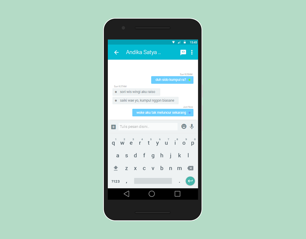
In this screen, i remove the icon (chats icon, feeds icon, and soon) and change to text base. Then i also exchange the position of read, delivered, sent, failed, broadcast indicator with the date, and only leaving color indicator. And i think if i removing the line beetwen two chats will add some white space, which is good for eye viewing.


For this screen, i remove some icon like Add Pictures, Camera, Glymse, Add Files, and move that to single plus icon. If plus is tapped, it will change the keyboard to icons that i removed before. I think all features or icon is not have to be display in one screen at all. It can set to be hide, and appear only when needed.
On the original design, i think, that's too much lines. I try to reducing by relocating the like button to the right side and deleting lines which that bounding the status text. In this screen i also adding a floating button that can be use for adding new status.


In contacts screen (on grid contacs layout mode), i resize the profile picture thubnail into smaller size for increasing the white space area.

And this is what will see if someone tapping on the profile picture thumbnail.

The slider menu is become like this. Look. both images (above & below) still have a low-res profile picture. Hehehe :D

This last one, in honestly, i dont have any idea yet ^^ Maybe it'll same with cotacts screen.

Thanks.
Some picture picked up from Admin LTE Web Bootstrap template.


