APR 2016
國立雲林科技大學設計學院 視覺傳達設計系
一〇五級畢業展 -『 他們你們我們 』
國立雲林科技大學設計學院 視覺傳達設計系
一〇五級畢業展 -『 他們你們我們 』
「他們透過了解成為你們,再透過參與成為我們。」
透過設計介入,那些原本使觀展人感到陌生的「他們」,因為有了瞭解的機會,成為更親近的「你們」;再透過參與,讓社會上更多個體集合成「我們」。因此我們將展覽名稱命名為「他們你們我們」,除了表達從陌生到熟悉的過程,也意指設計所隱含的社會凝聚力。
We give thought on the relationship between communication design and the society. Society is consisted of people and design ought to be the connection among people. The accurate expressions can shorten the distance between individuals and the society can have more power by this cohesion.
By our designs, the third party ”they” transformed into part of the participants and become “you.” Furthermore, more individuals come together and “we” have formed by participating. Therefore, we named our exhibition as ”Connected” (Literal translation-They , you and we in Chinese). Other than expressing the process from being strangers to acquaintances and this further indicates the social cohesion hidden in our designs.
By our designs, the third party ”they” transformed into part of the participants and become “you.” Furthermore, more individuals come together and “we” have formed by participating. Therefore, we named our exhibition as ”Connected” (Literal translation-They , you and we in Chinese). Other than expressing the process from being strangers to acquaintances and this further indicates the social cohesion hidden in our designs.


Visual design
視覺設計中,從文字中,找出他你我的交集,便是「亻」部,也正是展覽最核心的價值—「設計連結個人成為群體」。
延伸自展覽命名中人稱演進的概念,將他你我由外而內分成三個層級,並將他、你、我的文字拆解,使用瑞士風格對設計的秩序重新組合。網格所形成的規則,讓他、你、我產生方向感,表現從他們變成我們的意象。
延伸自展覽命名中人稱演進的概念,將他你我由外而內分成三個層級,並將他、你、我的文字拆解,使用瑞士風格對設計的秩序重新組合。網格所形成的規則,讓他、你、我產生方向感,表現從他們變成我們的意象。
From the Chinese characters, “亻human” can be found in all three words “你我他 you, I and he/she (singular form for 你們我們他們you, we and they).” This is the core value of this exhibition -connecting individuals and become a group.
Among the visual designs, using typography makes visual design. We extend the concept of “他你我 He/she, you and I.” There are 3 different parts from the inside out on the poster. We deconstruct the Chinese characters “He/she, you and I” and then reorganize it using Swiss design style. We make “He/she, you and I” to have a direction expressing the process from “they” become “we ”
Among the visual designs, using typography makes visual design. We extend the concept of “他你我 He/she, you and I.” There are 3 different parts from the inside out on the poster. We deconstruct the Chinese characters “He/she, you and I” and then reorganize it using Swiss design style. We make “He/she, you and I” to have a direction expressing the process from “they” become “we ”
In Chinese, when expressing “they, you and we” It can simply be done by adding one character “們” at the end of “He/she, you and I他你我.” On the poster, the character”們“ is on the far right and “he/she, you and I 他你我” stand out in the middle. As for the post deconstructed form of “he/she, you and I他你我”character stands on the far left.

印刷技法上,在局部使用夜光塗層,表現slogan— 「設計隱含的社會凝聚力」中「隱含」的意象。
We use luminescent paint partially on the print showing the slogan “the social cohesion hidden in our designs.”
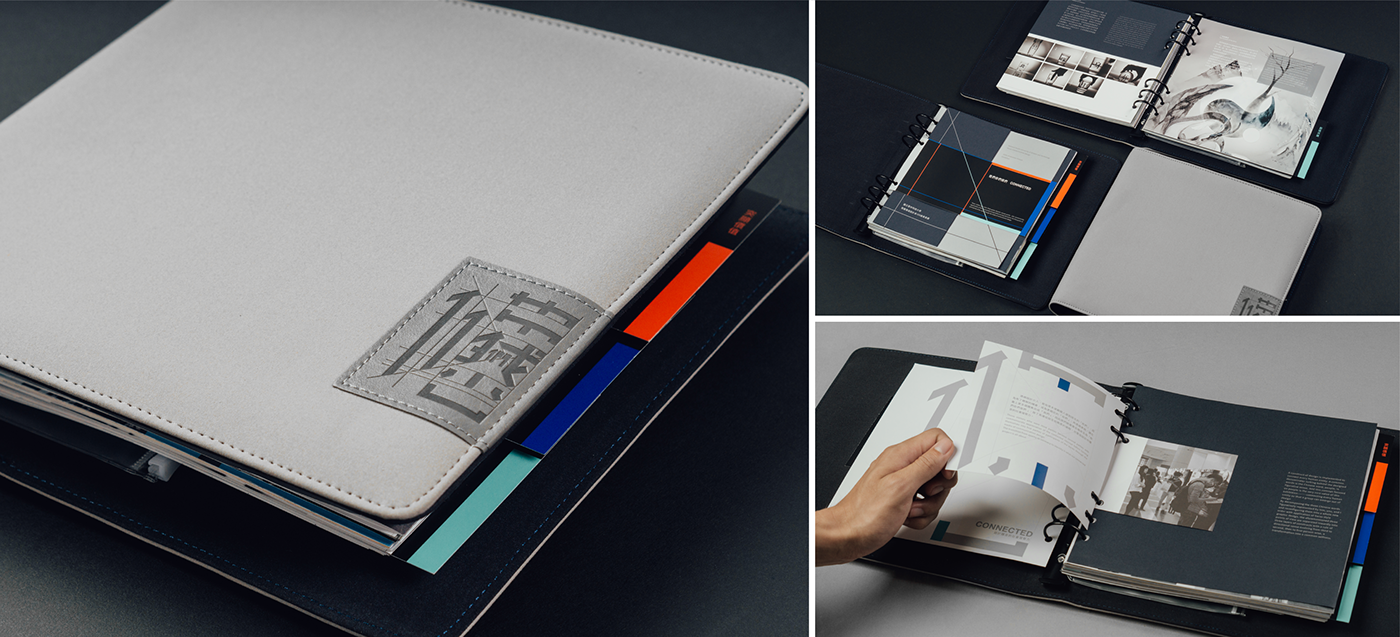
Catalogue
專刊採六孔活頁進行裝訂,配合參展者自行發行的文宣周邊,可透過活頁的形式進行收集。內頁使用日本進口雪銅紙,紙面上霧油,可以降低紙面反光,便於閱讀。編輯上使用不同大小的頁面規劃來增加專刊的豐富度。隨書附贈PVC袋,可作為收集展場文宣使用。
In the catalogue, we use loose paper along with flyers we will be handing out. For the paper, we use Matt-Art paper imported from Japan and matt coating on the surface so it’s easier to read. In terms of the size, we use different size of papers so that it’s more fun. PVC bags that come with the brochure can be used for collecting flyers from the show.

Badges
識別證使用視覺設計中斜切的手法進行設計。配合展覽延伸出的三項主題分區,以標準色區分各區工作人員。
We use angle cutting in visual design to make it more chic. Coordinating with the three different themes in this exhibition, the badges are divided into 3 parts and different colours is to distinguish the staff from different part of the exhibition.

Brochure
設計就像報紙的角色,作為媒介,將訊息傳播,連結社會與使用者。這次的展覽DM使用輕塗紙模擬報紙質感,並配合專刊六孔的形式,做打孔的設計。
Just like newspaper as media, spreading out the message connecting the society and the users. We use LWC paper of which the texture is similar to newspaper for the DM of the exhibition; on top of that, we punched 6 holes on the DMs so it’d easier to collect with the brochures.

Extra Info.
Project|2016視覺傳達設計系105級畢業展-『他們你們我們』
School|國立雲林科技大學視覺傳達設計系
Project|2016視覺傳達設計系105級畢業展-『他們你們我們』
School|國立雲林科技大學視覺傳達設計系
Team|105級形象組
Concept|馬綺襄 Rosa Ma、吳翊寧 Damee Wu、劉琦璿 Marilyn Liu、薛麒威 Winfred Leon、高敬謙 Jingcian Ho
Graphic Design|薛麒威 Winfred Leon
Copywriter|劉琦璿 Marilyn Liu
Motion Design|吳翊寧 Damee Wu、胡雅淇 Kiki Hu
Catalogue|馬綺襄 Rosa Ma、劉琦璿 Marilyn Liu、薛麒威 Winfred Leon
Display|高敬謙 Jingcian Ho
Display|高敬謙 Jingcian Ho


