The Logo Project
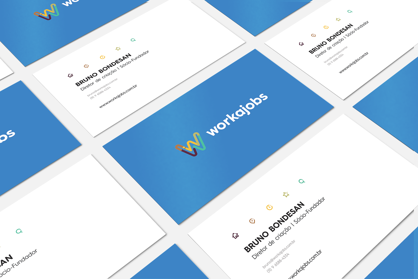
The logo design came quite from the colors, since the begin WorkaJobs worked with three main colors to distinguish what type of work the user were looking for, Full Time Jobs, Freelancers and Internships. Based on this principle we begin a study on a color palette where we had a spectrum of colors that would be combined beautiful and still not lose this color theory by category within these studies we have reached a very interesting triadic palette and harmony that I even like share that the principle of this triadic color palette is the same of the project with some tone adjustments.
Featured
Check it out the archive made by DesignIdeas.pic about the entire project, WorkaJobs Logo by Bruno Bondesan.