typographic communication
overview:
Since the early XX century modernist experiments of Theo van Doesburg and Vilmos Huszár, designers have explored varying letterforms and alphabets constructed from a limited set of shapes. This is the same approach later used in the development of bitmap fonts of the 1980s.
Since the early XX century modernist experiments of Theo van Doesburg and Vilmos Huszár, designers have explored varying letterforms and alphabets constructed from a limited set of shapes. This is the same approach later used in the development of bitmap fonts of the 1980s.
premise:
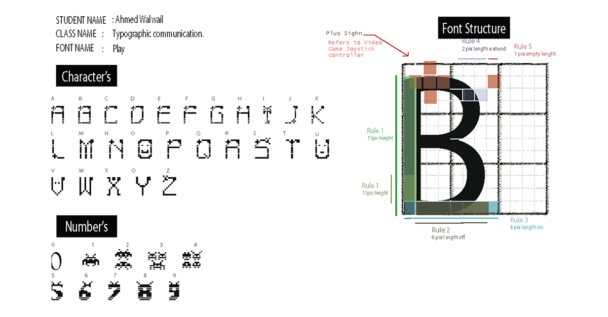
in this project, I created an alphabet (upper or lowercase) using only a small set of basic geometric shapes: a grid of squares or a grid of dots, for shaping a new typeface.


Download link will be available soon (Game Over Font)

Download link will be available soon (Play Font)
