SABARÉ
MEXICAN CANDY SHOP


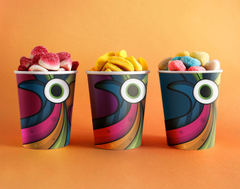
LOGO - ILLUSTRATION VERSION


Sabaré is a Mexican candy shop with presence in all the main airports of the country. They wanted to find a consistent graphic identity that could help them to unify their visuals across their more than 200 products in all shapes, sizes and forms. Their brief was straightforward: they needed a logo that “would have a lot of presence in their packaging”.
My proposal was creating a very simple but versatile logo along with its "illustration version". The "simple version" would be used for corporate purposes, whereas the illustration would serve as background image for the packages, allowing it to be the main element without being just a logotype, but a part of the design.
To give the "illustration version" more flexibility, I chose a color palette composed by 10 tones inspired by traditional Mexican sweets.
Additionally, I created a text pattern for wrapping papers, where the client can read different popular Mexican sayings related to traditional sweets and deserts, as well as the lyrics of the kids song “Acitrón de un fandango” from where the name of the brand comes from.
The image chosen for the logo is a bird for the direct association with the concepts of flying and travel, which connect the brand with airports, as most of their customers are travelers looking for sweet souvenirs to take home.
Project commissioned through Mantra (www.mantra.ws).
Roles // Branding design, Illustration and Concept.


