Branding the new city circuit
in the Land of Fire
A city circuit designed to conquer a new speed record in a F1 race,
powered by the ambition of a ancient culture, along the old and the new city.
powered by the ambition of a ancient culture, along the old and the new city.
Baku is proud of its history. And eager to show its love for innovation.
So, this brand is a statement that could only come from a place that combines these unique features.
A brand that is created now, by joining past and contemporary.
A true classic for times to come.
So, this brand is a statement that could only come from a place that combines these unique features.
A brand that is created now, by joining past and contemporary.
A true classic for times to come.
Made in Brandia Central / © Brandia Central / © Baku City Circuit Operations Company / www.bakucitycircuit.com
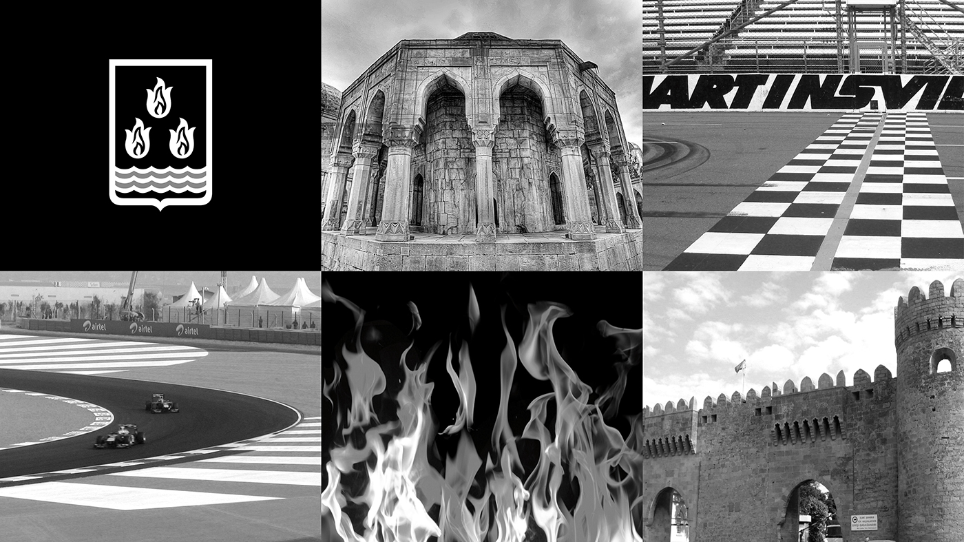
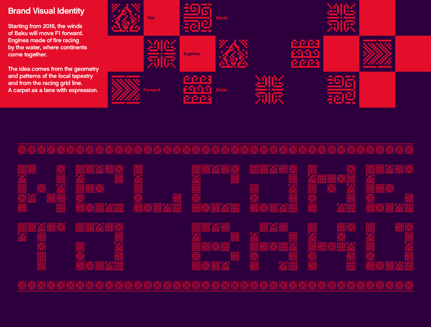
History-inspired
The arches of Baku’s architecture and the three flames of the city's coat of arms
are visible in the angles that compose the symbol. Paying homage to the City’s background.
Racing-inspired
The world known chequered flag is part of the symbol, calling out all motorsports’ fans.
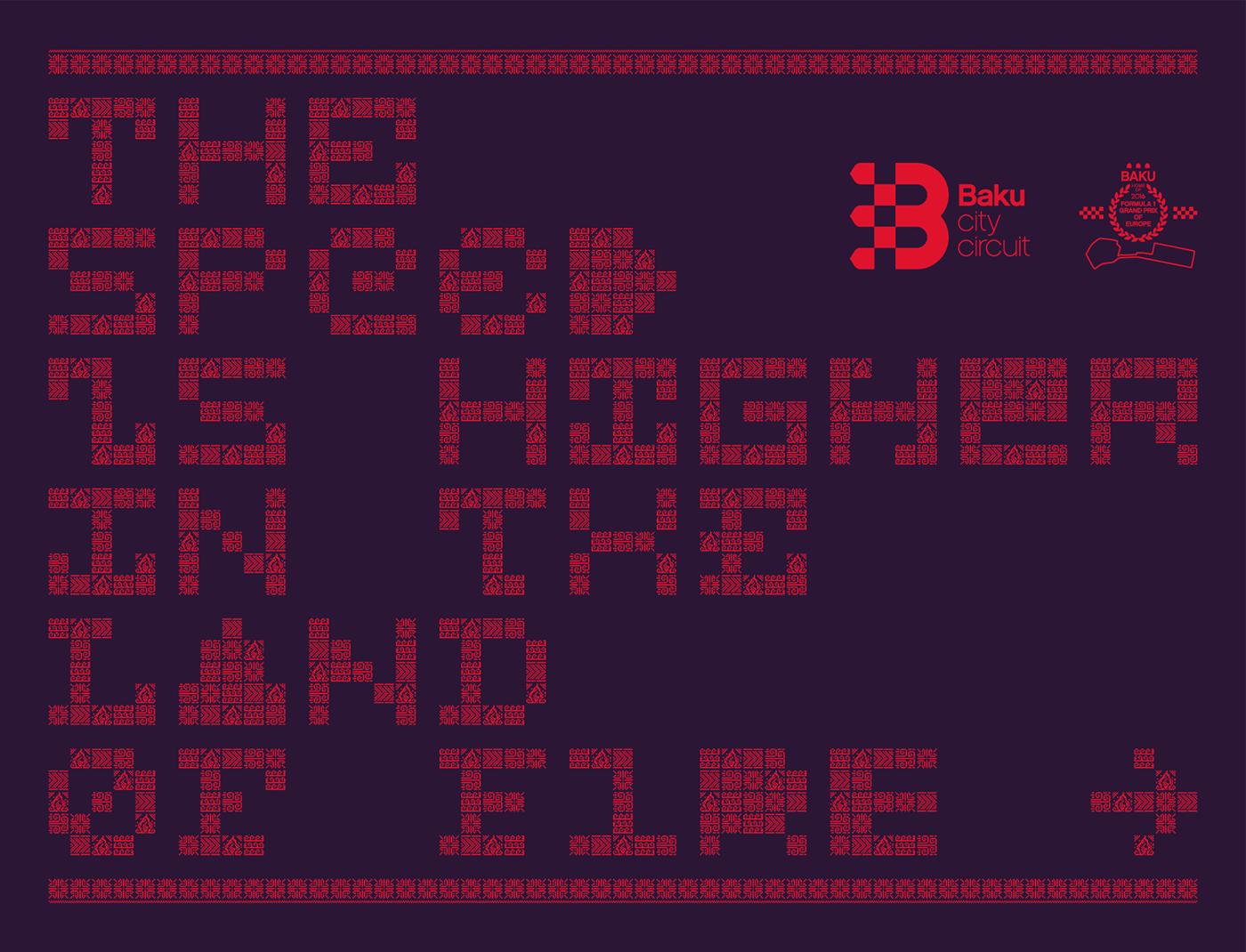
Modern-inspired
The design of the letter “B” is subtle yet powerful.
The design of the letter “B” is subtle yet powerful.
An up-to-date visual approach that uses clear shapes - round and straight - as in a circuit’s design.
Contemporary Tipography
The name of the circuit is presented by a clean-cut typography.
The name of the circuit is presented by a clean-cut typography.
The usage of lowercase in “street circuit” makes it youth-focused and less formal.


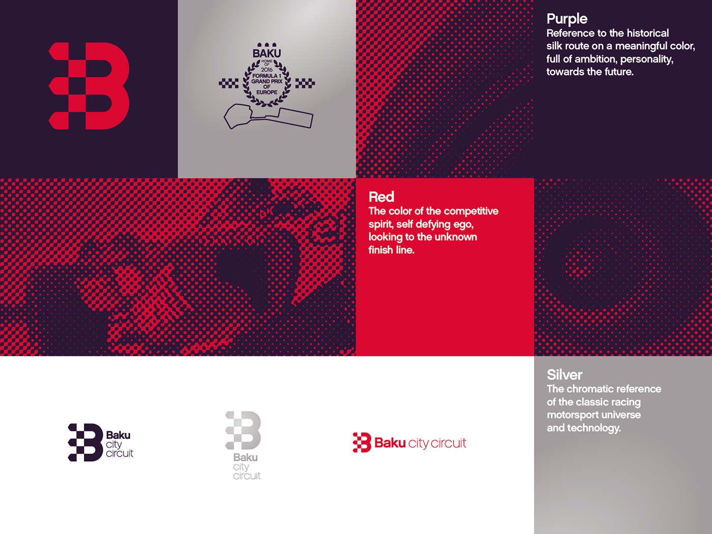
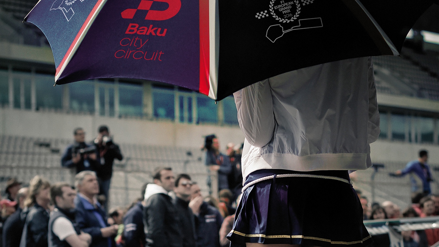
Photo: Miguel Melo