Wir Sind Nicht Uber die Gleiche Sache Sprechen.
Hand made editorial done for a particular assignment, that brought out a message about 'We are not talking about the same thing'.
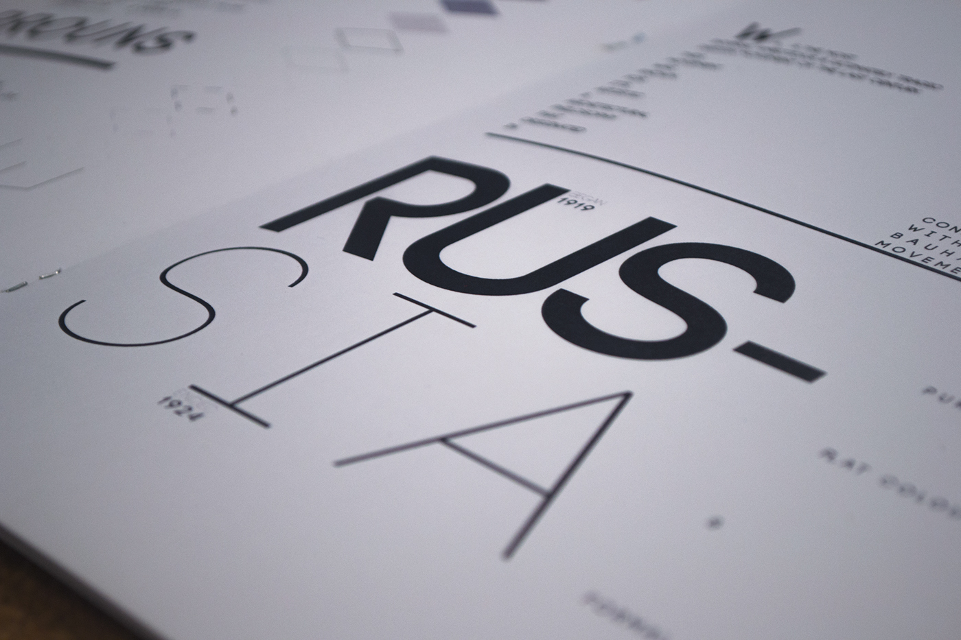
The inspiration about my project was mostly on Platonic Solids, Sacred Geometry and focusing on just a CUBE. Keeping everything plain & simple is my forthe, and most of all keeping everything black on white with a touch of photography. Gathering various research and analysing more about this topic gave an upper hand on how to handle such topic.
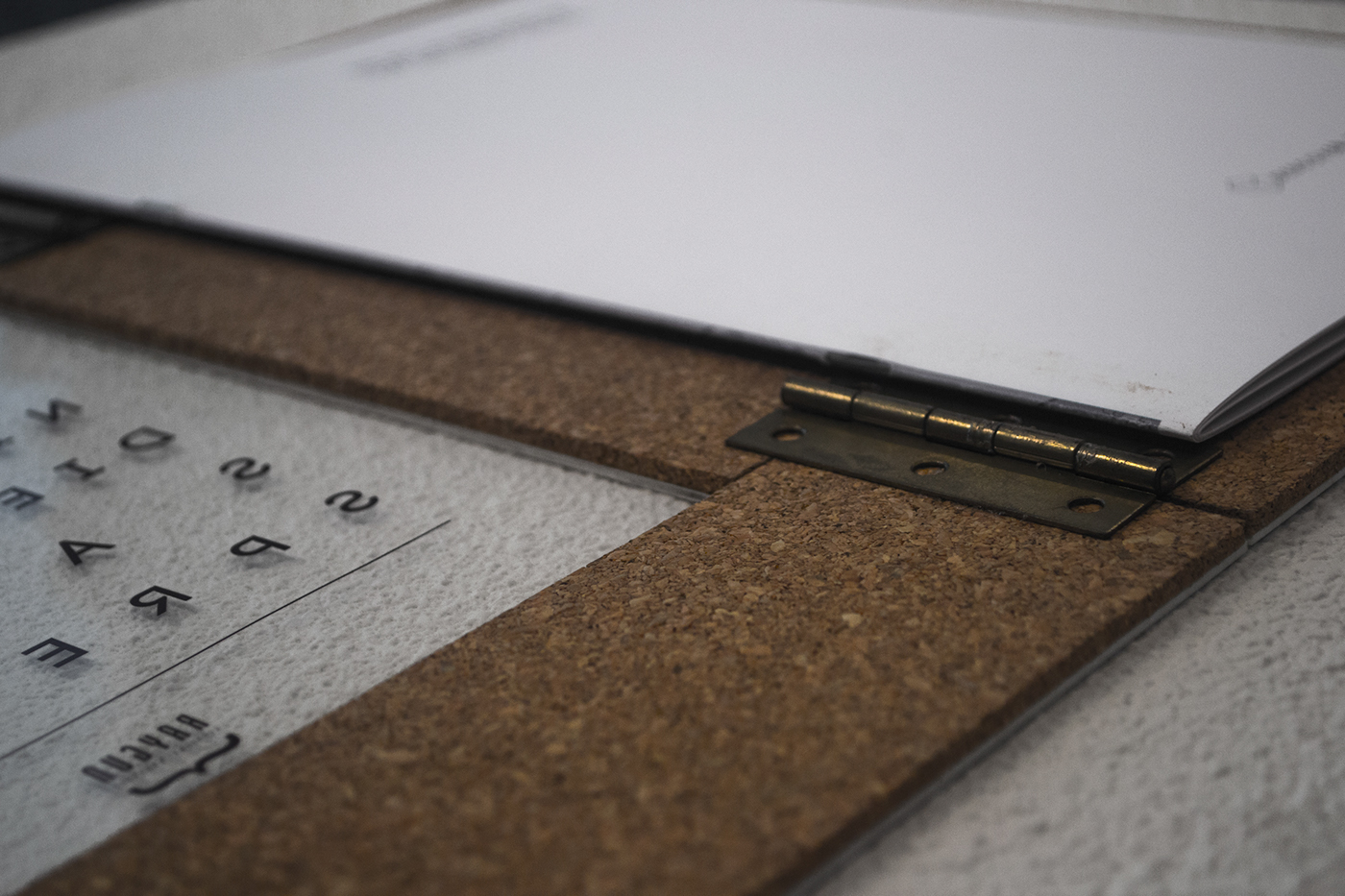
The materials that I used binded solidly the editorial, covering the first layer with pure cork of a 0.3mm and attaching another layer of PVC plastic sheet of 0.1/2 onto the cork. The cork is there for padding and at the same time used for appearance. Printed both the cover and last page on transparent plastic paper for appearance & for a pleasing design. Taking into consideration that my artistic inspirations were : Bauhaus & Constructivism and these two bind the modernistic era.
The inspiration about my project was mostly on Platonic Solids, Sacred Geometry and focusing on just a CUBE. Keeping everything plain & simple is my forthe, and most of all keeping everything black on white with a touch of photography. Gathering various research and analysing more about this topic gave an upper hand on how to handle such topic.
The materials that I used binded solidly the editorial, covering the first layer with pure cork of a 0.3mm and attaching another layer of PVC plastic sheet of 0.1/2 onto the cork. The cork is there for padding and at the same time used for appearance. Printed both the cover and last page on transparent plastic paper for appearance & for a pleasing design. Taking into consideration that my artistic inspirations were : Bauhaus & Constructivism and these two bind the modernistic era.
RAYGUN MAGAZINE was the primary source for creating this editorial.