Speakeazy
A redesigned platform for better public speaking
UX Research, Interaction Design
Challenge
Speakeazy (now Evrpresent) is a Chicago startup and online platform that helps you become a better public speaker through desensitization and feedback. You practice public speaking in front of a virtual audience, while being recorded. Friends and coworkers can then watch those recordings, and offer constructive feedback.
When we met, the team was having issues with their product. Although the bones and the basic functionality were there, they were getting feedback that clients didn't know how to use the software. They had just signed contracts with two, large companies including Motorola so the pressure was on to diagnose the issues. In their words, "the platform should be easy to use, but it isn’t.”
"The platform should be easy to use, but it isn't"
A quick gut check walkthrough of their platform revealed a lot of basic design issues
Domain Research
We kicked off the project with domain research. We wanted to immerse ourselves in the world of public speaking and become experts on the best practices, scientific literature and tools/competitors already out there.
Scientific literature backed the promise of the product; by invoking the same fear response, virtual audiences can help treat people’s public speaking anxiety. A music school, for example, was using virtual audiences to prepare musicians for recitals.
We also dug into Speakeazy's competition. We wanted to not just eliminate usability issues, but also help position Speakeazy's product to succeed in the long run. Their team believed their closest competitor was Toastmasters, but maintained "as far as we know, we're the only ones in this space." My research on Reddit and Quora's public speaking channels revealed that there were actually handful of public speaking simulators already on the market or being tested.
However, the majority of the public speaking apps we found were VR simulators focused mainly on desensitization, and we didn't find any built for desktop. A couple had interesting functionality like slide integration, they lacked built-in recording or feedback mechanisms. We saw these as important differentiators.
A screenshot from an Oculus Rift application we found called Presentation Simulator
User Research
While we were conducting our domain research, we started scheduling interviews with leads our client had given us—a mix of target users and actual clients.
With our interviews, we wanted to understand how people think about public speaking, how they practice, and any frustrations they had. We typically led by asking “tell me about the last time you had to do some public speaking,” and transitioned into questions about their role, the amount of public speaking they did, and pain points. We also saved some questions about speakeazy concept for the end of the interview.
7 x 45min remote user interviews

While we were interviewing we also did some quick dog food usability testing with the Spekeazy product. We selected three people who were interested in improving their public speaking to test the product.
We found really serious usability issues. Not only was the platform hard to use, but it was broken. The majority of the times we used it, we couldn’t actually get videos to properly upload and save. Navigation and on-boarding were also lacking. However the concept resonated with people, which was promising. If we could eliminate these usability issues we might actually have a solid product.

From the affinity diagramming, we were able to start building out our “synthesis deliverables for the next client presentation: competitive analysis, interview findings, problem statement and design principles.
Synthesis
With research complete, we used affinity diagramming and to boil down our interviews, secondary research and usability testing into a set of "nuggets," design principles and a reframed problem statement.
Problem Statement
People need a comprehensive tool that will help both individuals and teams learn presentation skills, desensitize themselves through practice and feedback, and shift their mindset to see speaking as an opportunity rather than a threat.
Design Principles
Enjoyable: The platform should frame presentations as opportunities not obstacles
Painless: The solution should mitigate the awkwardness of seeing yourself on fim
Supportive: The platform should provide anxiety-free learning and feedback
Conversational: The platform should grow users into powerful unscripted speakers
Enlightening: The platform should reveal new insights about peoples' speaking
Flexible: The solution should work for both new and intermediate speakers
Ideation and Execution
We did this by going through some whiteboarding—doing "requirements definition" and building out a preliminary sitemap. A lot of the requirements came from client feedback, since these are things that were core to the product or within the realm of the technically feasible. The sitemap was challenging because a lot of the screens only came after working out the key flows.
When it came time to ideate, we initially started as broad and crazy as we could. Our team did a series of creative warmups to help us get into the brainstorming mood ("how might we solve world hunger with this coffee mug?"). We then kicked off a series of crazy eight's—where we had 5 minutes to come up with eight separate ideas for features and facets of the platform. The point wasn't so much to nail the final interface, or even specific features, but rather to scratch at ideas that were truly new.
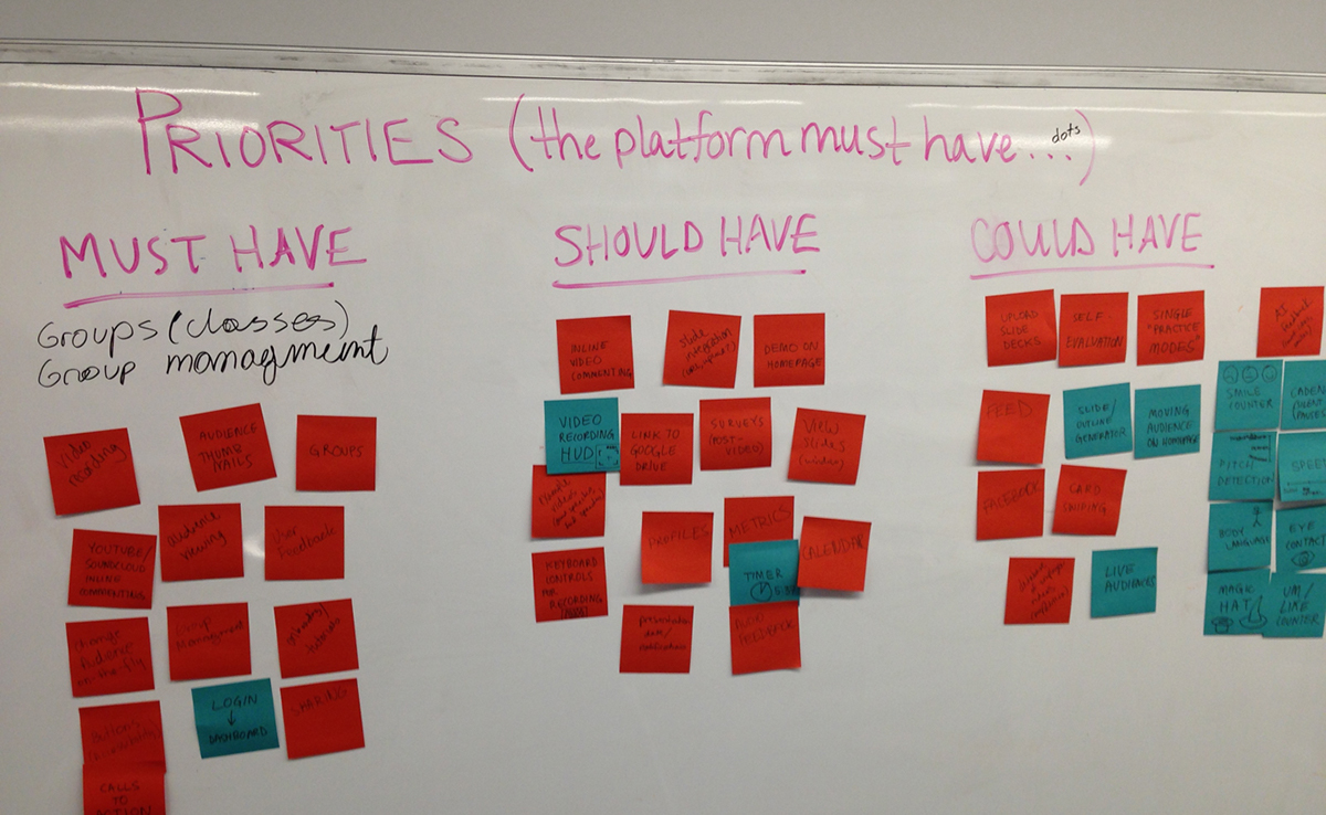

Crazy 8's don't give you a lot of time to make anything beautiful, but they are good for definind specific features. "Magic Hat," a feature we used later, actually came out of our interviews and this crazy eight session.
After this inital divergent exploration, we split up to make our own wires. Although everyone in my group was fairly skilled in Axure, we decided to do paper prototypes in InVision.
Splitting off to make separate paper prototypes was great in that it allowed us to envision the same product in multiple ways. Because we were working off of the same requirements, the products would have the same core functionality, but because the visual formats and structures would be different, we would be able to get more client feedback.
Before I set off prototyping, I did a little bit of competitive UI analysis. Competitive UI analysis is a great way of not reinventing the wheel when it comes to specific feature sets. A lot of what I and my teammates researched was centered around dashboard design patterns, but the analysis also helped us when breaking the platform into specific features. Broadly speaking, there were really three core components of functionality to our platform: (1) the file hierarchy, (2) video recording and (3) video commenting.
Video recording was the easiest. We were able to look at patterns like Skype and Google Hangouts to see how they had solved these problems. One of the things we wanted to add was some kind of visual signifier that you were recording, while you were recording. We also wanted an elapsed time timer, to show people how long they had been speaking.
"Make sure you focus on corporate clients"
The other two pieces of functionality were slightly harder. When it came to the file hierarchy—navigating projects and individual recordings, we knew we needed a way to keep things really clear. Because Speakeazy's corporate clients had all mentioned using Google Drive, we thought it might offer us a nice way of structuring the file hierarchy. Because one of their specific asks was to think about functionality specifically for corporate clients, we thought this might be a familiar pattern.
The other core functionality—video commenting—took a little more research. I think initially we were drawn to youtube's commenting format, where people can add timestamps to refer to specific parts of the video. We also thought about soundcloud's commenting format, where you added comments inline on the timeline.
But our research also took us to a video editing collaboration tool, called Wipster. Wipster had a nice interface, and allowed you to add comments to videos by clicking on the video, as it was playing. Then, when you returned to replay the video, it would cycle through the comments in a right hand column, as they appeared. In some way, this way of feeding comments back to you in realtime reminded me of a Periscope recording.

Wipster lets you comment on videos as they are playing. I think it's intended for video editors, but the pattern is quite nice, and it's one our team borrowed.
Looking out of category allowed us to really iron out the key elements of our design. We were going to borrow the file hierarchy and structural format from Google—with folders for projects and video recordings. We were also going to borrow video recording patterns from apps like Quicktime, Skype and Google Hangouts. And finally, we were going to implement a video commenting style similar to the Wipster interface, where comments were added inline, in realtime.
Having the general feature sets scaffolded out really helped us when it came time to wireframe. We were going to work in paper, so I actually started drawing out some exploratory wireframes on paper. The goal here was not so much to capture the final flow, but to explore different variations of key screens to get a sense of what patterns might work best. That way, when it came time to assemble the more refined paper prototype, I would be able to pick and choose from the best ones, and make any minor edits that I needed to make in the process.
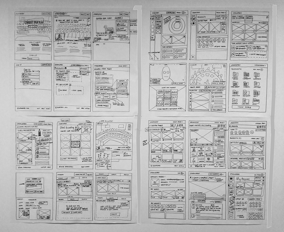
These exploratory wires are by far the most monumental wireframes I've ever done. I used flipboard paper, and traced out six 8.5 x 11" rectangles onto each—for a total of 24. It was a painful amount of sharpie marker to inhale, but if compliments are a measure of success, this is some of the best design work I've done
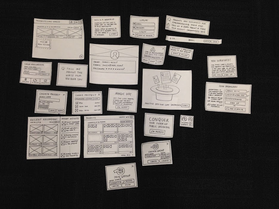
My paper prototype was mostly structured and built in layers. Getting everything to lie flat while I photographed it was pretty challenging.
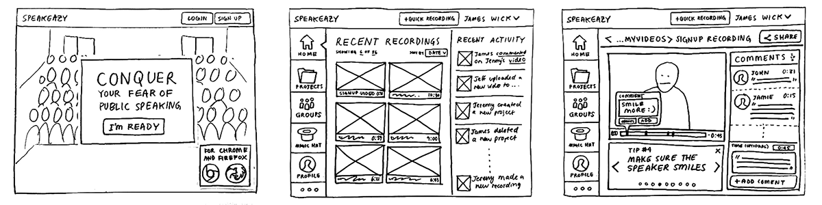
All in all, I was able to build out a 25-screen paper prototype in Invision. I stuctured the prototype into a series of key screens and modals, laying different variations of screens and securing them in place with masking tape. In the future I'd like to figure out a system that uses less sharpie marker (I had headaches at the end) and less masking tape. I've thought about having a clear overlay to get everthing to lie flat. Anyways, below you can see three key screens in the paper prototype:
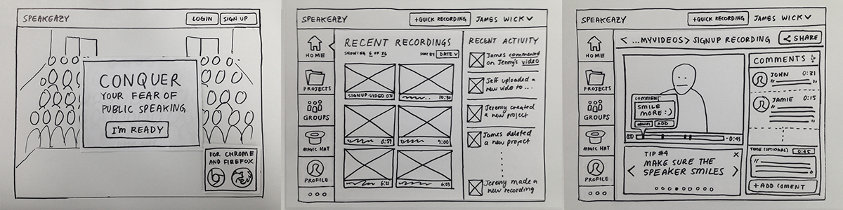
Three key screens from the final paper prototype: the marketing page, dashboard home, and video commenting page
Because I and my teammates were each developing different prototypes, we ended up with three very different paper prototypes that we could test. Each of us really chose to focus on separate features. In mine, for example, I wanted to use a product demo on the homepage to serve the dual need ot enticing new customers, and onboarding existing ones when they went to sign up for the service. It allowed you to test out two features: the "Magic Hat" feature, and the video recording functionality.
My teammates (who were responsible for prototypes #2 and #3 developed other aspects of the platform. Caity, for example, used a dashboard to provide sort of big data feedback on a range of different speaking quality metrics (like eye contact, tone, body language and conttent). Thomas, on the other hand, focused on developing a platform with excellent video feedback and commenting.

These are the three final prototypes we showed the client. Each of them had different strengths. I had spent a lot of time getting a nice onboarding flow. Caity had put together a pretty refined dashboard with various metrics, and Tom had spent a lot of time on the video commenting feature.
When we did user testing, we had pretty good feedback from the people who used it. They loved the magic hat feature, and could navigate between core features much better than the previous prototype. But the core problem was one we hadn't managed to solve from our initial user testing of the existing platform: people still didn't know what groups were—which was a core and important feature of the platform. We started to question whether "groups" were best for the mental model
The client also had feedback for us. They loved the prototypes, but they wanted us to limit our final medium-fidelity prototype to features that they felt were core—or actually implementable. They didn't envision the platform having deep learning functionality, so the kind of hyper-granular feedback on things like eye contact, posture and tone didn't make the cut.
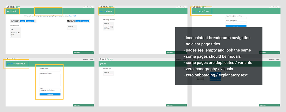
Annotated Wireframes
The process of going from paper prototype to medium-fidelity wireframes was basically us taking the successful components of each platform, and combining them into something we felt was cohesive. One of the drawbacks of our approach (which was to “divide and conquer” the flows) was that our wireframes had fairly visually different stylings, and that Caity was stuck with defining the main dashboard, which was easily the most complex screen. We also had trouble coordinating on things like the size of the grid we were using, but eventually it all came together. The only key change we made was opting for the shared folder model from Google Drive, rather than SpeakEazy's "Groups" model.
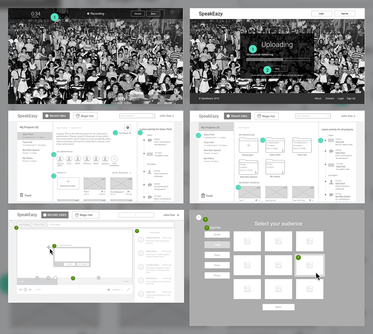
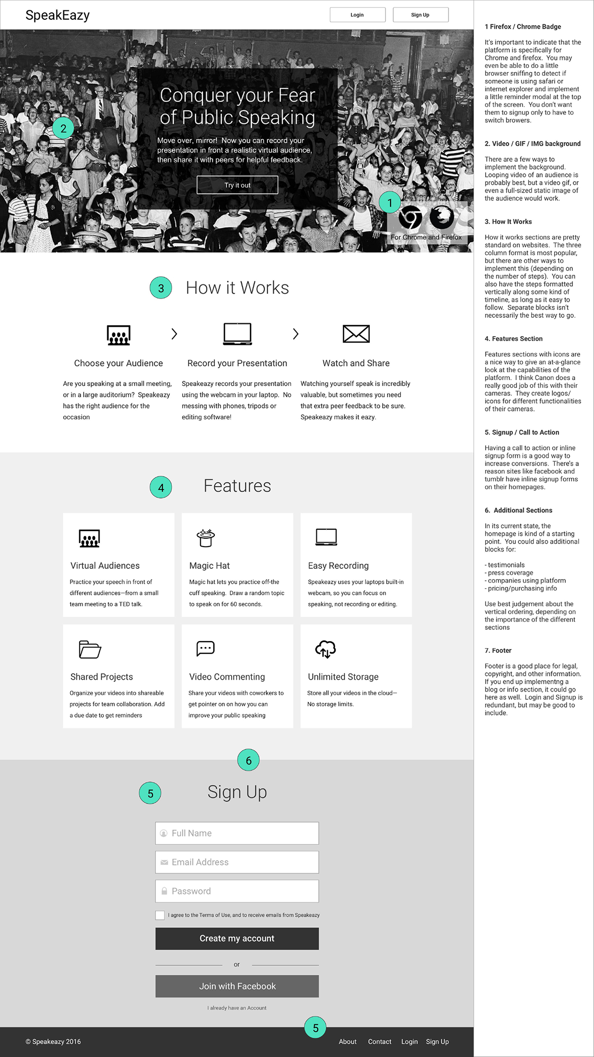
Nevertheless, we were able to come together with a fairly cohesive medium fidelity prototype making the screens in Sketch. When we presented it to the client, they were happy with it. Our final step was to annotate it, and package it all up into pdfs. This was pretty straightforward, it just took a lot of time to capture the detail. Below are some of the key screens:
Nevertheless, we were able to come together with a fairly cohesive medium fidelity prototype making the screens in Sketch. When we presented it to the client, they were happy with it. Our final step was to annotate it, and package it all up into pdfs. This was pretty straightforward, it just took a lot of time to capture the detail. Below are some of the key screens:
Project Lessons
Make good wireframes
Because the DESIGNATION team behind us was actually responsible for creating the visual interface, it was important that we leave them good work. We later got excellent feedback on our annotated wireframes
Have a presentation “Czar”
The czar manages all of the materials for a given presentation. In any group, there should be one teammated responsible for all of the key materials for a presentation, and getting all of the styling to line up. Divide and conquer only works so well for certain scenarios (our wireframes, similarly, could have benefitted from uniform styling).
User Testing works
It won’t necessarily revolutionize your product, in terms of features, but it’s a foolproof way to uncover any glaring usability issues. We learned so much just running throught the key flow with three of our classmates.
