Branding / Identity design
2015

Novidário is a design studio based in São Paulo (Brazil) focused on the development of integrated ambient solutions for schools, residences, public spaces and offices. Five years after the studio was found, it was time to review the identity aiming to reflect the the studio's evolution and to align its image with the vision for the future.
The name Novidário comes from "novidade" (“novelty”, in portuguese). It means the place where people can find something new. The symbol in the original logo was inspired by a mandala, representing the creation process. The logotype was developed in a handwriting style.
The main weaknesses in the original logo were: too many elements, the poor proportion between symbol and logotype, and the type that was not the best fit for a long name. The objective then was to bring a fresh and more professional look for the brand, while keeping the original idea.
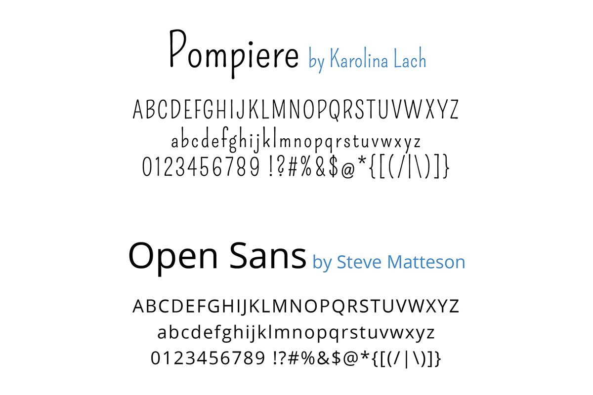
The new symbol has a similar shape from the original logo with some small adjustments and now in one colour. This makes it look more like a symbol, and not an illustration anymore. The logotype was completely redesigned, keeping the handwriting idea, but not everything in capital letters as before and using the Pompiere font by Karolina Lach (with adjustments). This is a condensed font and has very tall ascenders. For this reason it is also playful (but not childish) and makes the name feel not as long as in the original logo.


Thank you!

