Lime Tech specializes in development and production of customer service quality improvement solutions.
Lime Tech’s two main values Organization and Order were visualized in the logo in the form of a parenthesis and a bracket. The bracket stands for the company’s rational and technical side. The parenthesis represents the irrational and live characteristic feature of Lime Tech.
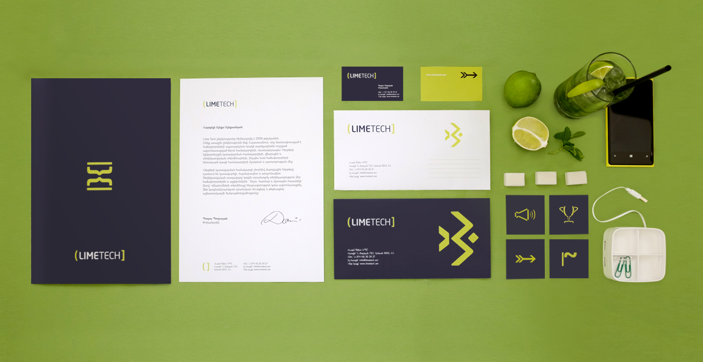
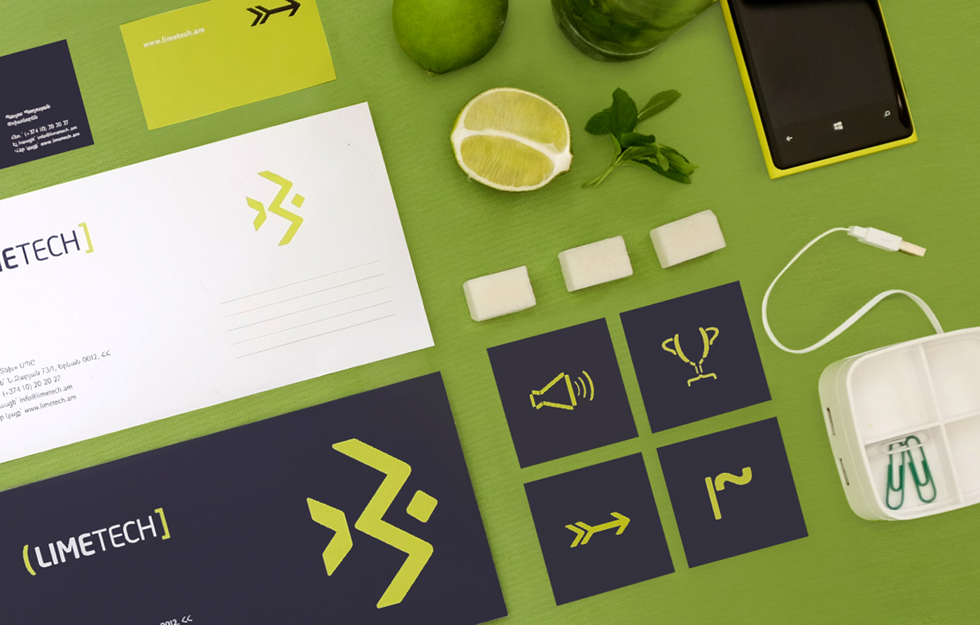
Lime color is prevailing for Lime Tech's branding. To highlight the freshness and ease of this color and to pass on to the audience the tint of gray has been used.
Lime Tech’s two main values Organization and Order were visualized in the logo in the form of a parenthesis and a bracket. The bracket stands for the company’s rational and technical side. The parenthesis represents the irrational and live characteristic feature of Lime Tech.
Lime color is prevailing for Lime Tech's branding. To highlight the freshness and ease of this color and to pass on to the audience the tint of gray has been used.
Credits
Client: Lime Tech
Art Director: Siranush Danielyan
Graphic Designers: Siranush Danielyan, Varduhi Antonyan


Thank you for appreciating!
Visit our website – www.marog.co
Follow us on Facebook – www.facebook.com/MarogAgency


