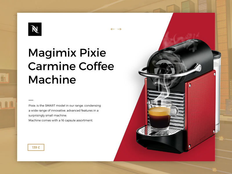
Just for fun and because I love coffee!
Click here to see my work on Dribbble!
Just for fun and because I love Nike!
Click here to see my work on Dribbble!
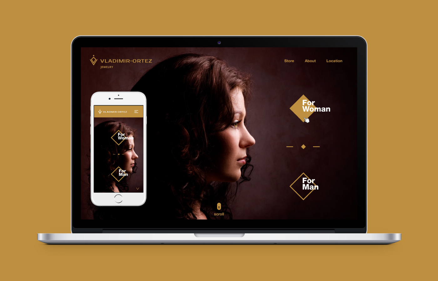
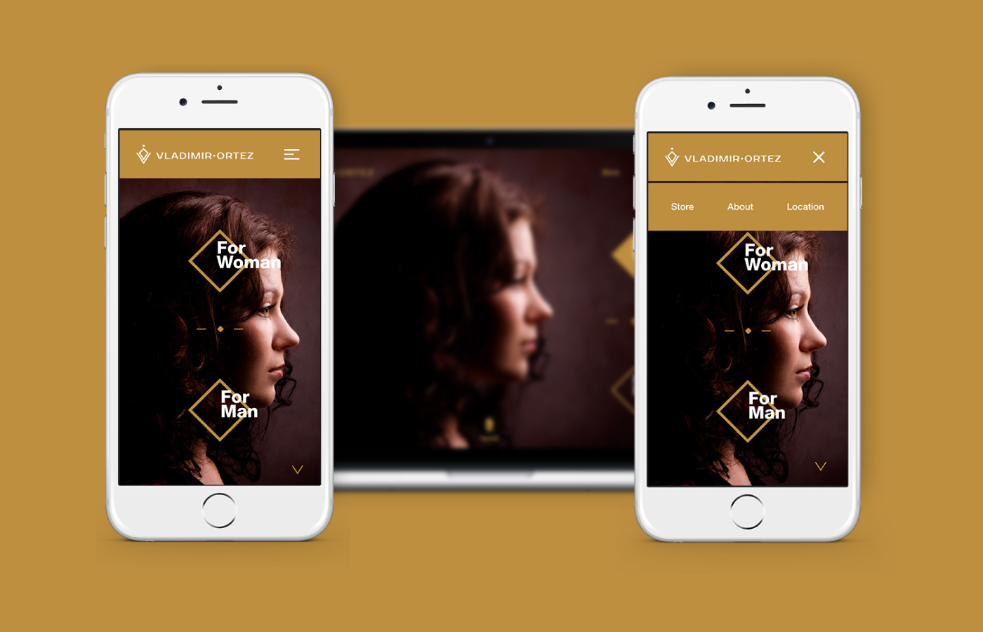
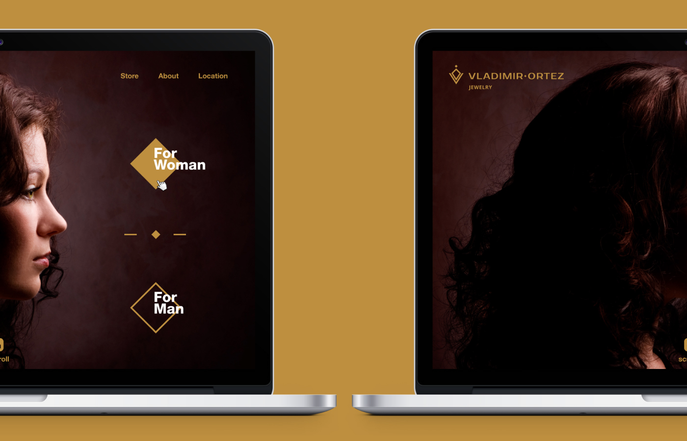
Click here to see the full branding project of Vladimir Ortez, Jewelry Store.
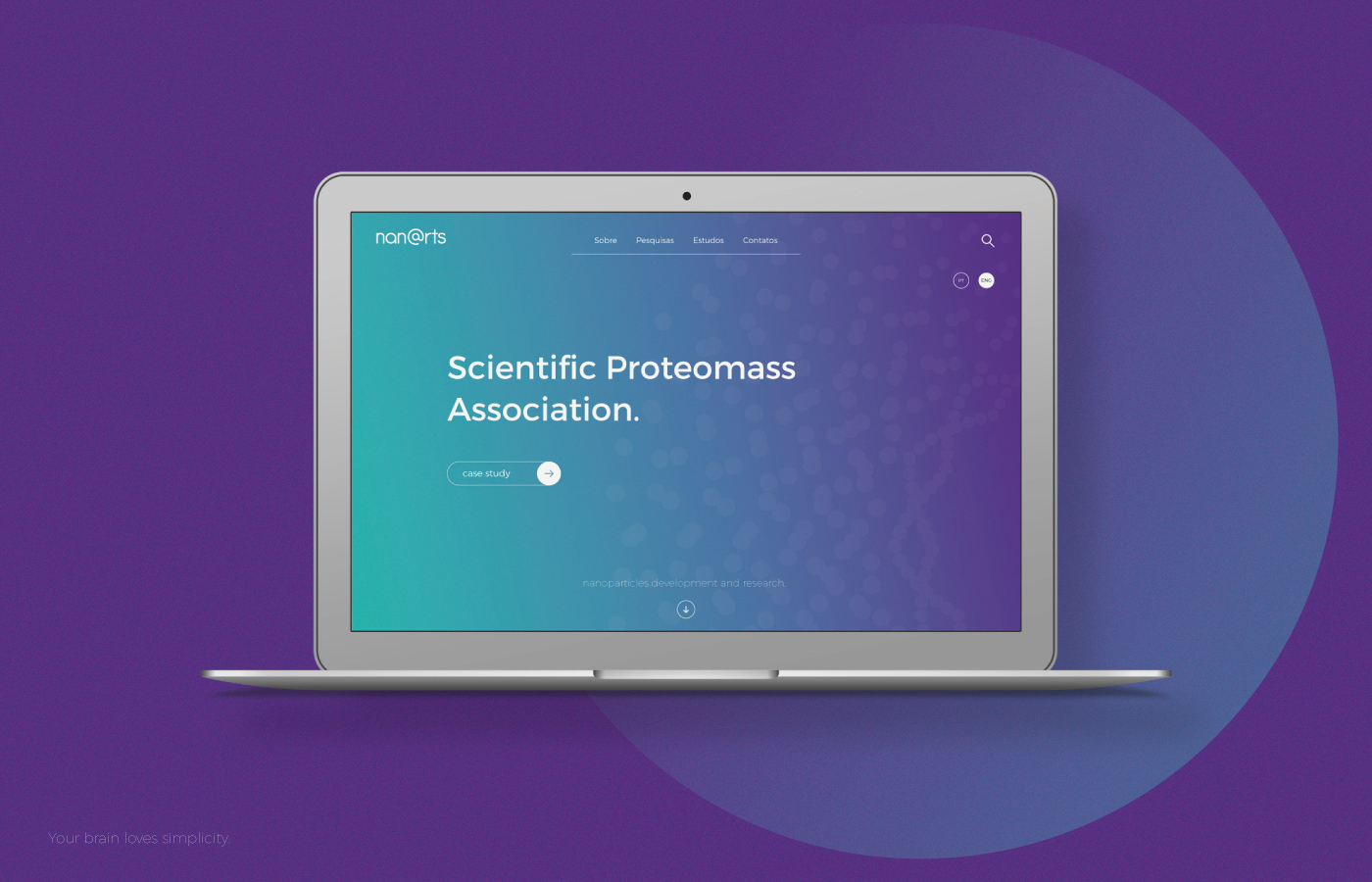
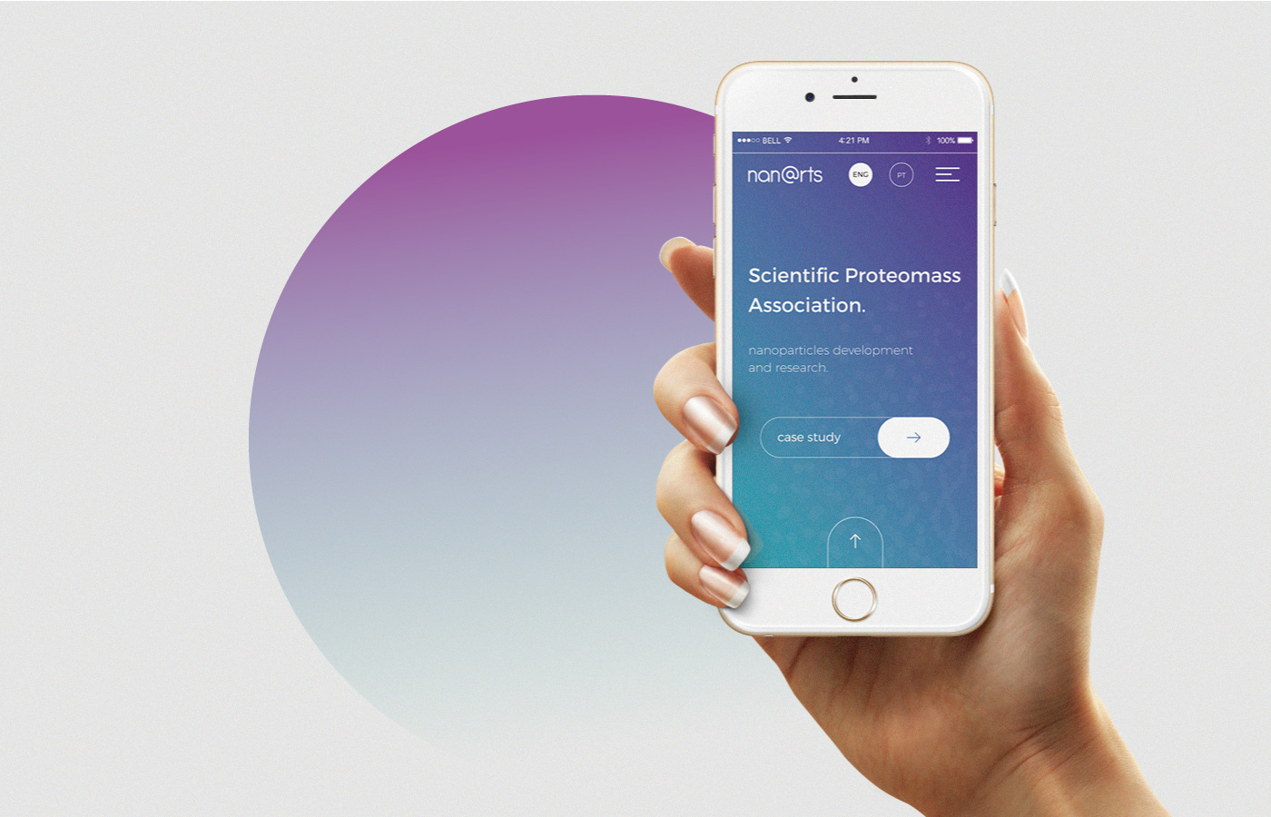
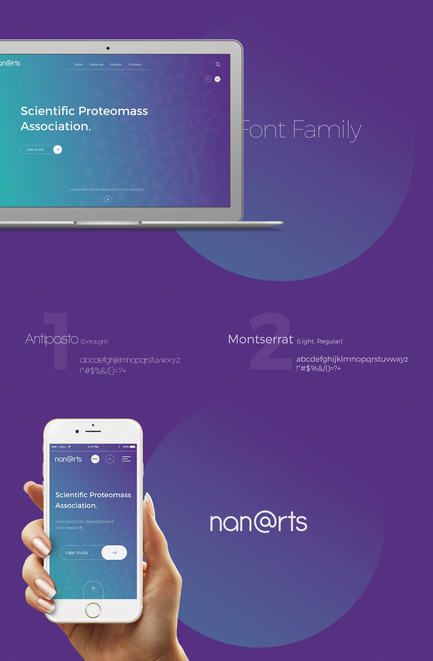
Click here to see the full branding project of nan@rts
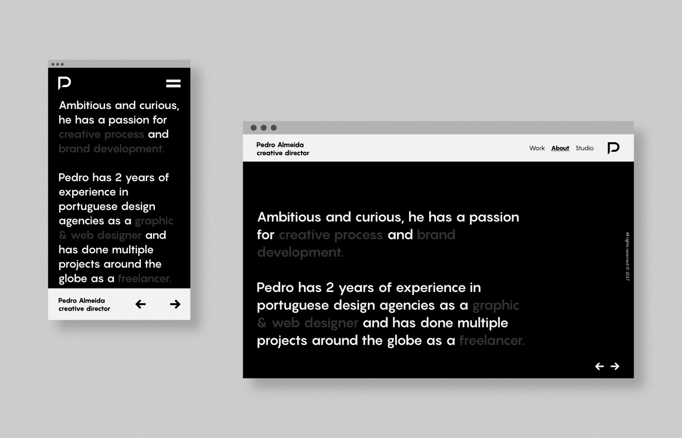
As mobile phones have gotten taller and wider, the menu is "fixed" in the bottom so you can use only one hand and also it's easier to reach the menu and other buttons with your fingers.
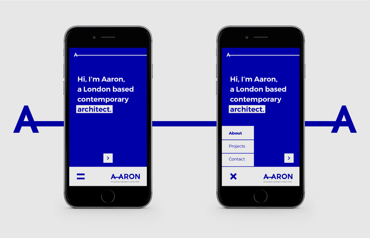
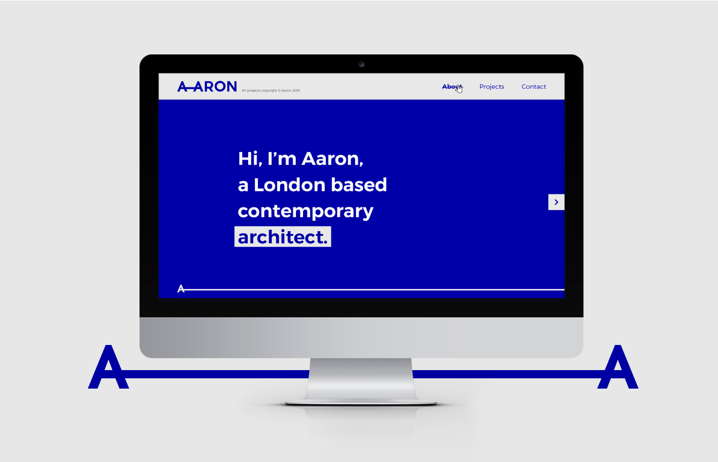
Click here to see the full branding of AARON.
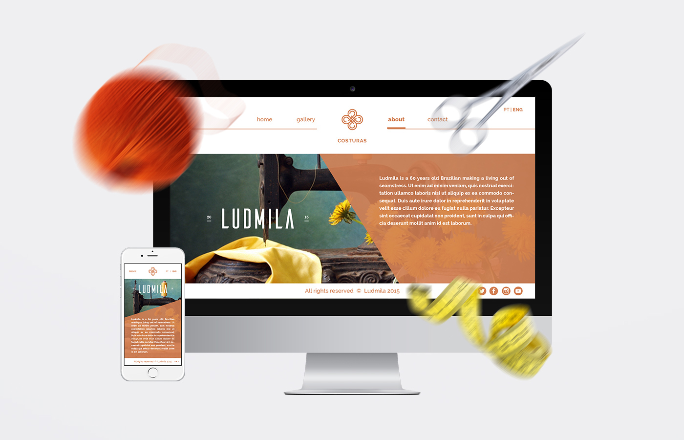
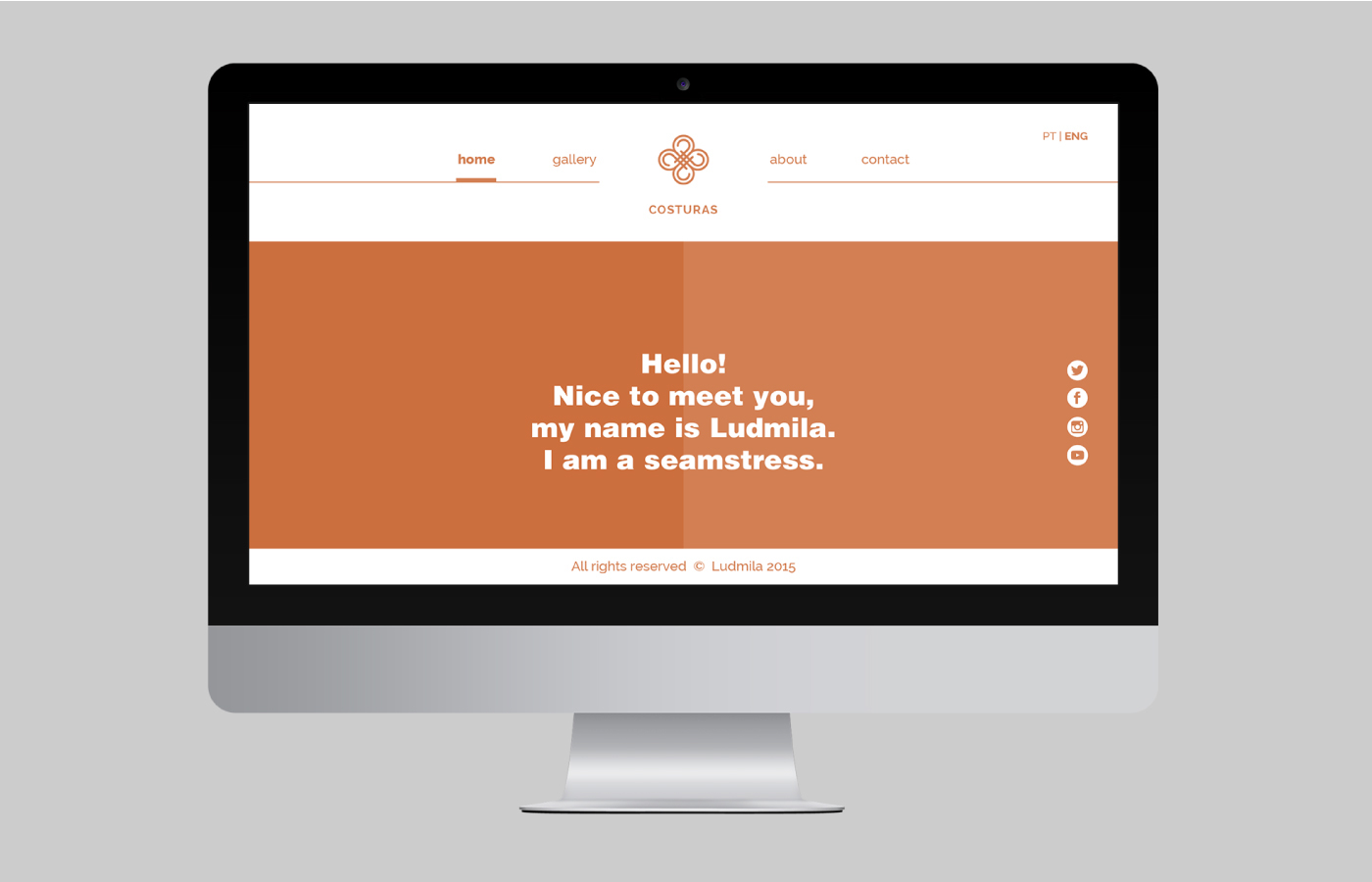
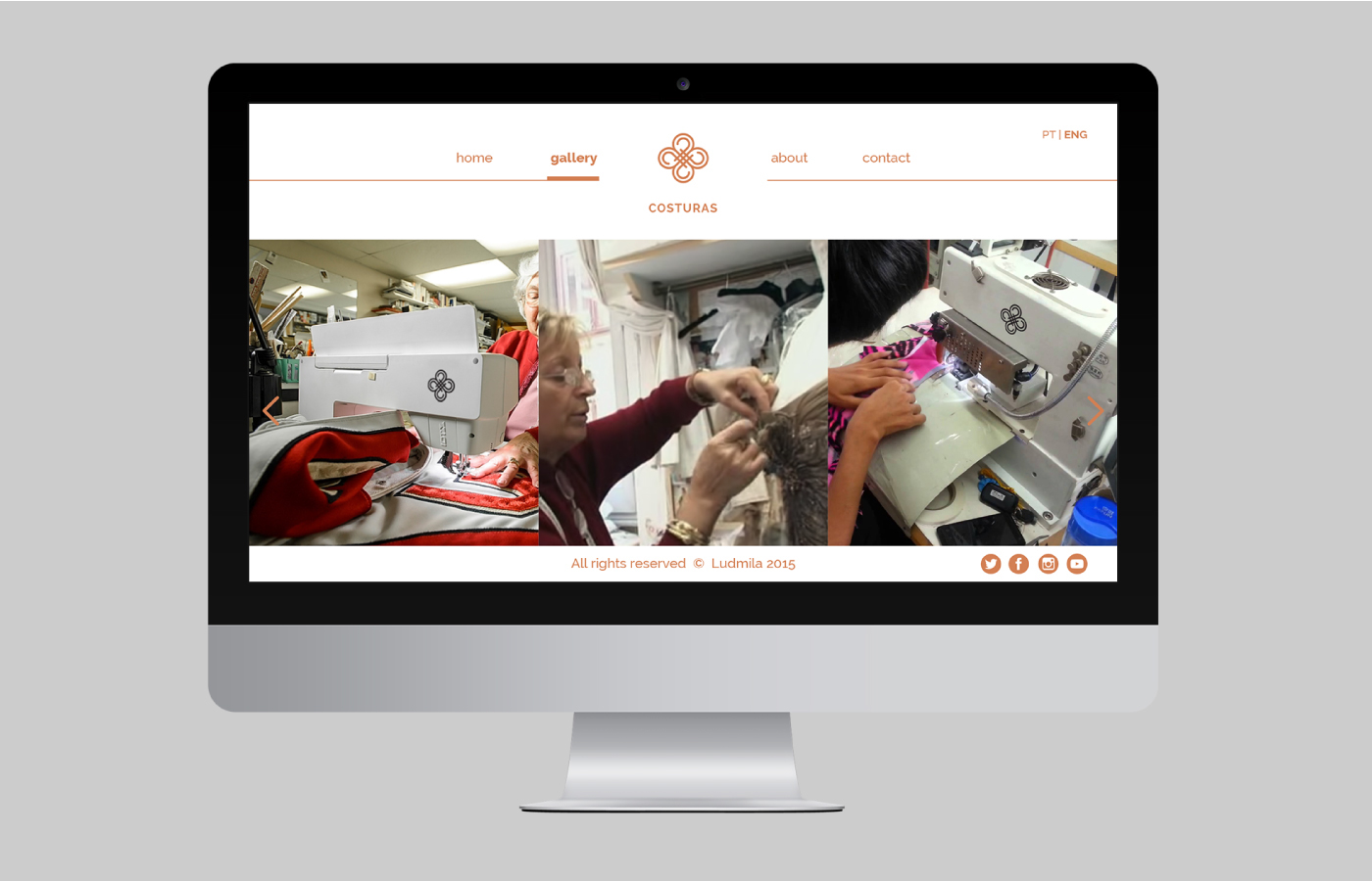
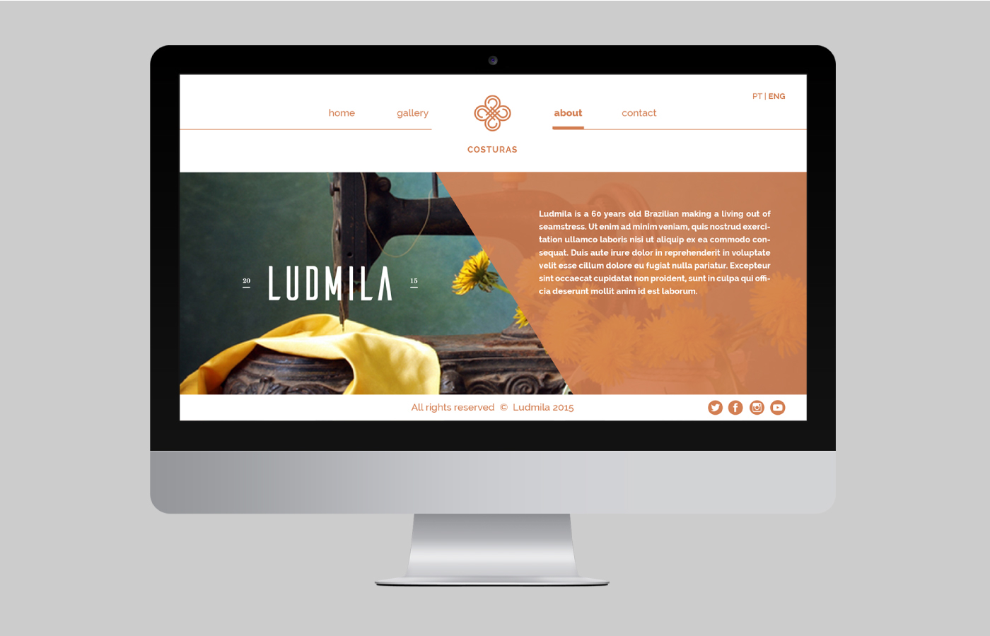
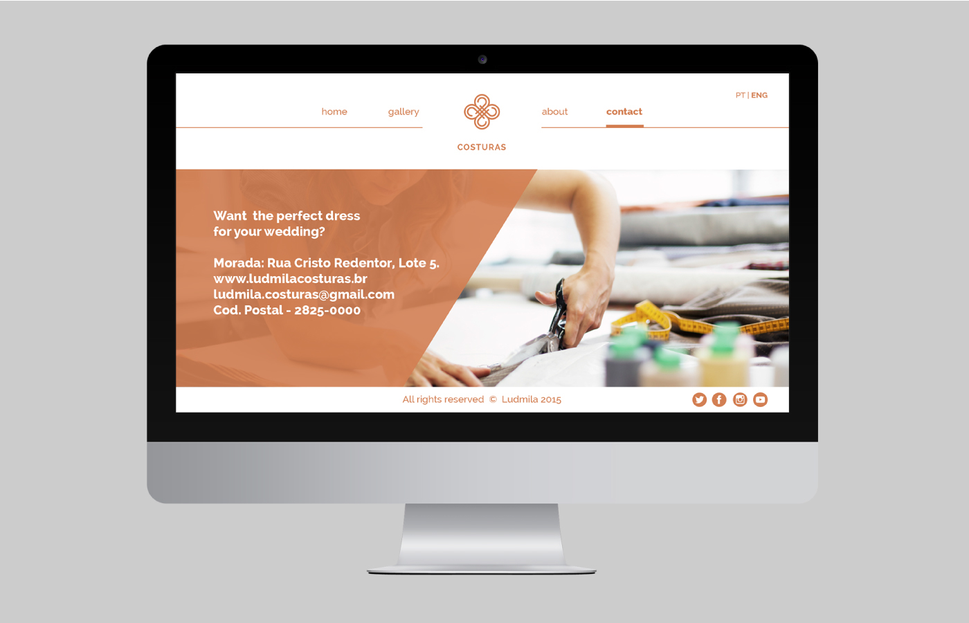
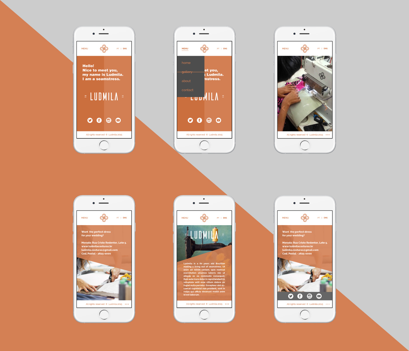
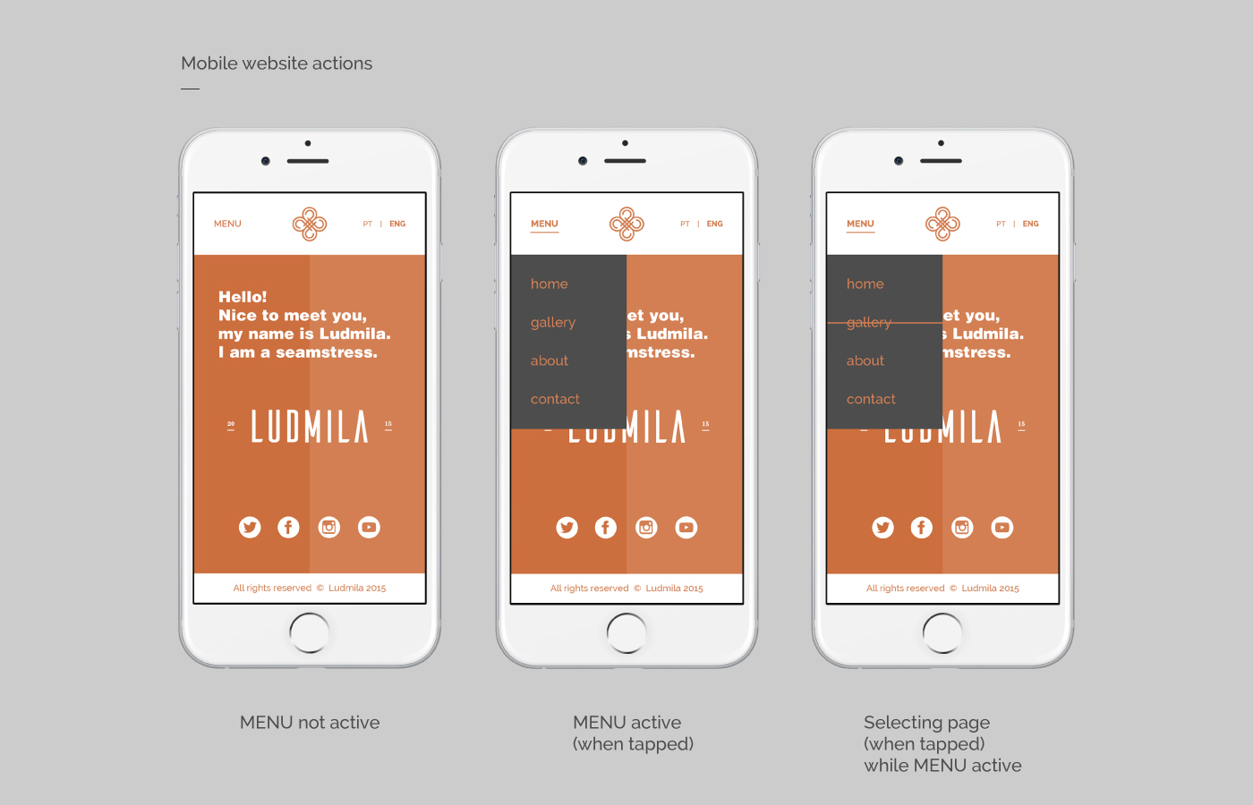
Click here to see the full branding project of Ludmila Seamstress
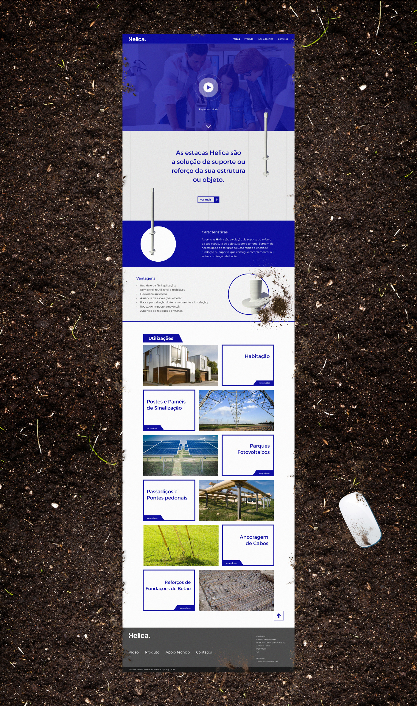
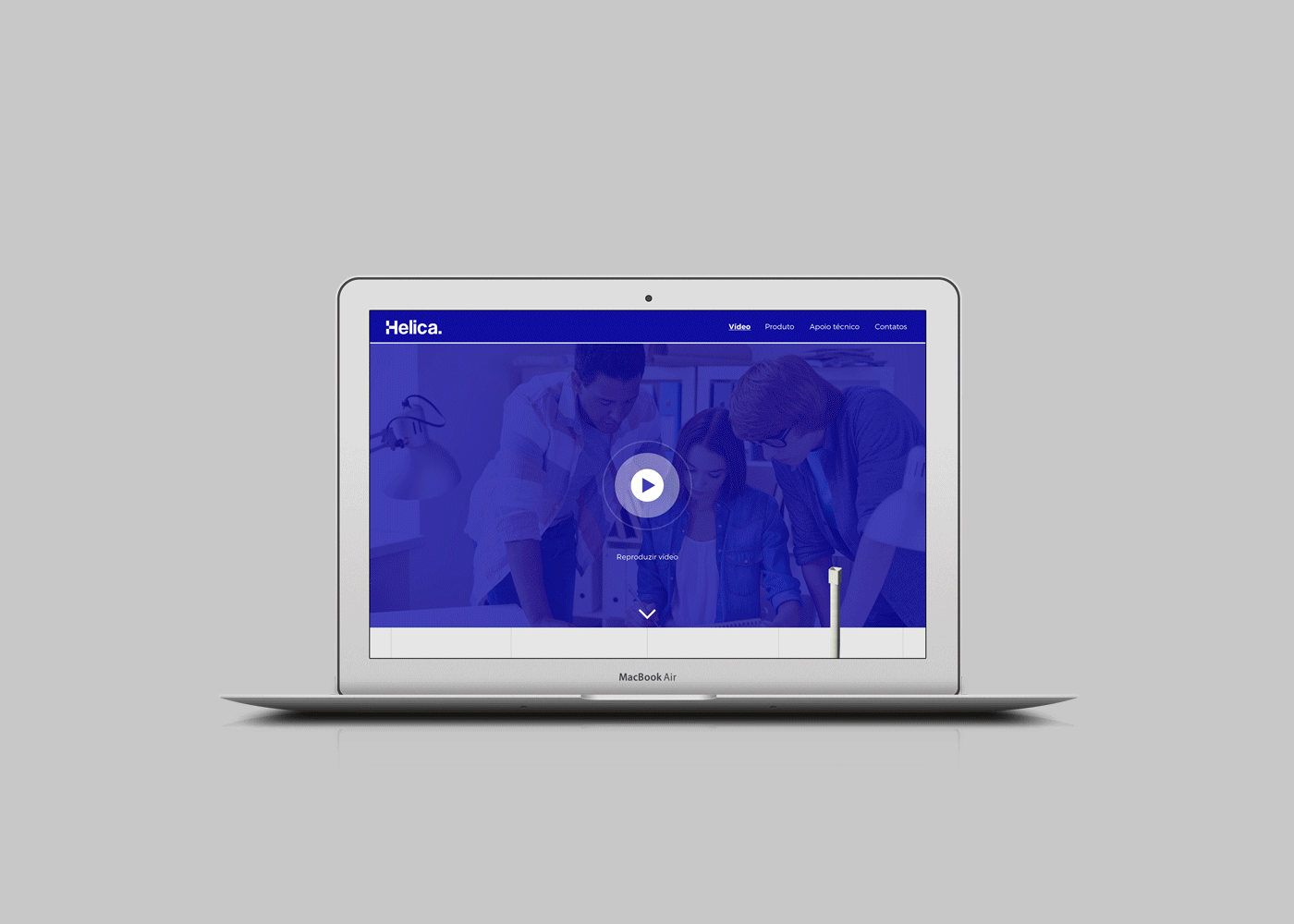
Click here to see the full brand development of Helica.
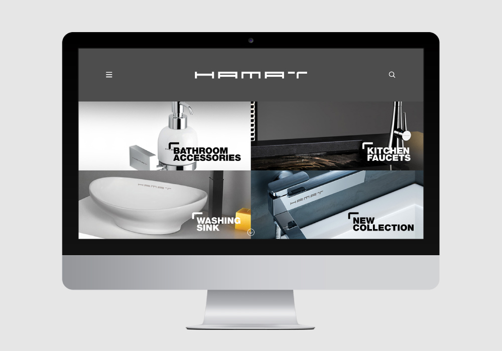
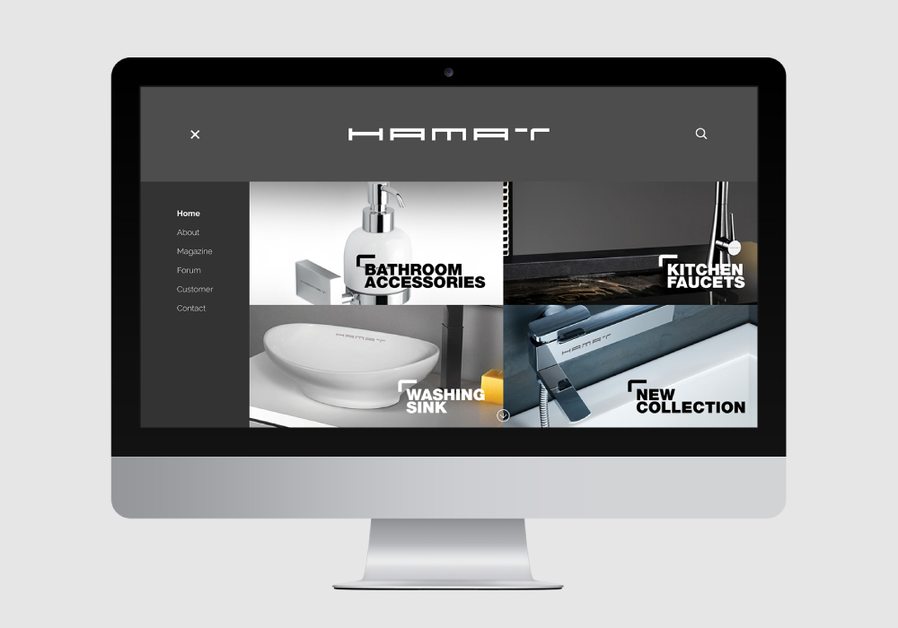
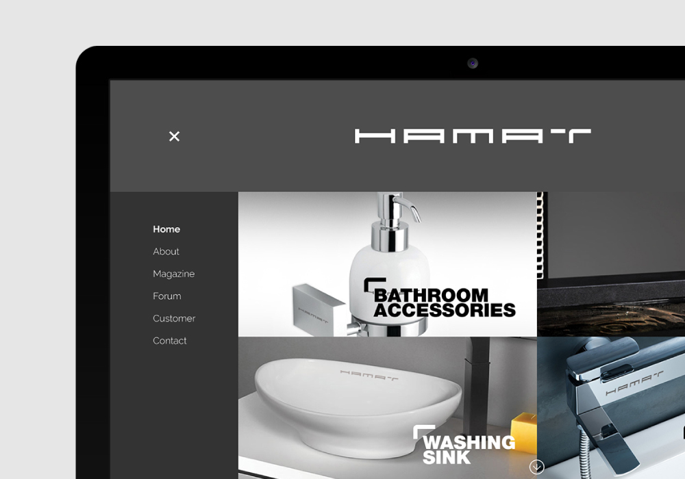

Click here to see the full brand concept of Hamat Accessories.
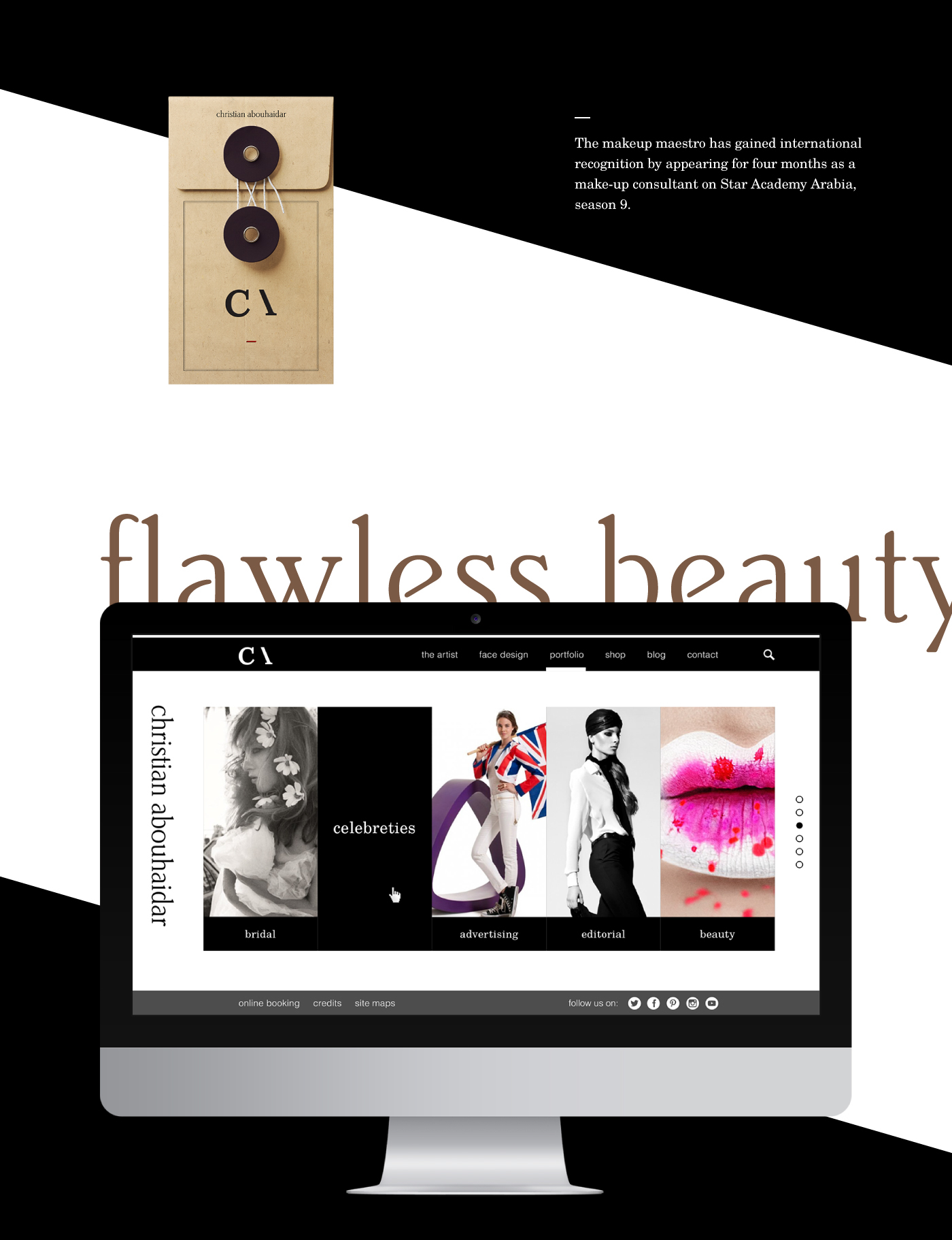
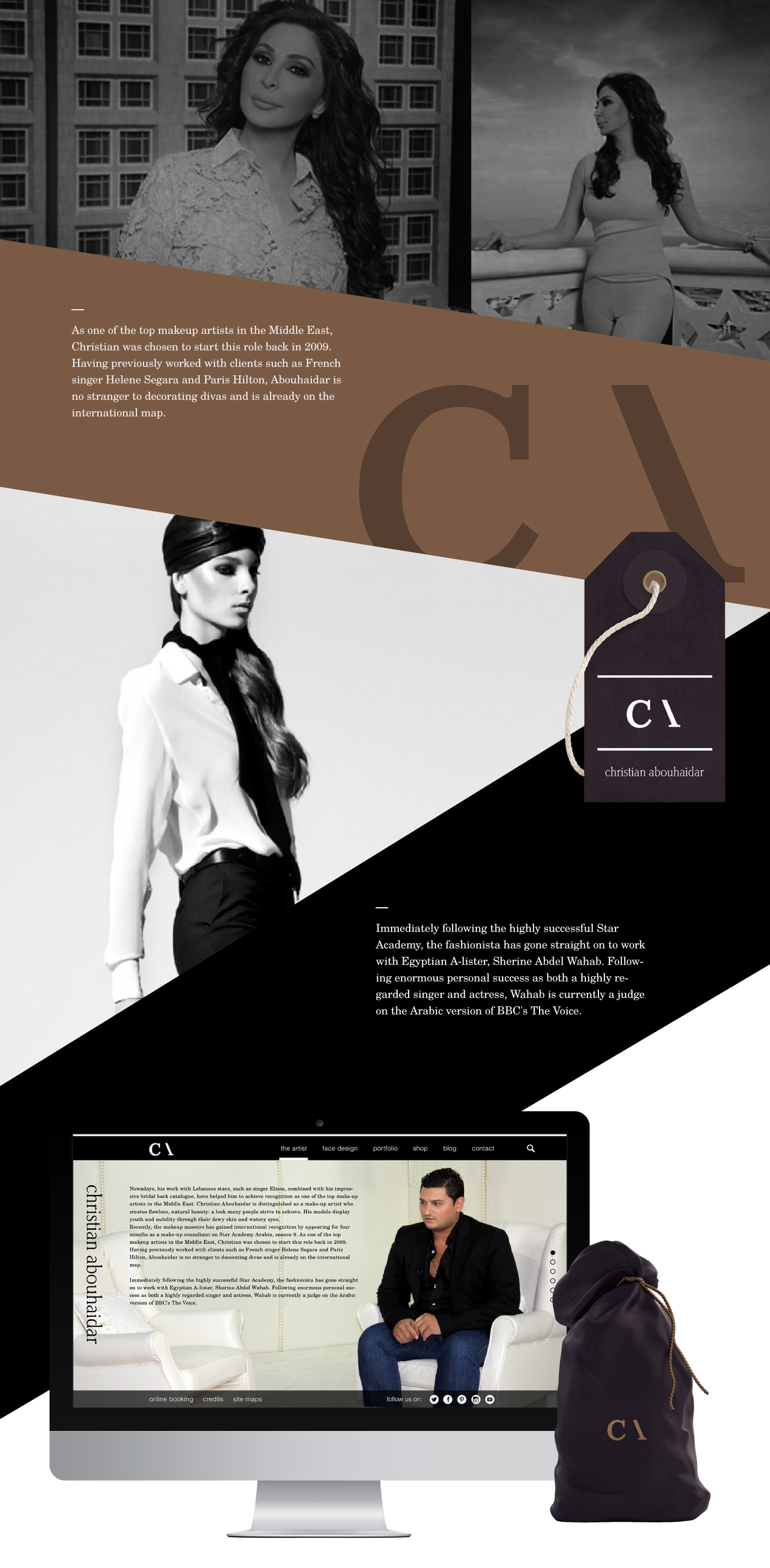
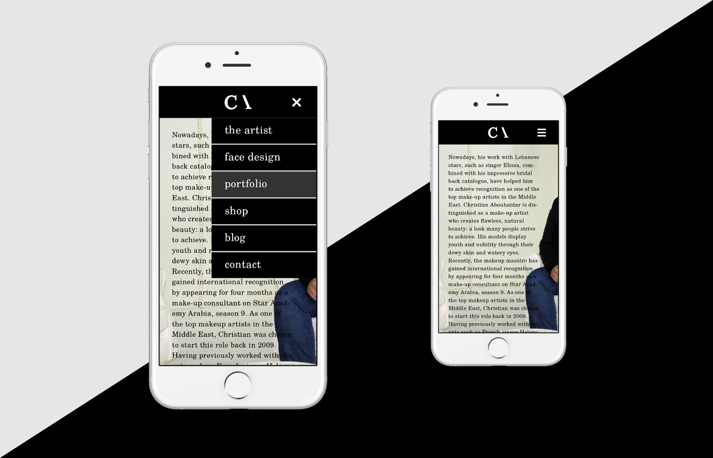
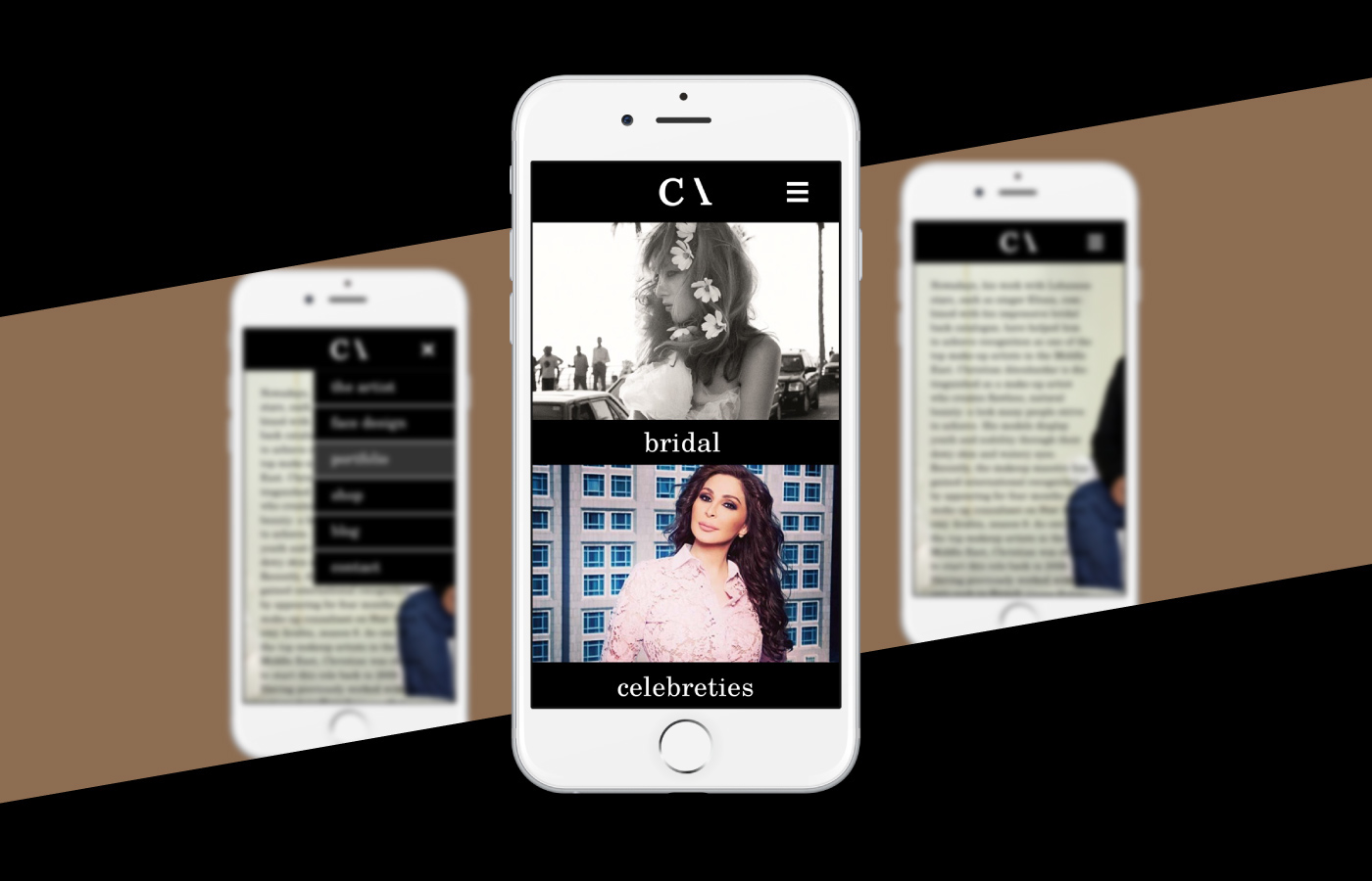
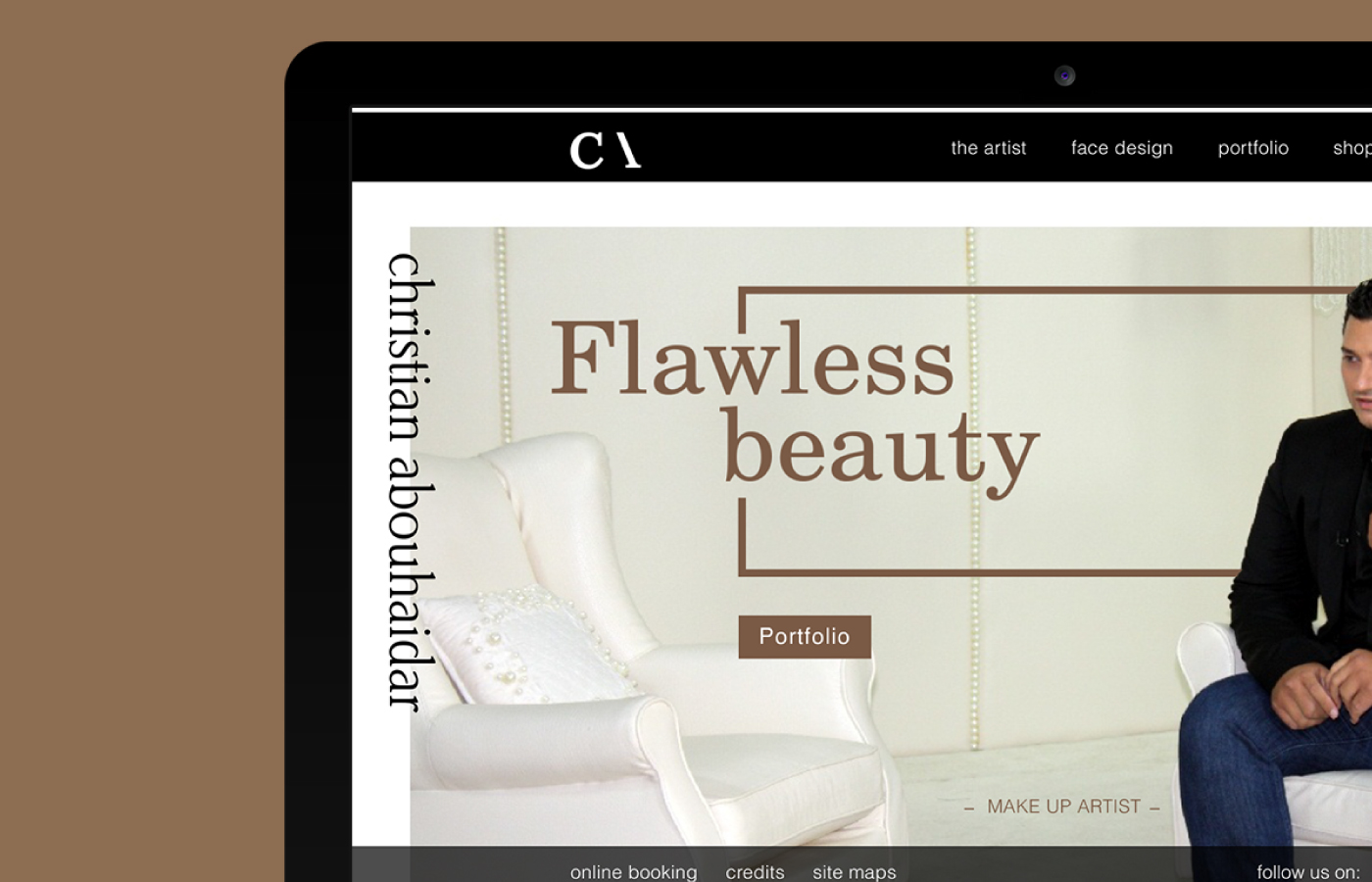

Click here to see the full branding project of Christian Abouhaidar, International Make up Artist.

I replaced the "hamburguer" menu with one of the brand graphic elements, also an universal symbol. The plus symbol " + " which means more (obviously). And when the menu is active, the plus symbol turns into the minus " - " symbol, representing the meaning of less. You know, if you want to see more, press the plus icon, if you want to see less, press the minus icon, is as simple as that.
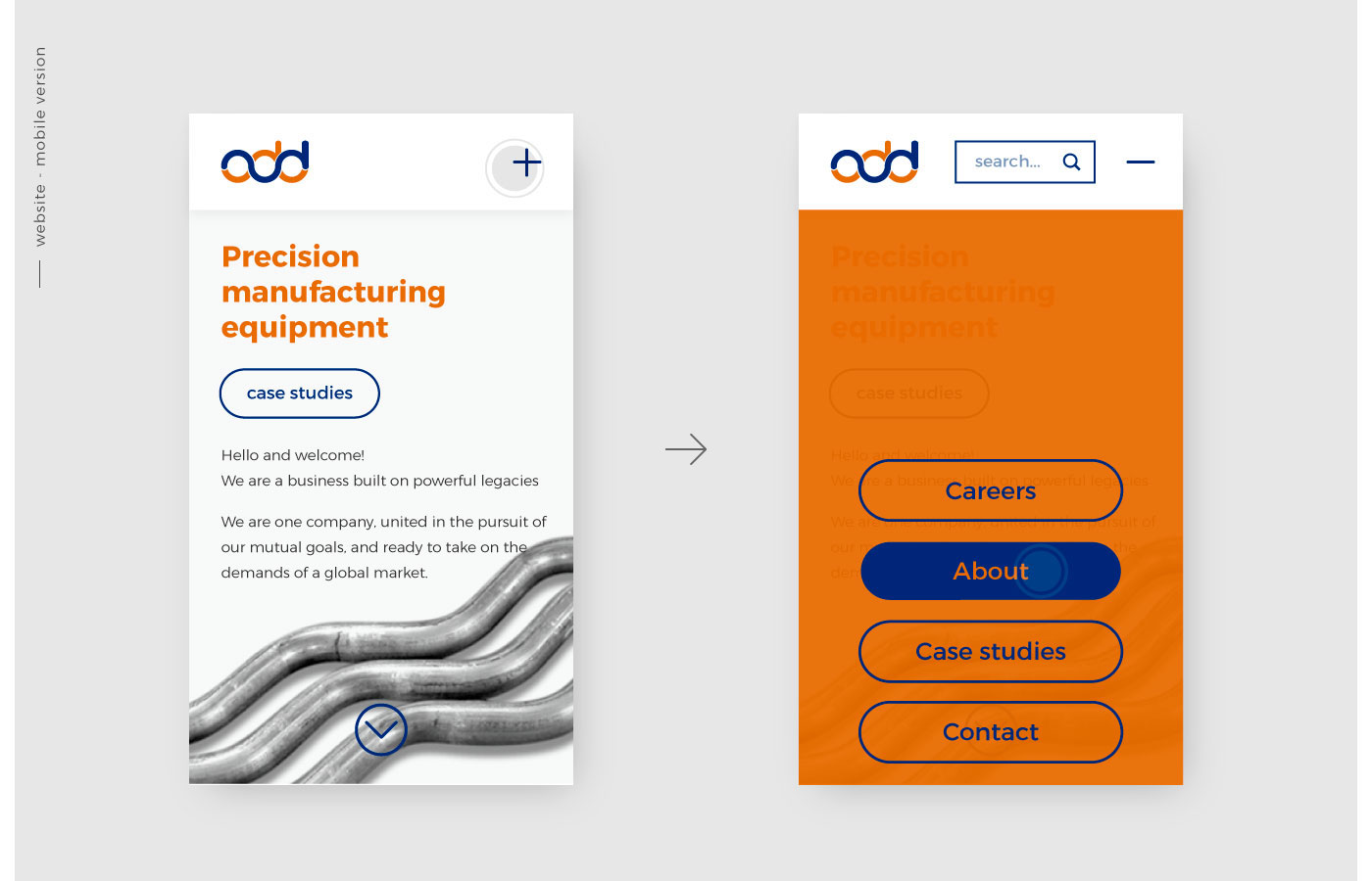

Click here to see the full branding project of ADDITION.