
Kelmscott K
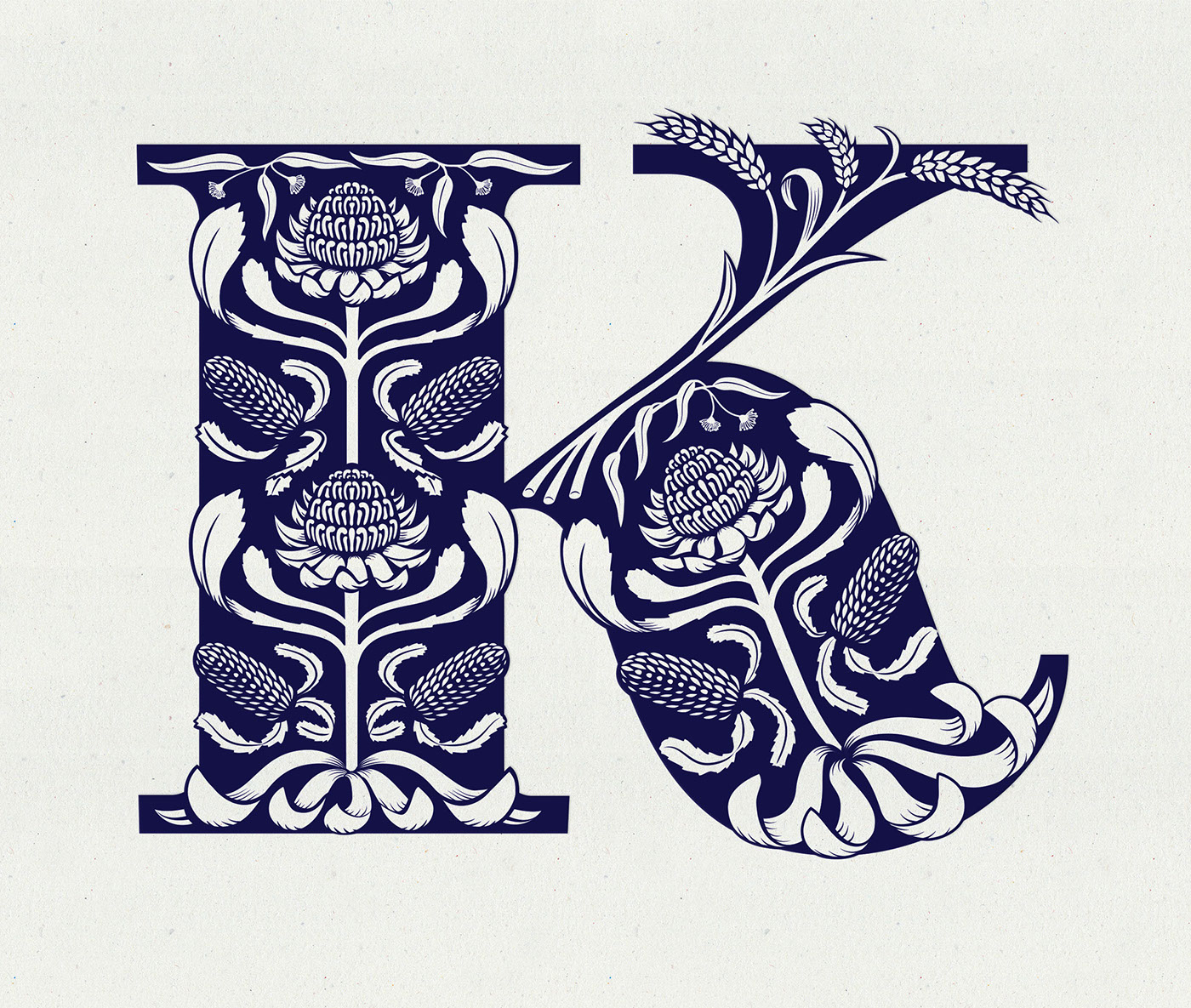
I was commissioned by design studio, Bit League, to produce an ornamental monogram for Kelmscott Bakehouse. The artisan bread and cake bakers practice traditional methods and use only locally sourced and sustainable ingredients. Their name is a reference to the renowned Kelmscott Press, founded by William Morris in 1891.
The letter was to be influenced by Morris’ decorative Arts and Crafts work and feature native Australian plants and wheat to symbolise the bakery's location and profession.
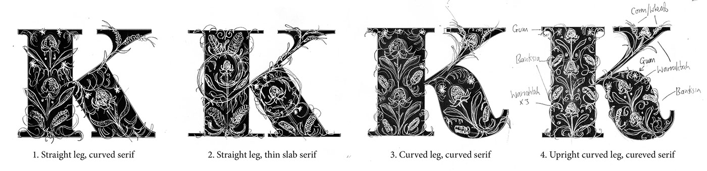
Early stage sketches exploring the various letterforms
The client chose waratahs, gum and banksia plants which I constructed into a pattern harmonious with the letterform. Waratahs are very large, distinctive flowers that grow on straight, thick stems and so these became the central spine of the K. These dominant flower heads draw the eye and form a central repeating structure, enabling the viewer to quickly comprehend the overall design, a technique that Morris employed in his own patterns. The wheat is slightly thinner than the rest of the illustration to darken and strengthen and top arm of the letter.

Sketches to show how the pattern would work within the chosen letterform

Bag mock-up by design studio Bit League
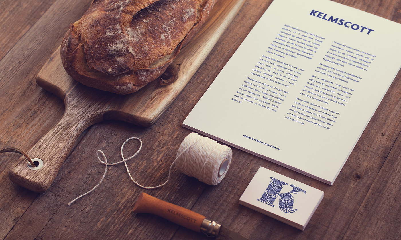
Mock-up showing the K at a smaller size by design studio, Bit League


