Here's the evolution of the AppMill logo, from what I previously thought was the final logo, to what I now hope is the final - I was just iterating on an idea, and lo and behold, it kind of popped into existence. This is a first for me, as I'm not a designer. It felt really great to make a breakthrough, and to validate that it's true what "they" tell you: practice, using good design principles, and pretty soon you'll have something.
I wasn't meticulous or religious in following all the rules, but the iteration thing - that really did work!
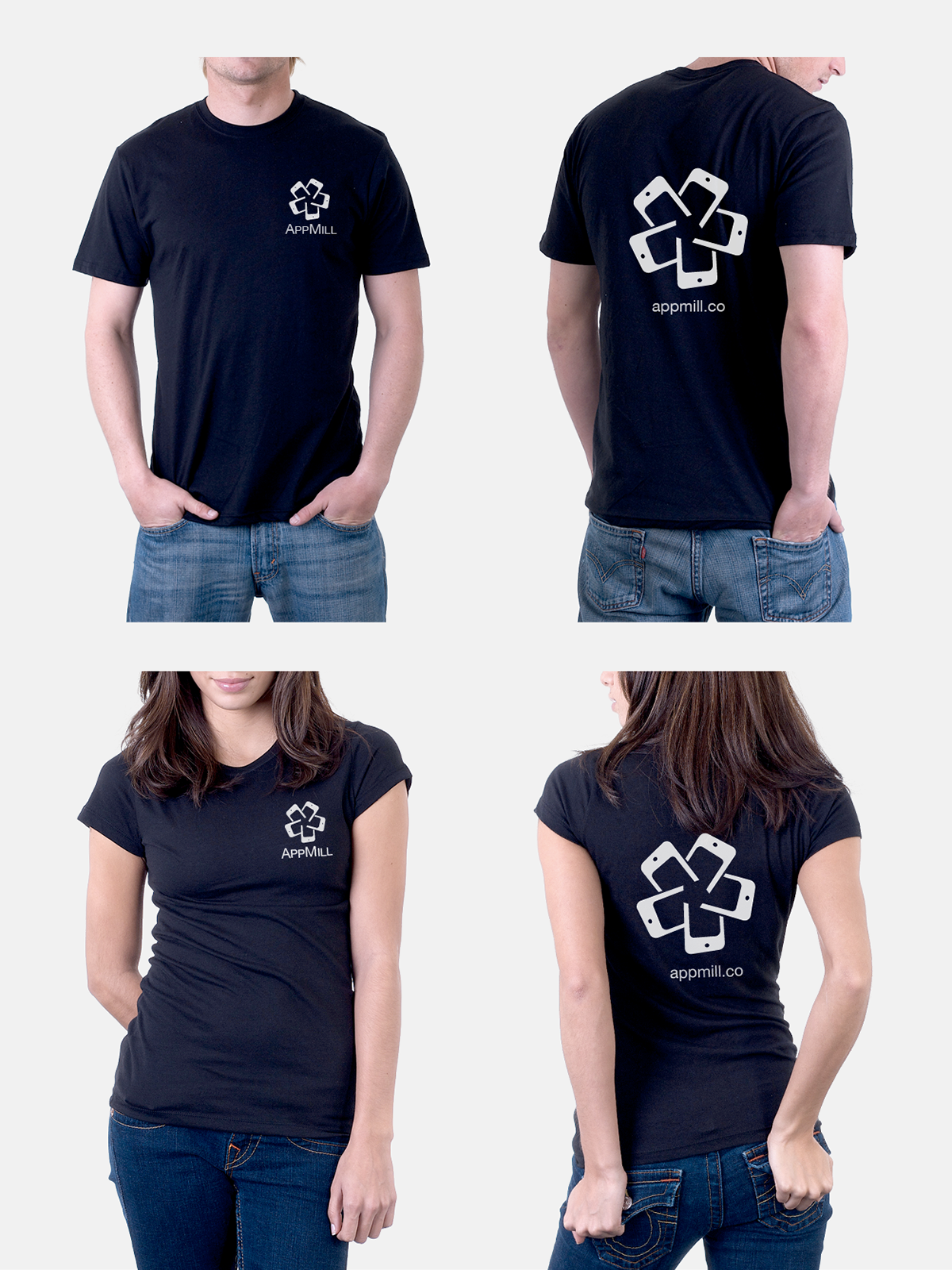
I hope you like it, and if you could let me know which of the final 4 you like?
Thanks!
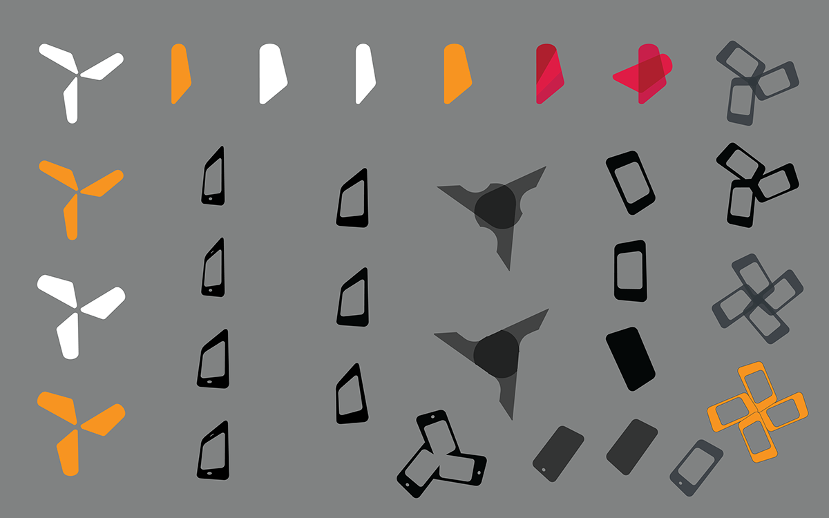
Parts and ideas - Shout out to the PhoneGap Logo, which inspired me to try the device as a perspective.
Really liked the solid quazi see-thru effect. I hadn't yet considered having the middle overlapping portions create whitespace

iterating with skew - I thought the speaker at the top would be cool, but it distracted.

seeing what happens when you make them longer...great for being a windmill, not so great for being a mobile device!
Getting closer now! I realized that too much skew wasn't good.

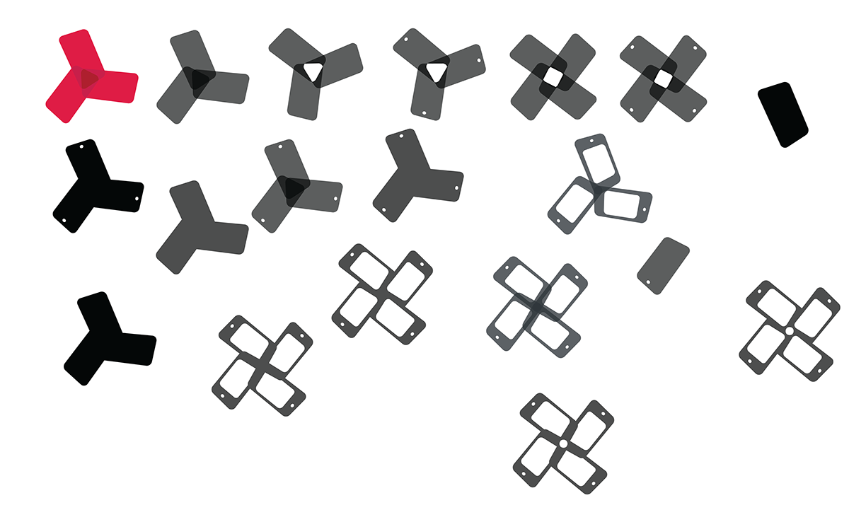
Breakthrough! I accidentally rotated from "too far" inside the axis, and when I removed all the gunk in the middle---voila! whitespace! These are iterations, finding the right combination.

refining further, and narrowing it down (also trying a center circular axis)

My wife LOVES the 5-sided one. I think it's too busy. It's worth noting that the 3-sided one all the way to the right--- that's the unaltered first experiment.
The moment I saw it, I knew I was on to something.
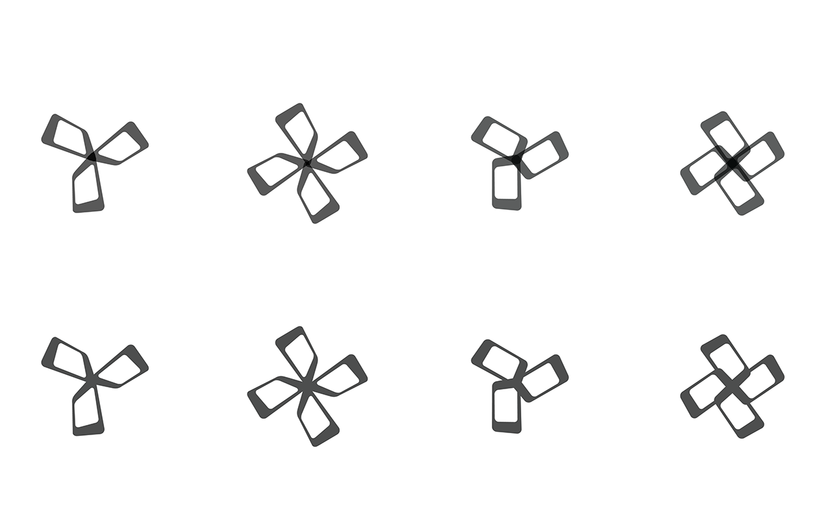
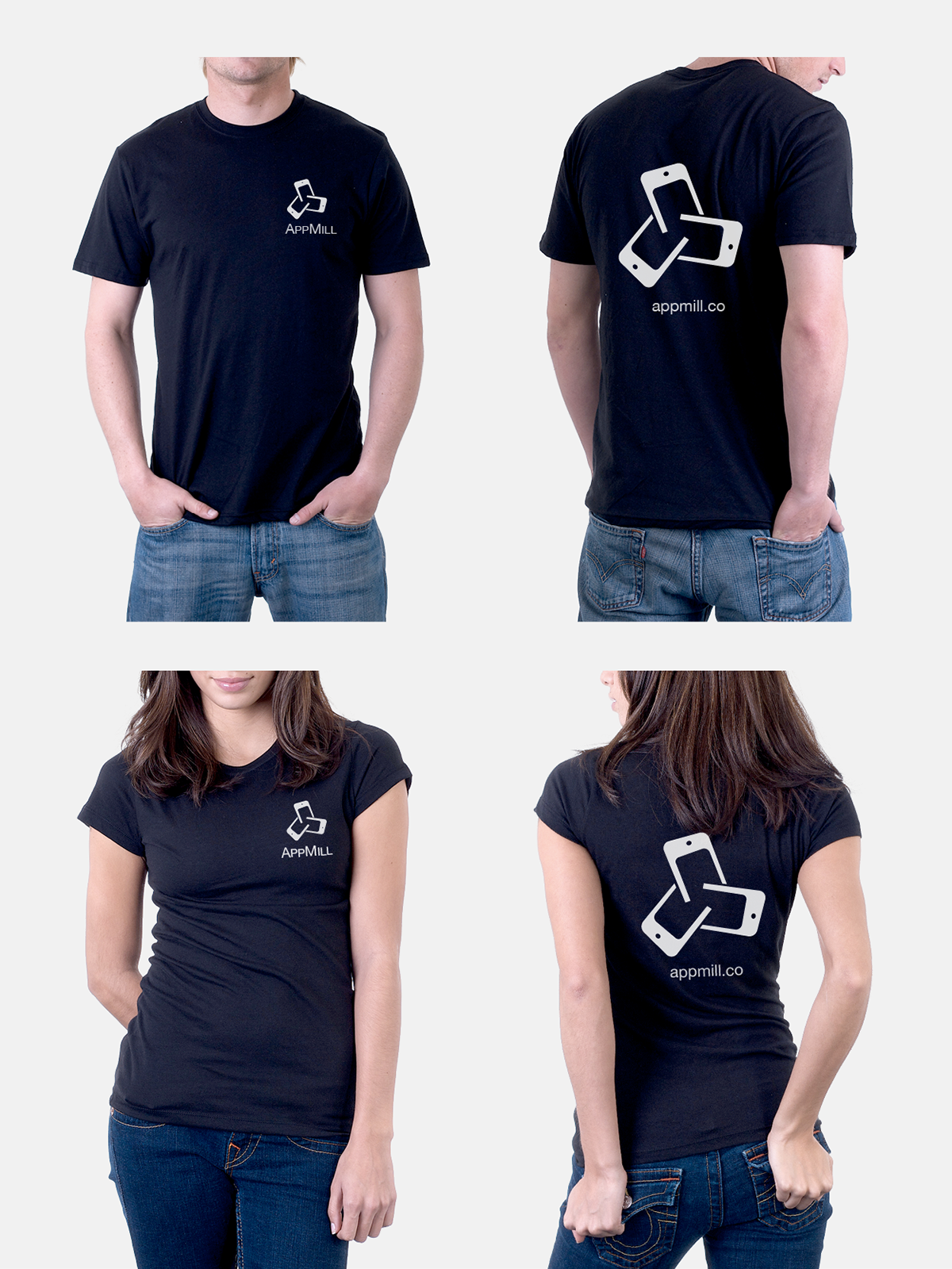
Finalist #1 - 3-sided OPEN


Finalist #2 - 3-sided

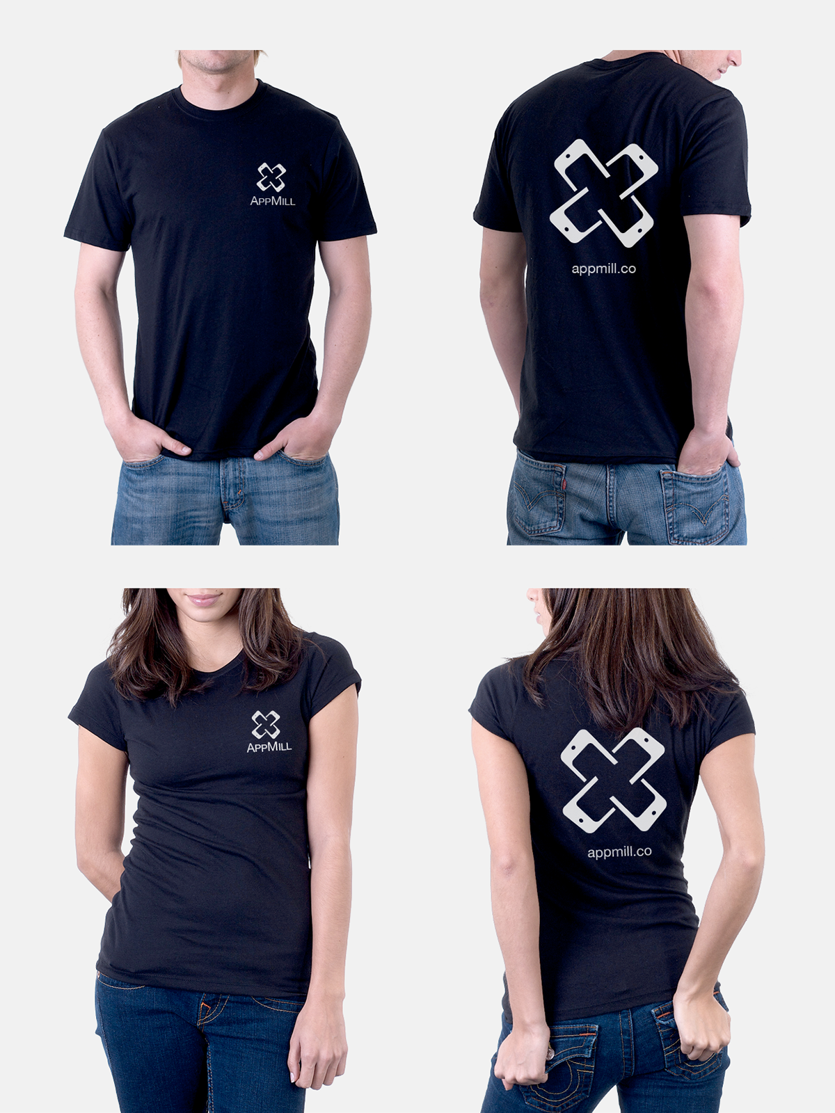
Finalist #3 - 4-sided

Finalist #4 - 5-sided