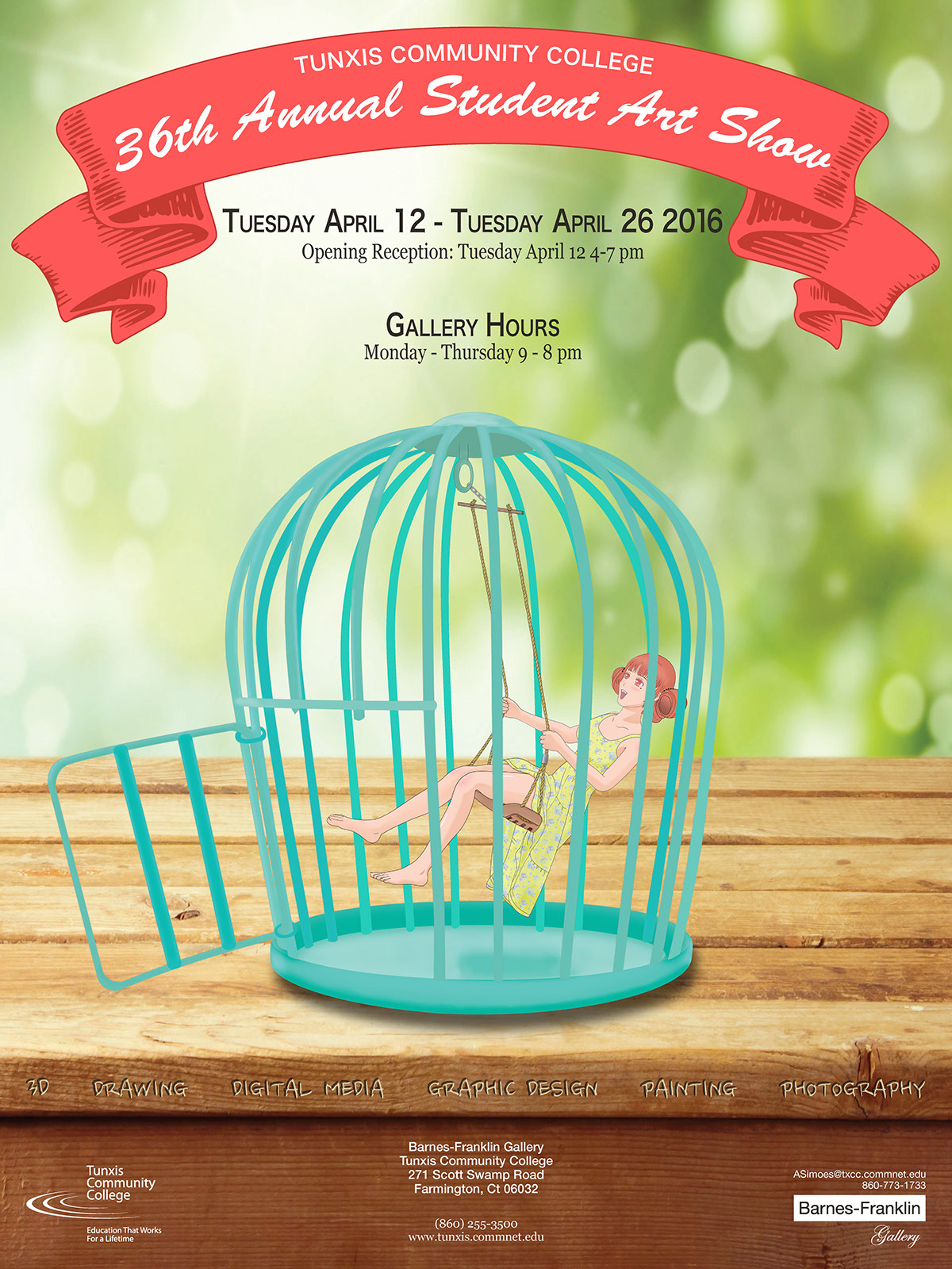
Type & Design II. Student Art Show Poster assignment. Used Manga Studio 5 ex to draw female character. Illustrator for cage and banner. Photoshop to dodge and burn cage. Indesign for the type. I really wanted to go with something artistic and different, so that is why I went with a tiny woman swinging in a birdcage.
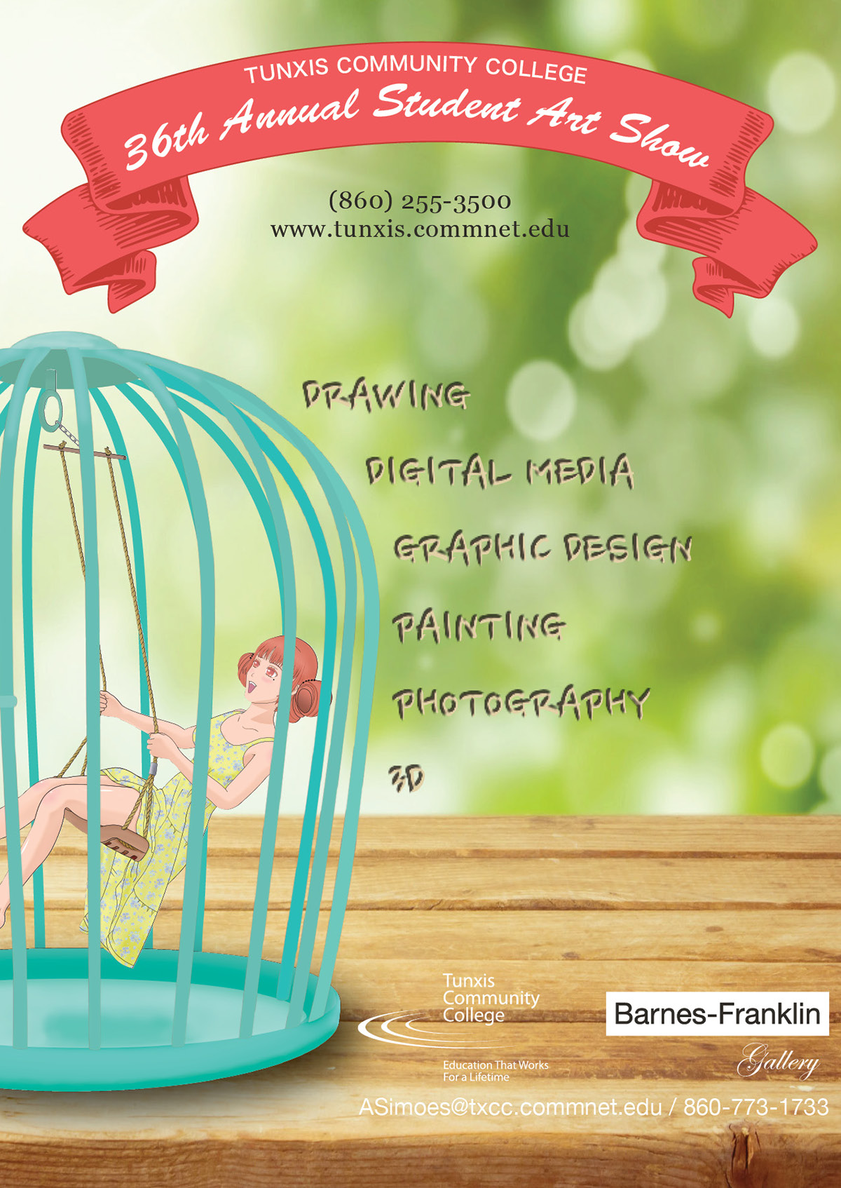
Type & Design II. Student Art Show Mailer of Poster. Front Side. I just wanted a slight different look than the poster and had the categories work its way down the side of the birdcage.
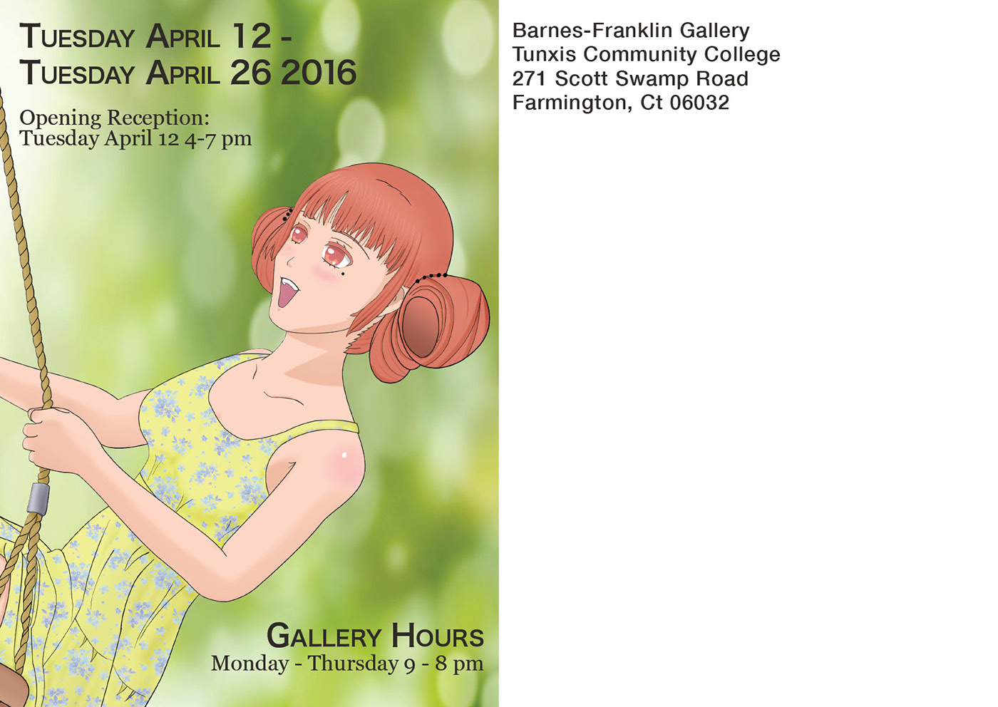
Type & Design II. Student Art Show Mailer of Poster. Back Side. Since in the poster and front side of the mailer, you couldn't really see the detail of the woman, so I enlarge a great portion of her to see. And to put the rest of the important information around her.
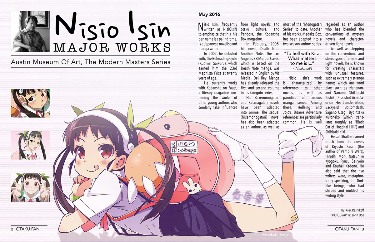
Design Production. Artist magazine article. First time making a magazine article in InDesign. My inspiration for this was seeing a Japanese anime magazine. The art in those are pretty much the most important part, so I did the same and had it large to fill the whole spread. Since the artist is a manga artist I went with a pen font for artist name and a typewriter font for the sub head, Major Works. The body text I wanted it to work around the art.

Design Production. Made in Indesign. Trade Up Phone Service Ad assignment in different sizes. The other two that follow are based off this one. To make the headline noticeable I went with a large sans serif font and made the word "up" fit within the word "trade". Then divided it up with the subhead with a rule and went with a light all caps font for the subhead.

Design Production. Trade Up Phone Service Ad assignment in different sizes.

Design Production. Trade Up Phone Service Ad assignment in different sizes.

Type and Design II. Recipe Magazine Article. The headline was made in Illustrator with Photoshop effects within the program. Portrait was done in Photoshop. All type and layout made in Indesign.
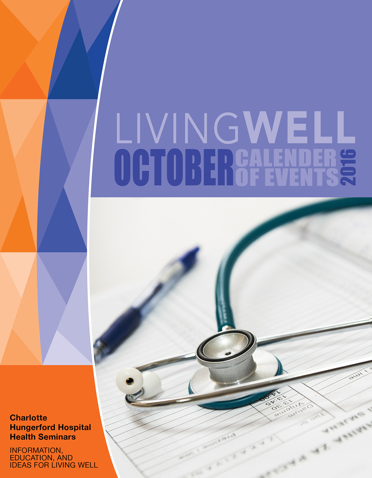
Design & Production Class. 8 page brochure. Living Well. Assignment dealing with an Health Seminar Event. Instead of making it look more geared towards a Fall/October look. I went with a corporate look. I used Illustrator for the polygon images, Photoshop for Duotone images and making them into tiff files. InDesign for the layout and typography. The eight page is blank, so it is not shown.


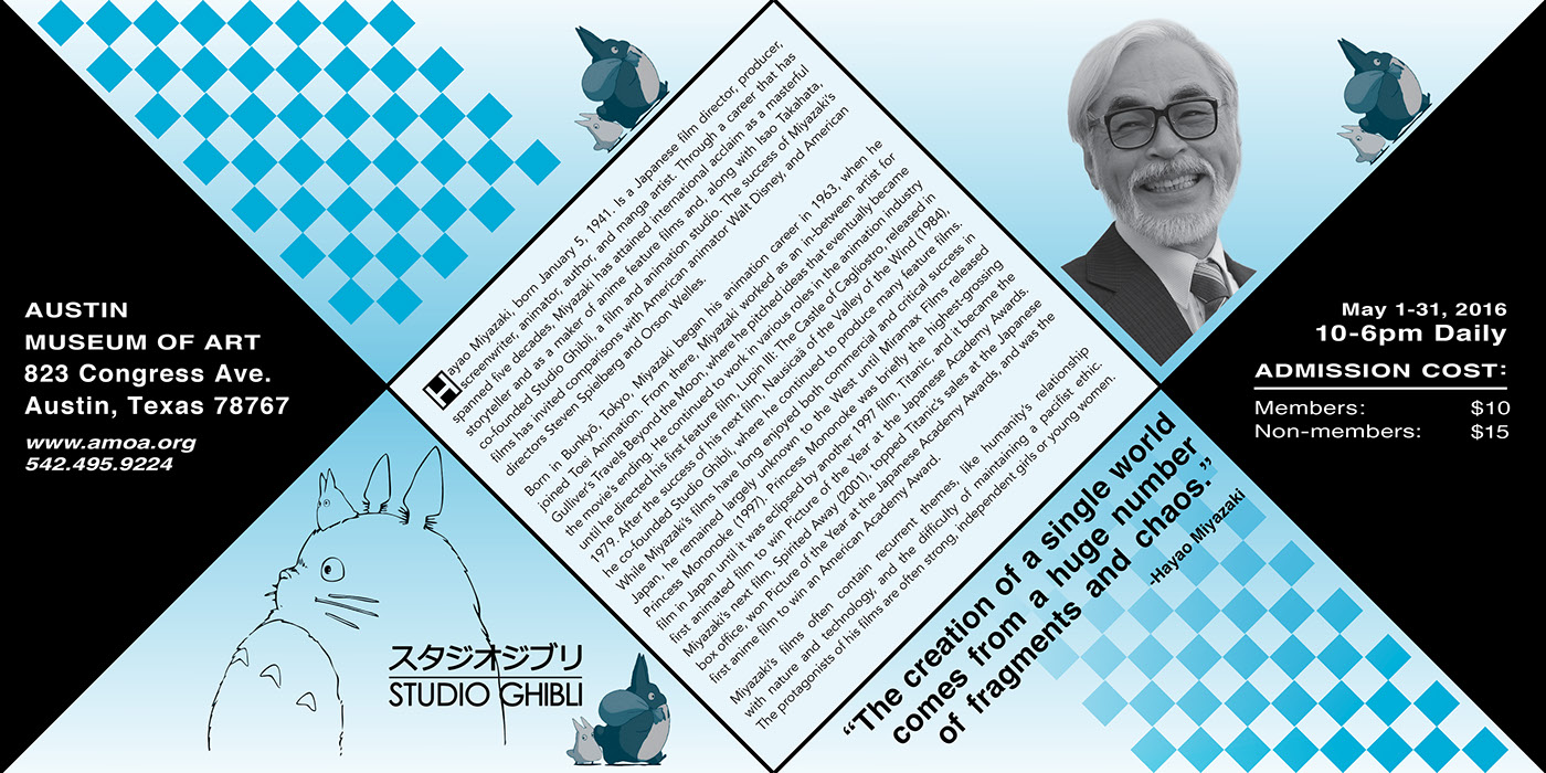
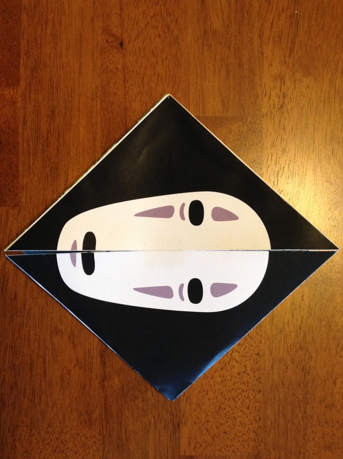
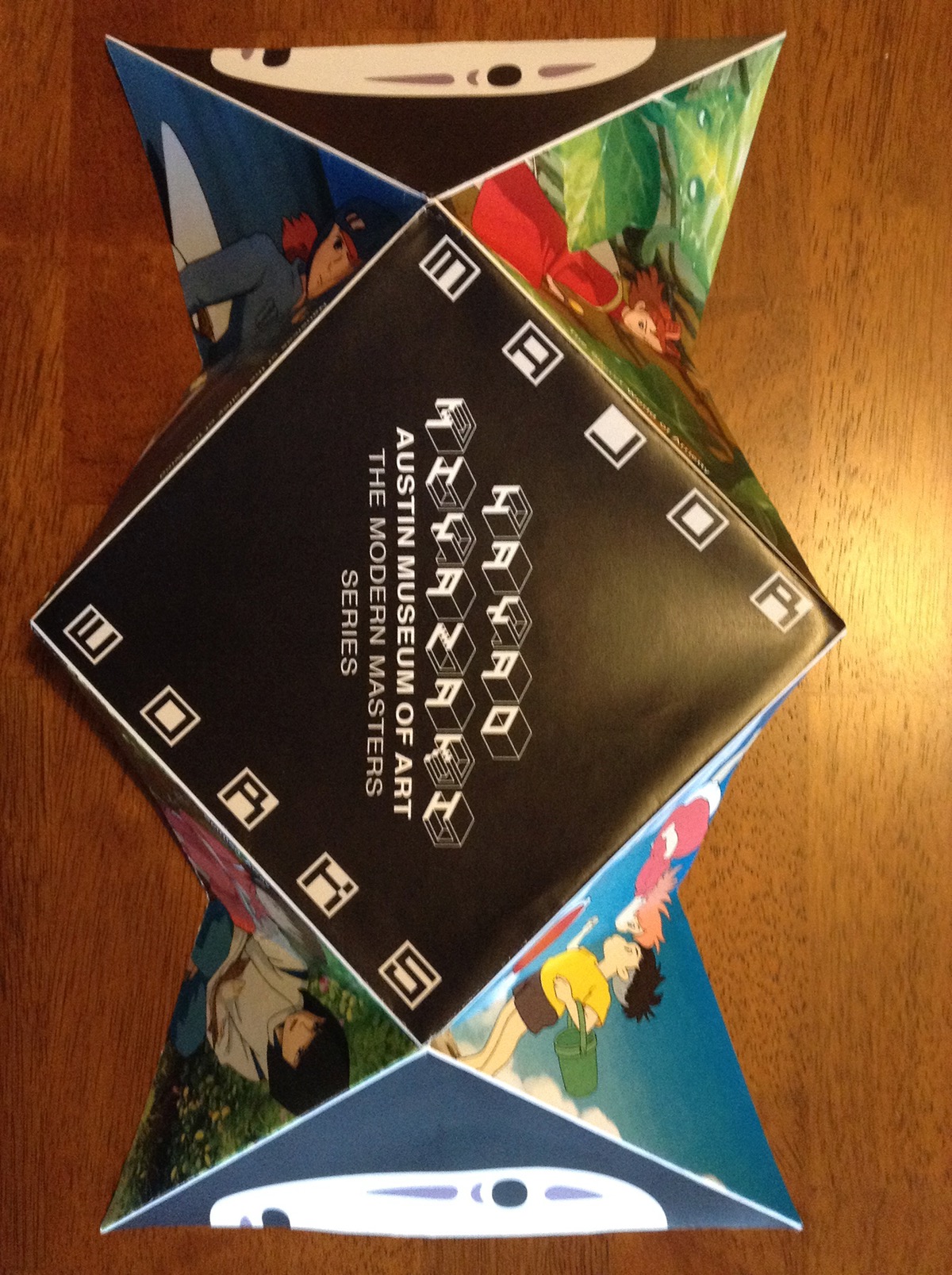
A brochure made for my Type II class. What is special about this brochure is that it is made to be folded up and every part of it is fun to look at, front and back. See rest of the images below to see the full brochure. The front is the face and the back is the artist and where the gallery is held. Plus when fully opened you can see examples of films made by artist on the back and on the front is a small biography, a quote, date, time, place and cost of admission.
