The Providence Phoenix was a weekly, local, free newspaper in Providence, Rhode Island that ran from the mid 1960's until ceasing publication in 2014. The original Phoenix was very community-based, and served as the voice for local news and events for many years. In rebranding the Providence Phoenix, I chose to focus on issues that are relevant today, yet still maintaining the communal aspects of the publication. This proposal for a revitalized Phoenix emphasizes contemporary environmental concerns, life away from the screen, and an overall cleaner, fresher design.
Printed at RISD on standard newsprint, 22" x 17" spreads
Fonts: Questra, Questra Sans
Type III, under the guidance of Jacek Mrowcyk
Fall 2015
Research
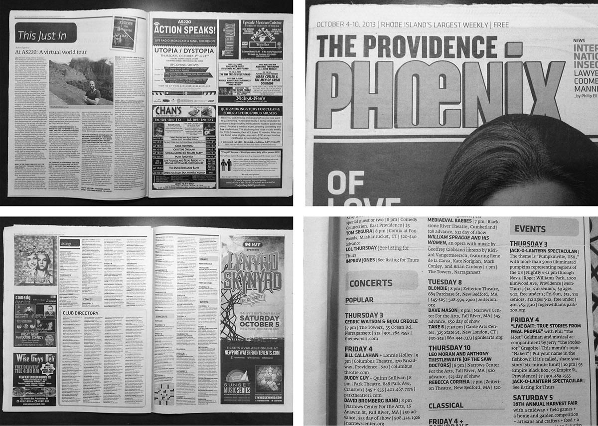
These spreads below are from editions of the Phoenix in 2013 and display a traditional newspaper layout, yet rather cluttered and difficult to read. There are aspects of "digitized" elements, such as arbitrary vectorized shapes for the headers, and drop shadows on text boxes. In re-designing the Phoenix, I chose to maintain conventional typographic elements, but I reduced the amount of unnecessary imagery, while compensating for advertisement space. It was highly important to maintain the accessibility of the Phoenix, given that it was a local newspaper and could not be too expensive.
Proposal + Implementation
With the new Phoenix, there would be a recycling program in conjunction with the Brown Market Shares Program. The Market Shares Program brings local produce to a central location where they are distributed every Thursday to shareholders. In addition to distribution through local shops, cafes, stores, etc.; each Thursday, people who brought with them the previous week's edition of the Phoenix to be recycled could receive either a piece of locally grown produce or a small seedling pot made from the past issues of the Phoenix. This would provide incentive for people to recycle, encourage healthier and more sustainable eating habits, and introduce a method of urban farming, seeing as inner-city Providence does not have much open land space for growing crops.

Design
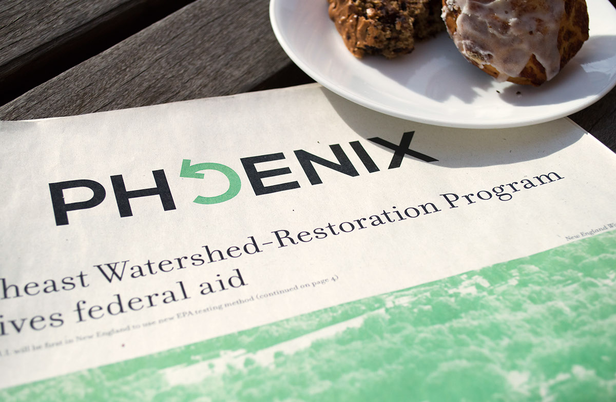
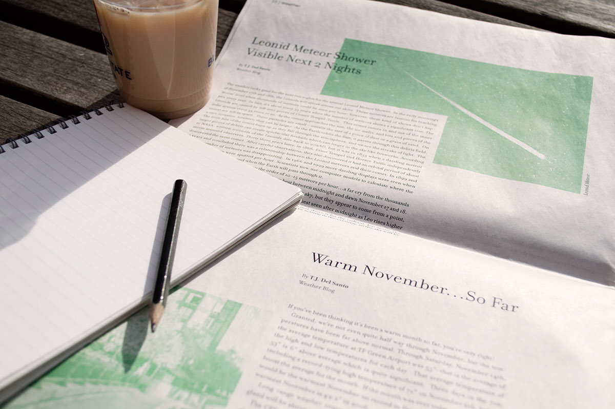
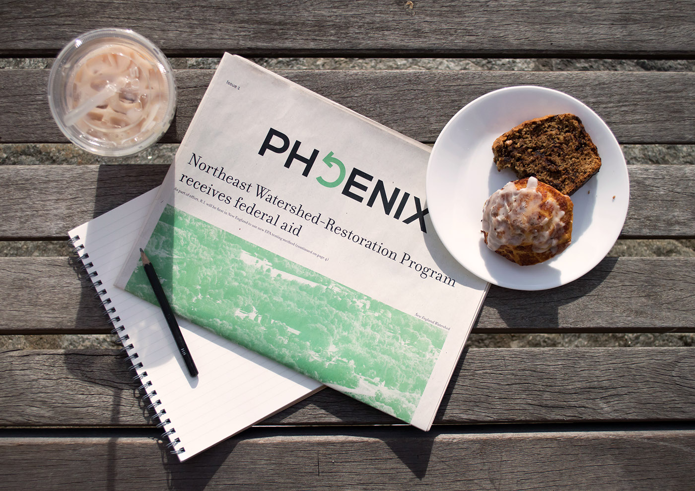
The new logo I created for the Phoenix references not only the rebirth of true mythical phoenixes, but also the concept of recycling and reducing waste that ties into the environmentally-conscious direction of the new Phoenix. In the new Phoenix, I planned to include sections of local news or articles relating to the environment, organized in a flexible 12-column grid, while printing only on newsprint, which is both biodegradeable and cheap. All of the images are in single color, to reduce costs and the amount of chemical waste. Despite many publications moving to the digital space, a physical publication is best to reach most of the residents in Providence, many of whom do not have access to a personal computer or the internet. This newspaper, after all, was founded on the ideals of bringing together the local communities, and not alienating those who are from different socio-economic classes.