This is my submission to the 2015 ISTD student brief Roots: to re-imagine a historically relevant text for a contemporary audience.
I chose to use The Bible as my text: I settled on this mainly from a personal perspective as it is an important text for me, but also because as a book it is heavily interwoven with the history of calligraphy, printing and book design. For me, this became a project which sought to re-imagine an ancient text whilst still preserving the typographical beauty of its traditional form.
I have targeted my outcome towards people who haven’t read the Bible or who are not familiar with it, and would like to understand more about the Biblical view on a particular topic. I felt this was an appropriate aim given the nature of the challenges I uncovered during my research. I believed that I should create a method of allowing people to access a curated version of the original text which is informative and accessible.
The concept focuses on exploring themes that appear repeatedly throughout the Bible, and which help to form the fundamental beliefs of Christianity. It needs to be accessible but at the same time I wanted it to carry some element of depth for anyone who was interested enough to read more. I wanted to allow for this breadth of usage as I feel it helps encourage discovery and curiosity. The concept would feature a number of other booklets, each of which would explore a different theme.

Front cover & sleeve
First & second page
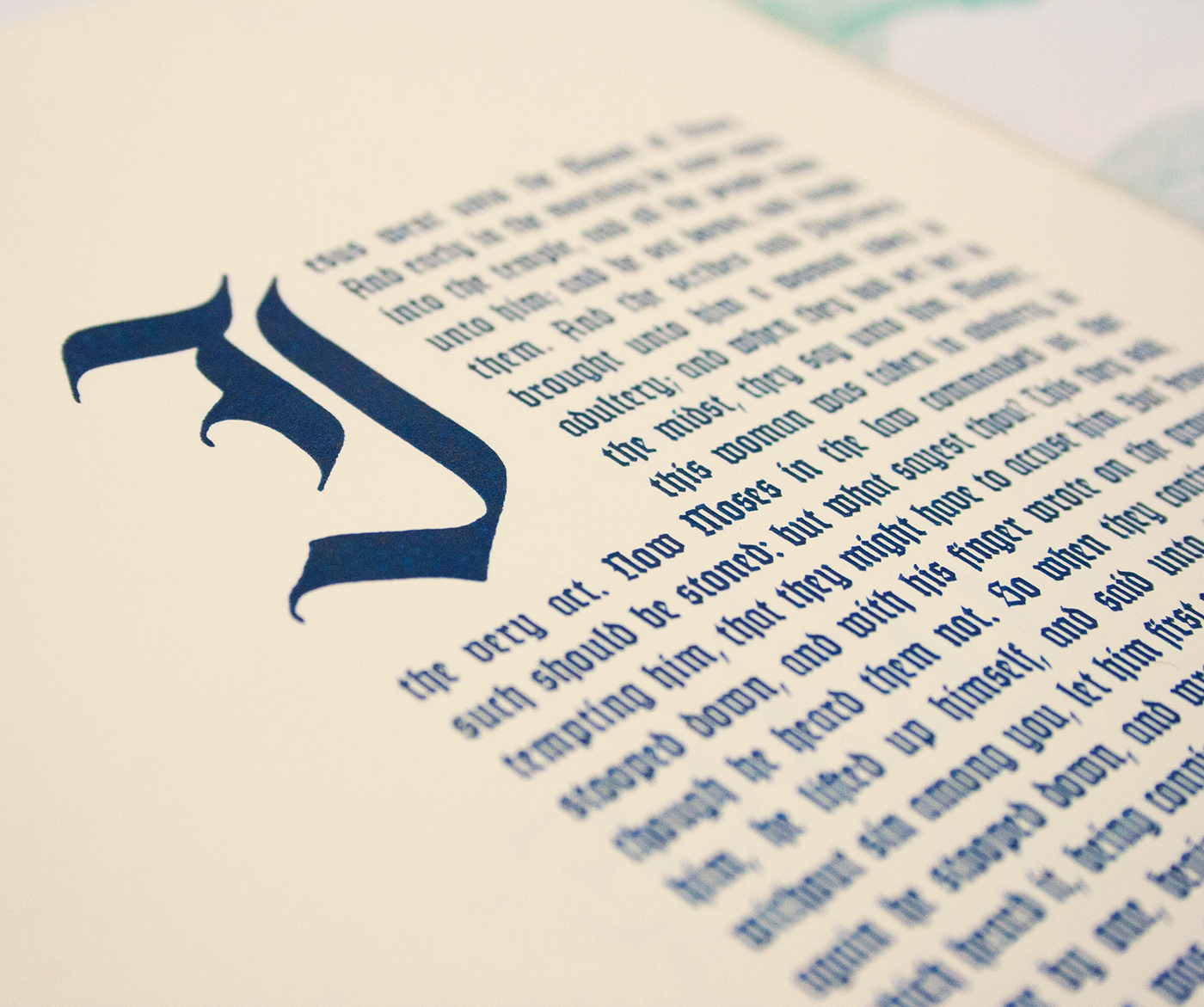
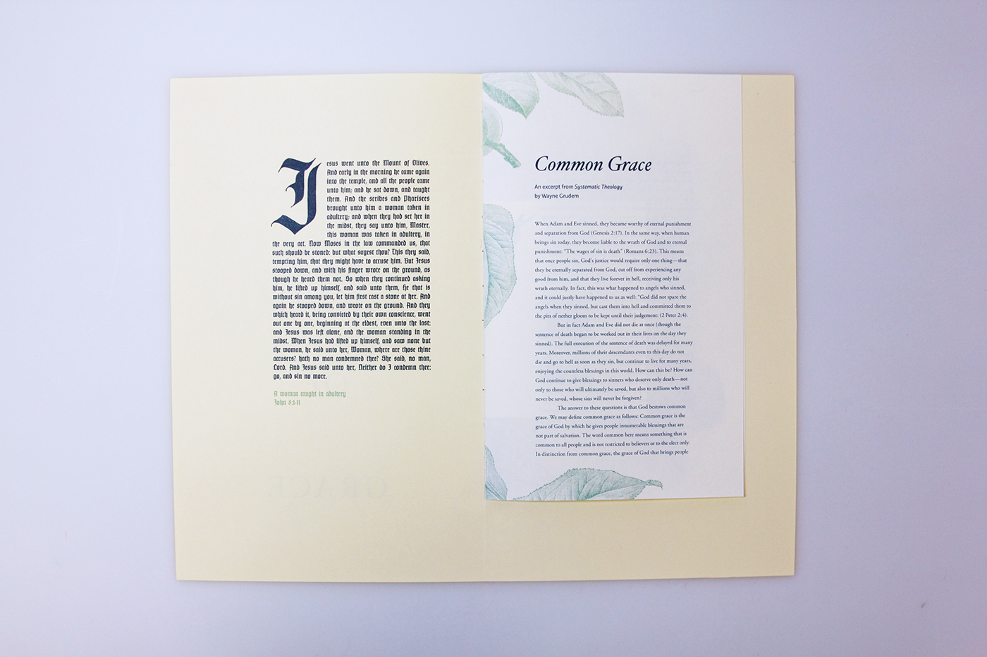
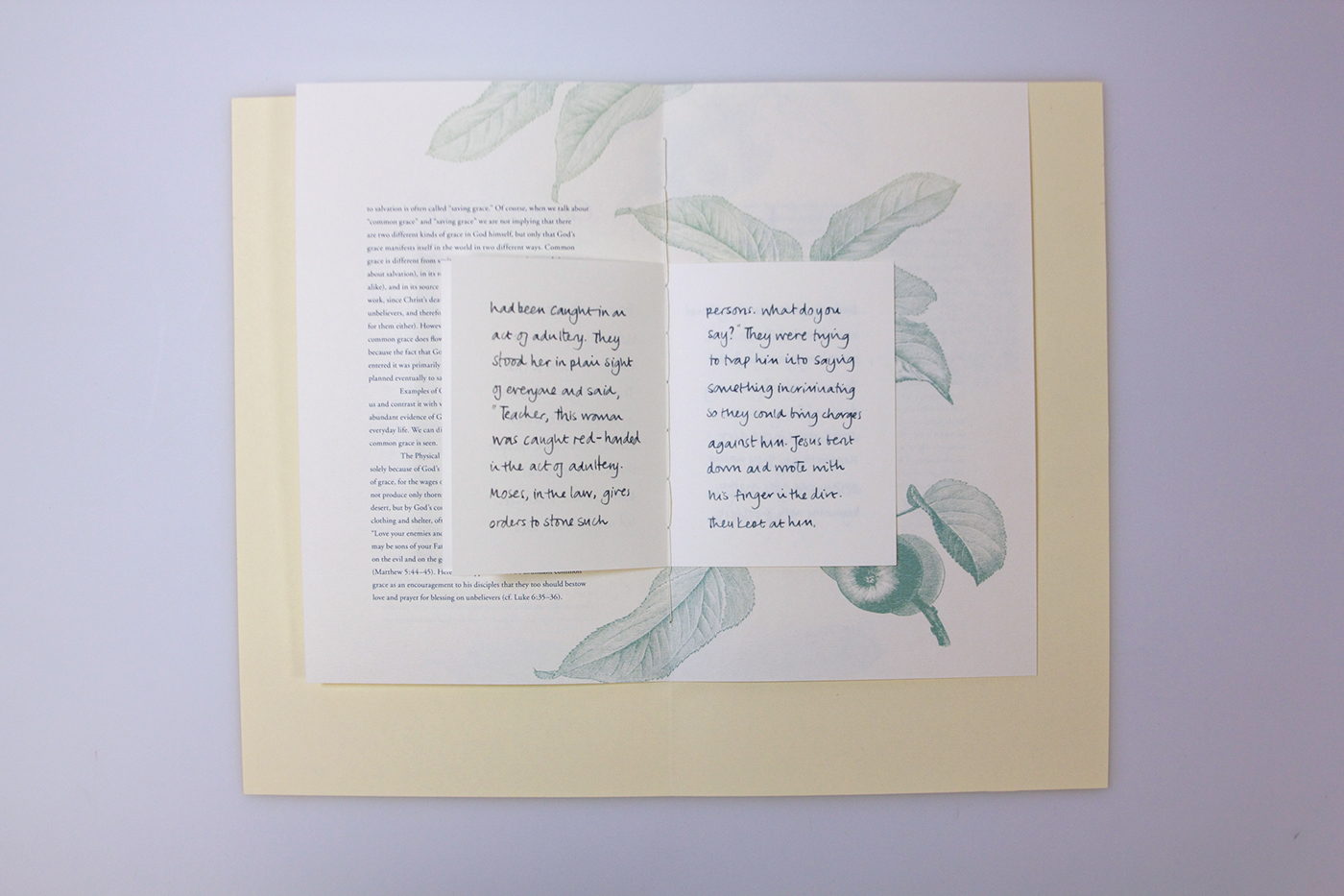
My design is made up of three sections, with each section containing different content (all of which would be focused on the same theme), from classical language to informative commentary to modern translation. The design of each section also reflects and frames the nature of the content held within. The 1st section contains text taken from The King James Version which is set in Gotenburg, a Blackletter typeface, and uses a page size and layout which was inspired by the works of Johannes Gutenberg and Jan Tschichold. Although the blackletter isn’t as easy to read, the reader is rewarded with the beautiful letter-forms, especially the drop-caps. Similarly the Bible passage, which as it is written in the KJV is not easy to understand, does hold the benefit of bestowing the reader with a far more poetic language than more modern translations. The 2nd section, which features a commentary taken from Systematic Theology, is set unobtrusively in Adobe Garamond surrounded by thematically relevant illustrations. This section is easy to read both in language and in typesetting, but remains traditional enough to be familiar in appearance. The 3rd section features the same Bible passage as the first section, but this text is taken from The Message, a Bible translation written in contemporary language. It is written by hand on a small page size, not dissimilar to a pocket notebook, which helps to give it a more personal feel. The paper choice for each section also reflects on the nature of the content; the 1st section is printed on a yellow-cream paper reminiscent of an early manuscript, the 2nd section is printed on an off-white paper similar to what many books printed in the 20th century would have used, and the 3rd section uses a smooth coated paper that gives it a very modern aesthetic.
Through this design I aim to bring a fresh perspective to the Bible whilst keeping true to its heritage. By using the format of a small book, the Bible immediately becomes more accessible because the quantity of text is much more manageable for the reader. Also by providing content written in a range of language styles, the book offers something for a range of readers.
Through this design I aim to bring a fresh perspective to the Bible whilst keeping true to its heritage. By using the format of a small book, the Bible immediately becomes more accessible because the quantity of text is much more manageable for the reader. Also by providing content written in a range of language styles, the book offers something for a range of readers.
Middle spread
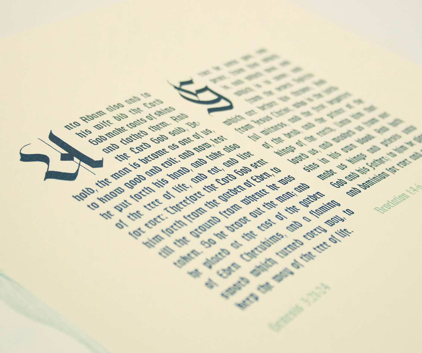
Hand rendered drop-caps using a Pilot Parallel pen