


+ = x
After a research about the actual service, we developed a brief to follow throughout the whole project. The brief is explained throughout different key points.

+ = x
Raw materials, pastel colours and food culture are the key points of the moodboard created
for the identity development.

+ = x
The logo, and in particula the symbols, was constructed gradually creating different girds for the construction itslef, positioning and spacing.

+ = x
For the colors we realized a statistical chromatic, shooting the main hall of every restaurant
involved in the service. Then, using an algorythm, we extrapolated the 3 colours of the logo.


+ = x
Thanks to the application of the logo to many artifacts, and to the use of raw specific materials, we managed to create a homogeneus identity.

+ = x
The website has been built looking for a balance between institutional and empathy. There is a video of introduction in the homepage to make instantly clear the service and how it works. Then, scrolling down, the user finds out all the other information in detail.


+ = x
Like the website in which this video is embeed, it has been thought to be institutional and emphatic at the same time. It has to explain how the service works and push the user to know more about it, in a short time. The style is minimal, following our logo.
+ = x
In the website there is also a video about the goals of the service. This video closes the circle of information given to the users: it lets them know about the results achieved with the service. It is mainly animated typography, and the second level of communication is made with colors: at the beginning there are the same ones of the logo on the background, associated to the meaning of what there is written on the screen, in the final part are the numbers to get the logo’s colors, again linked to their meaning (red: more donations, green: more equality, yellow: for everyone).
+ = x
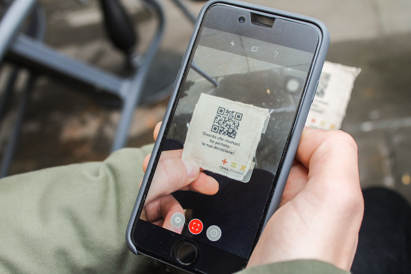
We developed many object to place in the restaurants involved in the service. These objects are the direct link between the customers and the service. They are made using the raw materials; in this way, the user has not only a visual experience, but also a tactile one. The main aim is to make people in ease with the service and to give them all the information they need; that is why, by scanning the QR code on the fabric ticket, you land on a video which shows the results achieved during the initiative. The heart is the element of customization: there are three sets of restaurants, and each set has its own color, complementary to those of the logo.


+ = x
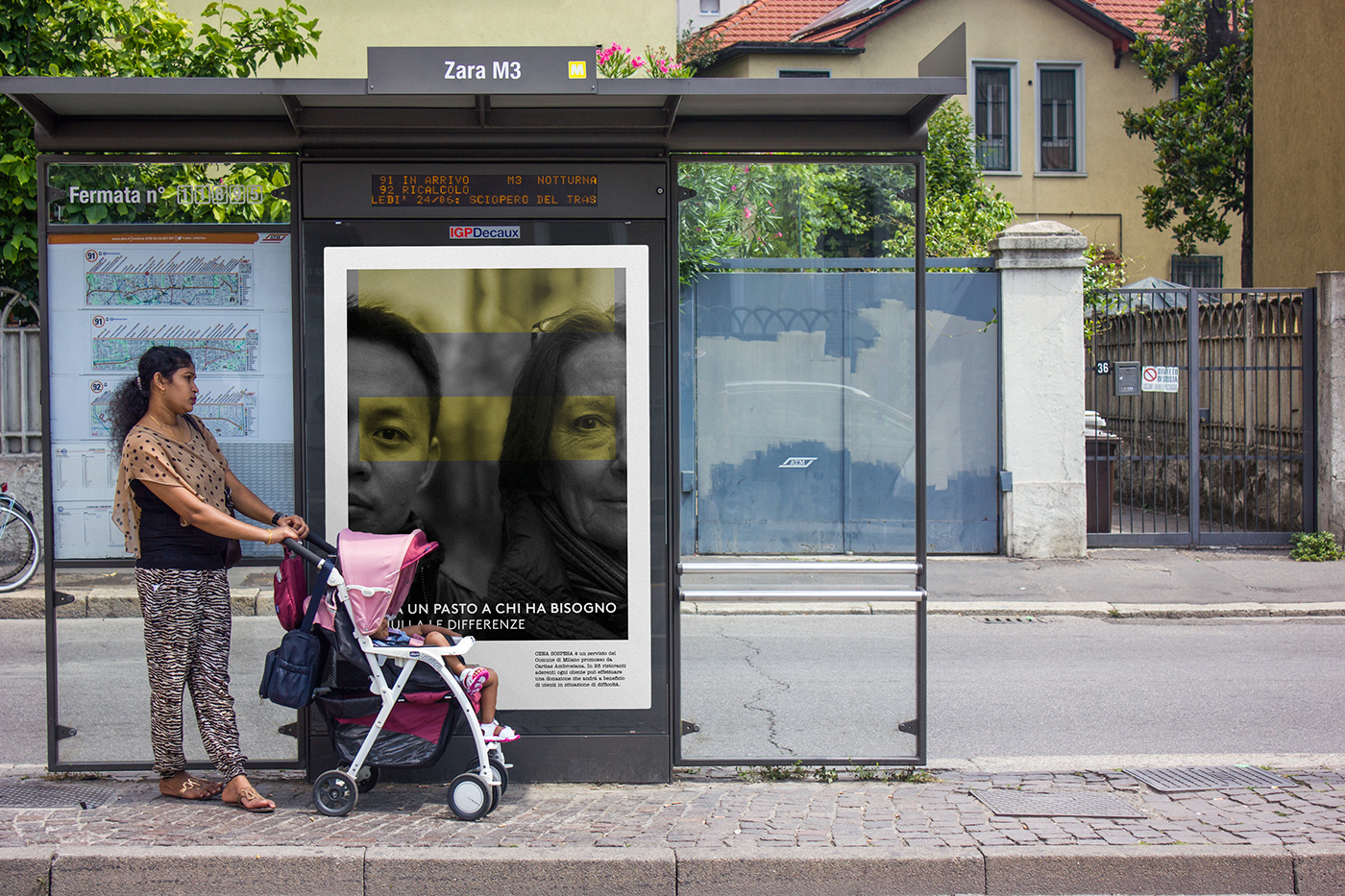
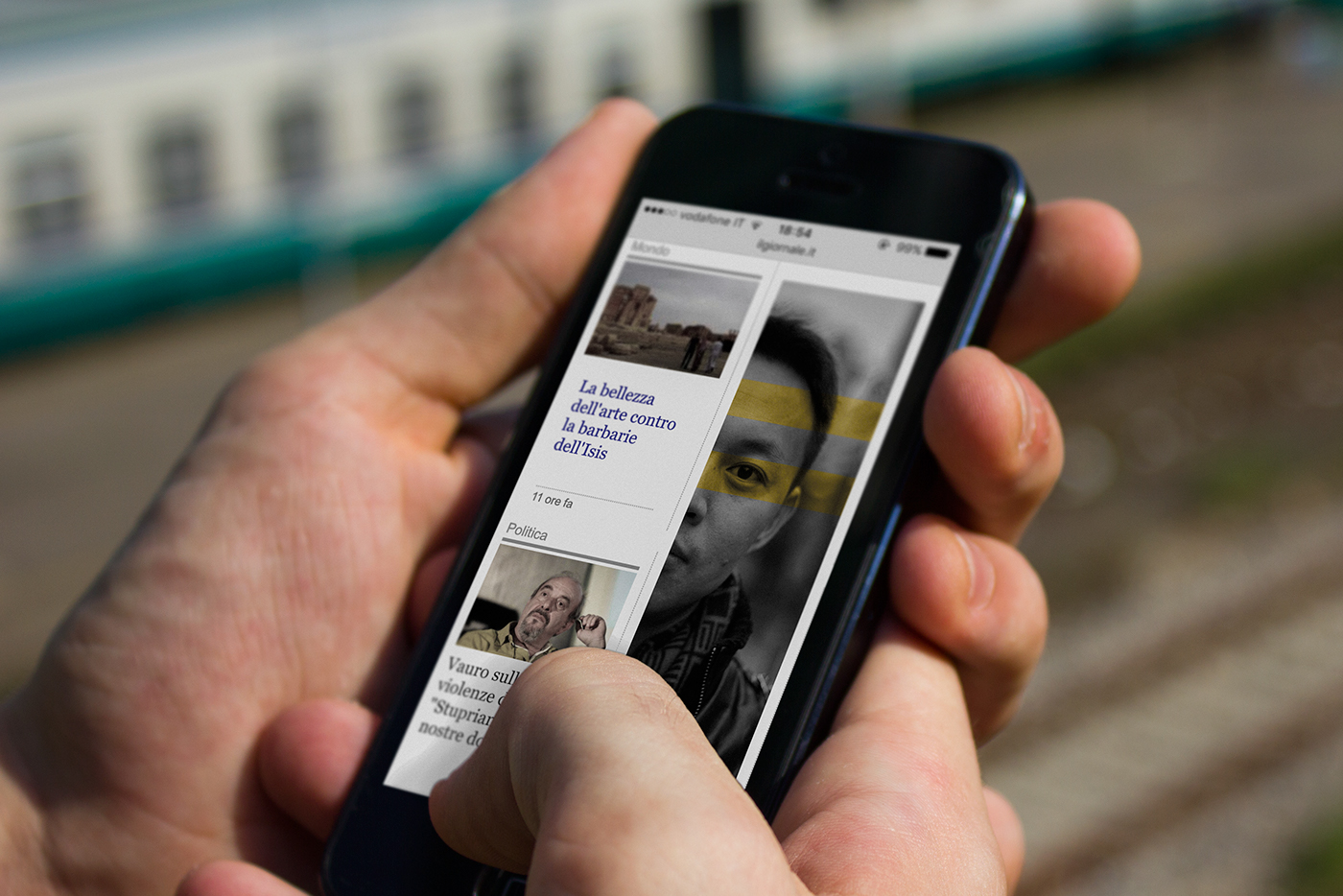
A poster campaign for the city of Milan was also developed. The posters are of different proportions and dimension, and hypothetically hung on bus stops and on public transport such as train and tram. The aim is to inform the citizens of the city about the service. These posters are composed using the symbols of the logo with an opacity effect on images with different meanings: gestures, portraits and people around the city itself.


+ = x
The last part of the city campaign involved a video aimed to sensitize people about the service itself. The video is minimal, without particular references to the service, execpt for the logo.


