
Updated Esurance's policy management app with a sleeker,
more intuitive design that features a simplified navigation.
Background
The old Esurance iOS app for policy management had a cumbersome tree navigation structure that required policy holders to tap several times before reaching their desired task. Additionally, the visual design looked dated and did not use the screen's limited real estate effectively.
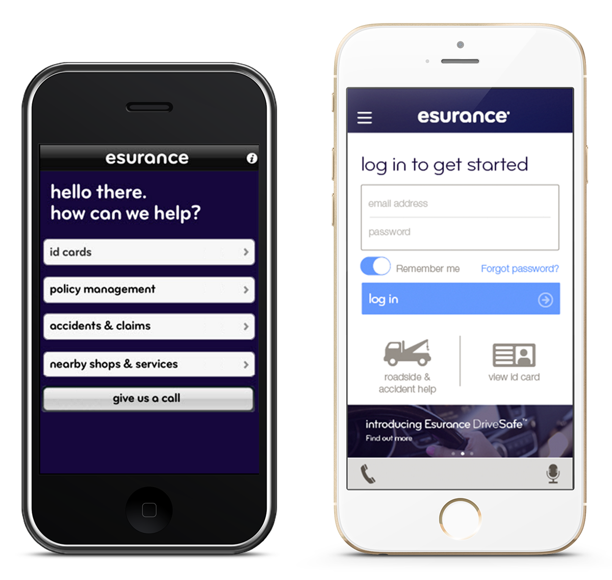
Home screen before (left) and after (right)
Goals
Beyond giving the app a visual refresh, we needed to create a new, more scalable architecture to accommodate users with multiple policies. In addition, we wanted to highlight the top items that can be accessed pre-login and expose the features of the app.
Approach
Data analysis
I looked at app usage data to determine which high traffic areas with high abandon rate had the greatest room for improvement. This exercise helped me triage and design better information architectures, task flows and page layouts.
I also conducted competitive analysis, downloaded numerous apps that exemplified positive user experience and best practices, and created a mood board for inspiration.
Persona creation
I created a persona to ensure that the core project team was aligned with the user's goals as we developed concepts.
Design concept development
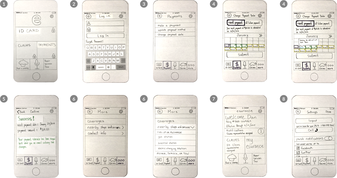
I designed 4 different navigation models for policy selection for users with multiple policies, rapidly prototyped 11 variations of the 4 options using InVision, and usability tested prototypes on iPhones with over 40 participants. You can view the final prototype with new visual design at https://invis.io/P9WRFQ35.
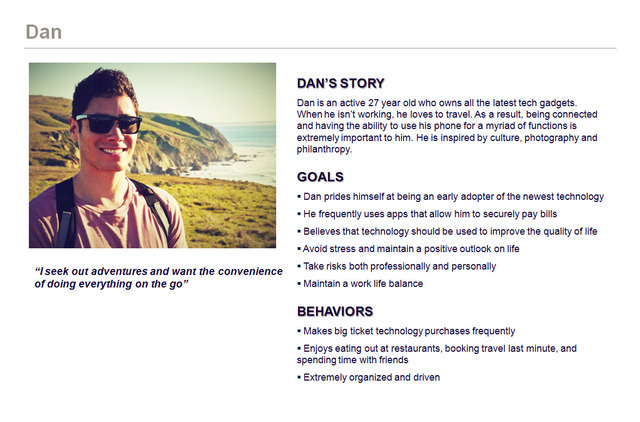
Our persona, Dan, helped us develop design concepts and frame critiques
Sketched early concepts by hand to focus on options for navigation
Usability study synthesis

Here I am explaining my sketch to pair designer Kay
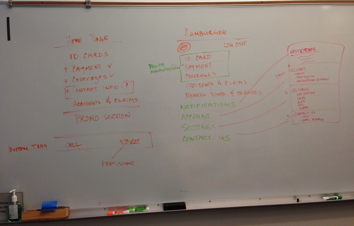
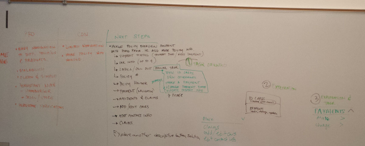
Notes from discussion about information architecture

Design review with team
Rapid prototyping
I designed 4 different navigation models for policy selection for users with multiple policies, rapidly prototyped 11 variations of the 4 options using InVision, and usability tested prototypes on iPhones with over 40 participants. Sometimes I’d make quick fixes in between tests. You can see the winning prototype at https://invis.io/P9WRFQ35.

Option 1: Dropdown
This was the winner. All participants in the studies instantly understood how to navigate between policies and liked seeing high-level policy summaries in a list.

Option 2: Horizontal Swiping
Swiping feels novel, but users can’t jump to policies at the end without first browsing through the others.

Option 3: Navigational Drawer Header
I wanted to try grouping all the navigational elements in the navigational drawer. In this version, a grid of policies displays on top of the menu and then rolls up into the header once user user selects a policy or taps the header. The majority of the participants had a hard time finding the selection grid again once the menu was exposed.

Option 4: Navigational Drawer List
I thought that revealing the list of the policies at the top of the menu would simplify selection and make the hierarchy more obvious, but participants had trouble understanding that they first needed to select a policy and then a task category (eg. Payments) in the menu.
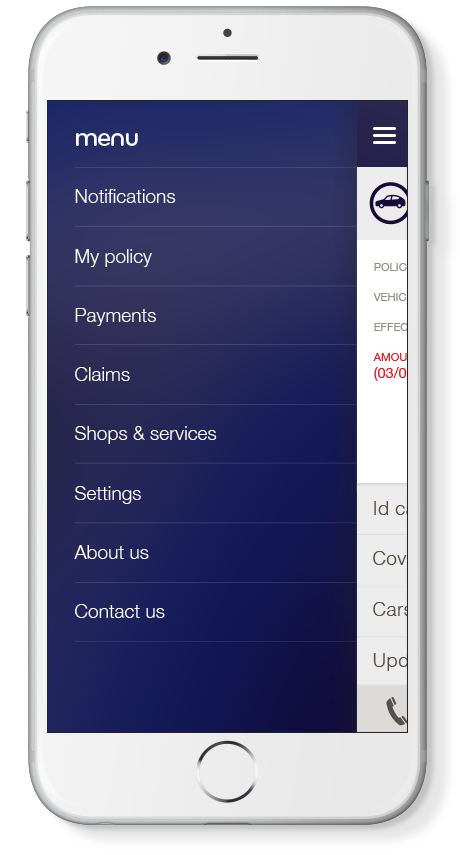
Hamburger menu was the most scalable option.
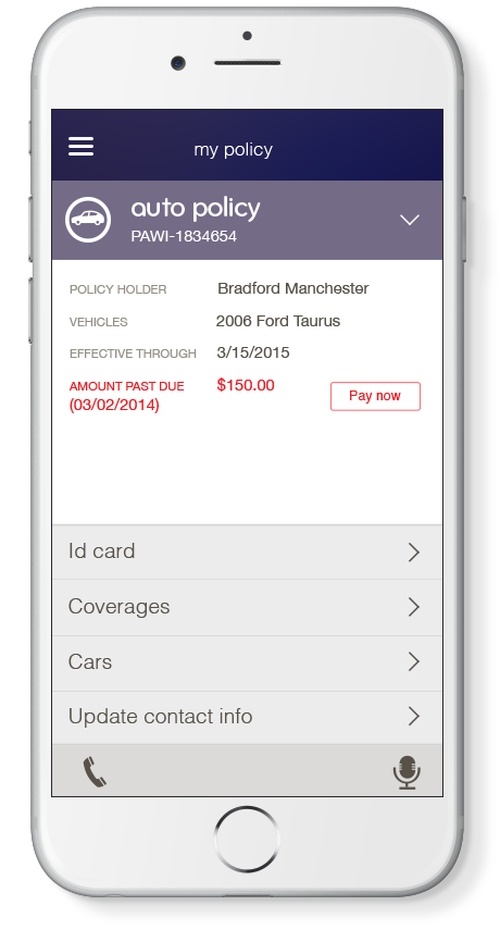
Example of My policy, the central place for all policy management tasks.
You can view the final prototype with new visual design at https://invis.io/P9WRFQ35.
Results
Overall we saw an uptick in app store ratings, from 2.5 to 4 stars. I am proud that my team and I had designed one of the most attractive (and usable!) financial services apps available at the time of launch.
What I learned
I learned how to influence skeptical stakeholders by sharing analytics, examples of competitive research, feedback from usability studies, and design principles. By directing conversations to objective data, away from personal likes and dislikes, I was able to build trust with the leadership team and help shift their thinking so that designers are seen as partners in product strategy development.


