


PROCESS:
For this book cover I decided to give the book a mysterious, dark and dead-like appearance. I did this to match the overall feel of the story which in itself is rather strange and dark. I stuck to a simple color pallette by restricting the use of only Black, White and gray. These colors I feel tie back to the dead-like appearance. I also applied this to my chose in typefaces aswell.
In the story the one got more involved with Cthulu the more their mind started to deteriorate and eventually go insane. I showed this with the way I implimented the textures in the illustration. The textures start at the top of the illustration but get more violent and apparent as they transition down and get closer to the name Cthulu.
In the story the one got more involved with Cthulu the more their mind started to deteriorate and eventually go insane. I showed this with the way I implimented the textures in the illustration. The textures start at the top of the illustration but get more violent and apparent as they transition down and get closer to the name Cthulu.
Target Audience:
This cover design was made in order to attract a younger audience of readers who love horror stories especially the classics or older tales. These readers are in their early to mid 20s. While doing research I noticed that the covers of older books may not necessarily attract the readers of today (especially younger ones) and decided that I needed to modernize the cover but still keep the feel of the original story intact.
This cover design was made in order to attract a younger audience of readers who love horror stories especially the classics or older tales. These readers are in their early to mid 20s. While doing research I noticed that the covers of older books may not necessarily attract the readers of today (especially younger ones) and decided that I needed to modernize the cover but still keep the feel of the original story intact.

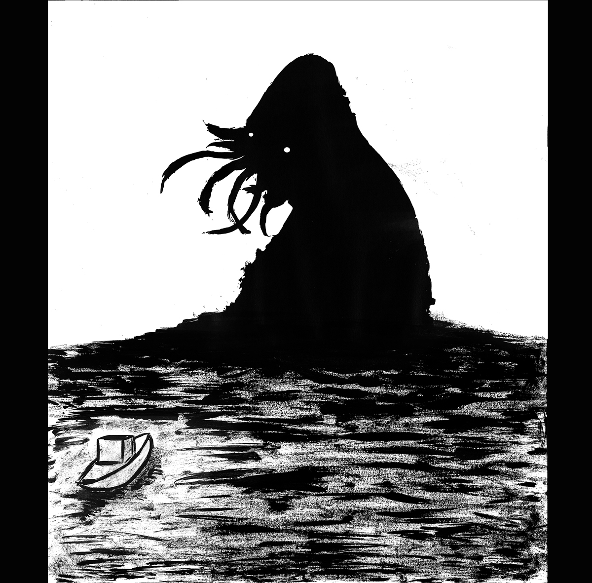
Illustration:
For the illustration on the cover, I wanted to show the being that is Cthulu in order to grab the attention of a potential reader. The illustration depicts the monster Cthulu arising from the sea ,which is a memorable part of the story. The Illustration also represent the corruption of the mind caused by Cthulu
One of the original thumbs that I came up with while doing research.


