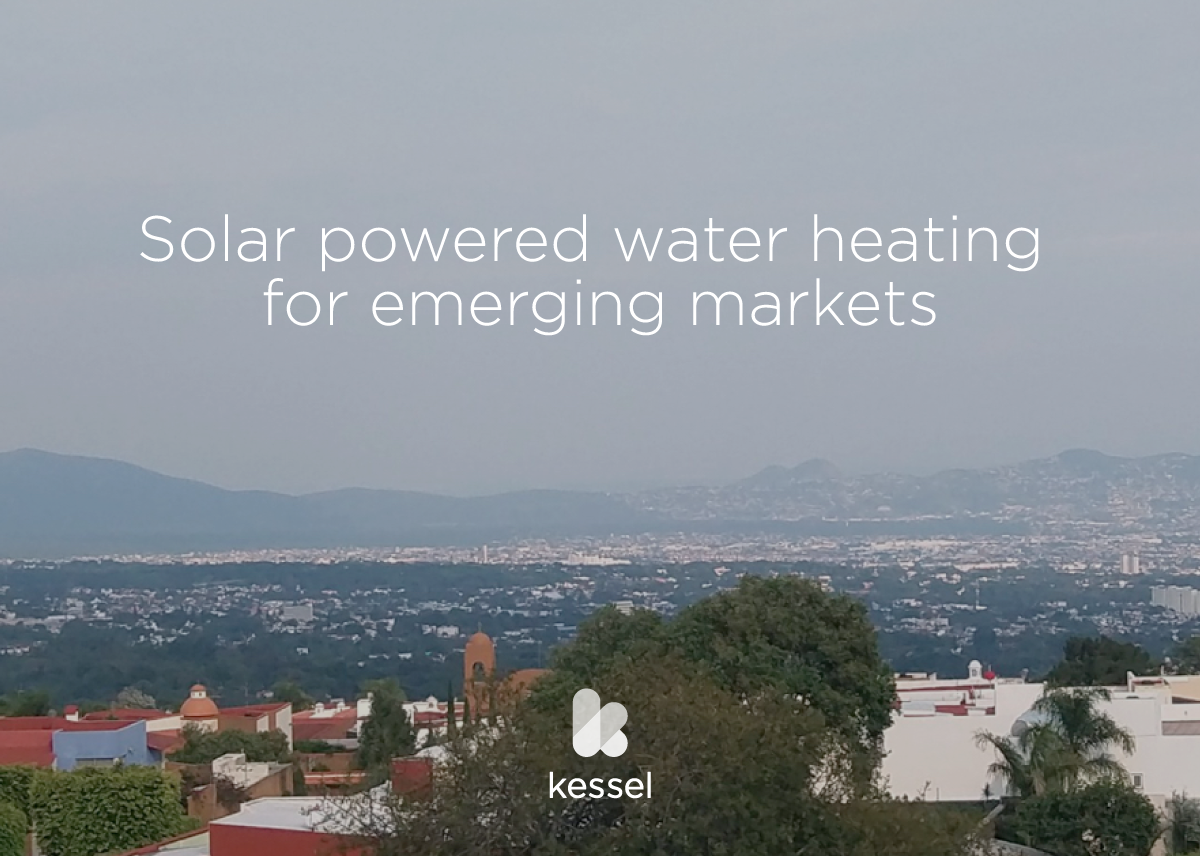
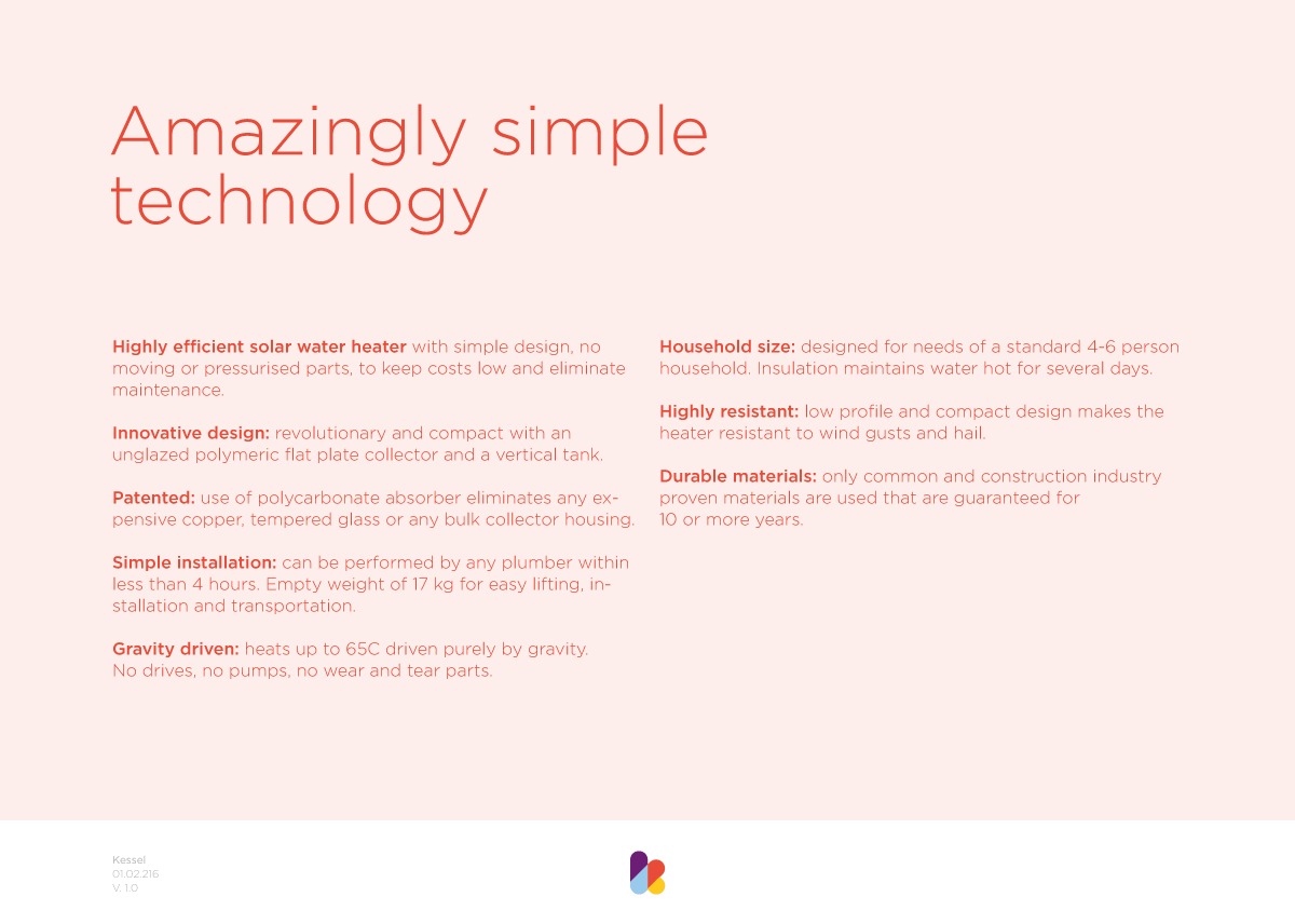
Kessel creates affordable, simple and scalable, renewable energy solutions. The first product, the Kessel, is a domestic solar water heater that reduces the domestic energy bill by approximately 80%. The kessel is build locally with parts sourced locally, a big part of the kessel mission is to create local job opportunities and improve quality of life where they operate.
The mark is based on the letter k, both mark and logotype is set in lowercase letters to emphasize the company's humble and friendly approach. The colour scheme and geometric shapes that creates the mark represents the eclectic mix of people involved and their unconventional take on the industry of domestic energy solutions.
Implementation of the identity is currently a WIP.