


Usar as iniciais não foi um pedido específico do cliente, porém era a forma mais simples de fazer uma referência direta a marca sem utilizar elementos da bandeira do Brasil.
The usage of initials wasn't a client request, however it was the simplest way to make a direct reference to brand name without using elements of the brazilian flag.
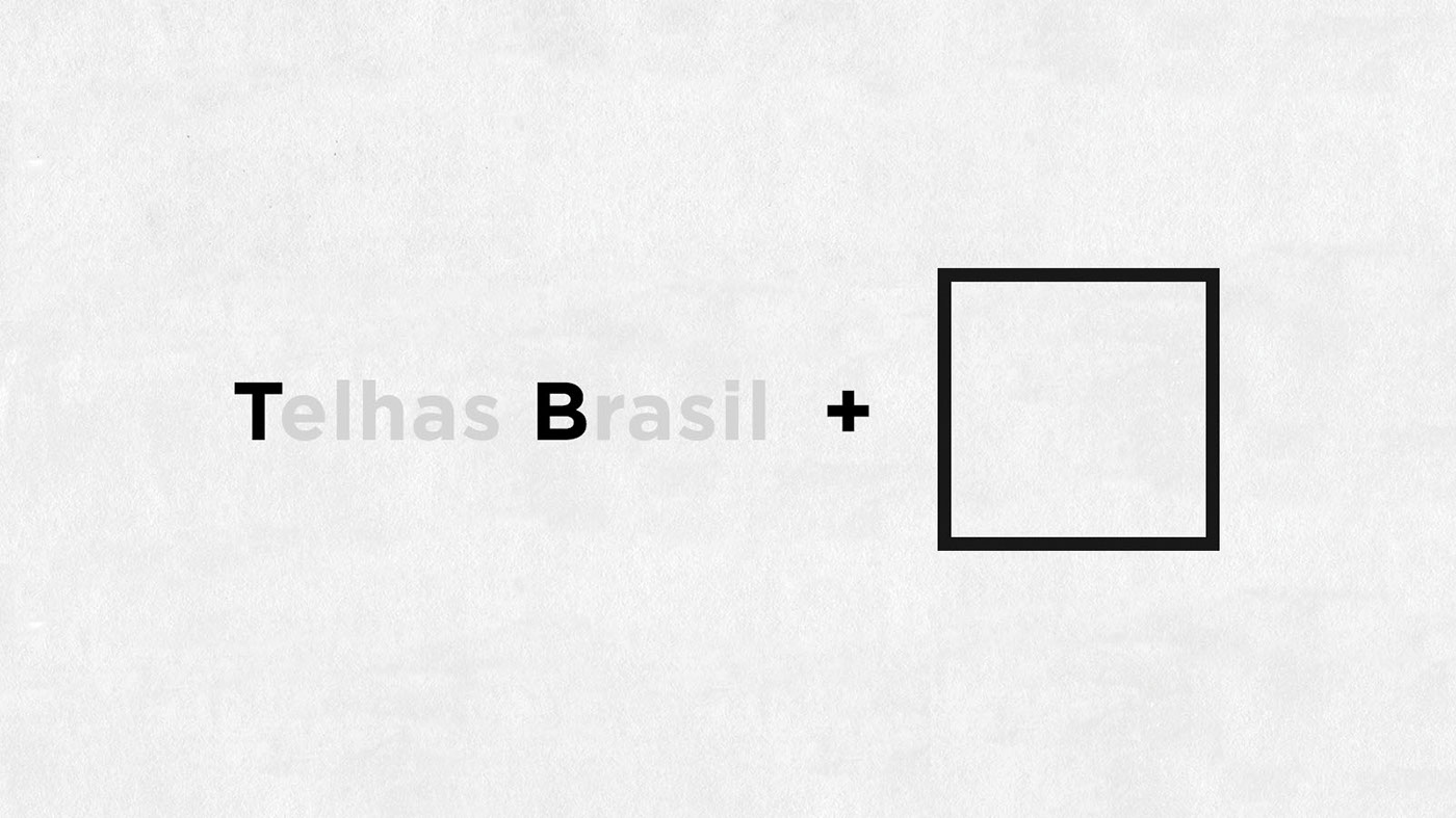
Nessa parte eu quis utilizar um quadrado como forma do logo, pois é um elemento que remete a tudo que é preciso e exato, sendo um dos símbolos da engenharia e indústria.
At this point I wanted to use a square as the main shape as the logo, because it is an element that it's connected to what is precise and accurate, being one of the engineering and industry symbols.

Foi um pouco difícil resolver as letras "T" e "B" de maneira integrada, a todo momento o "B" perdia legibilidade e ficava parecendo um número "3". A solução foi fazer ele se integrar no corpo do "T", utilizando-se um pequeno corte na parte inferior.
It was a little hard to make both "T" and "B" visible together, in almost every way "B" lost its legibility and it was looking like a number "3". The answer was to incorporate it into the body of the letter "T", using a small cut on its bottom.

A parte escrita também deveria ter uma personalidade própria, para ajudar a tornar o logo único e reconhecível. Portanto utilizei a fonte Gotham como base e, a partir dela, fiz ajustes de kerning e traços diagonais para tornar a escrita algo homogêneo.
The written part must also have its own personality, helping to make the logo unique. So I used the Gotham font as a base, adjusted the kerning and add diagonal endings to make the letters looks like a like each other.

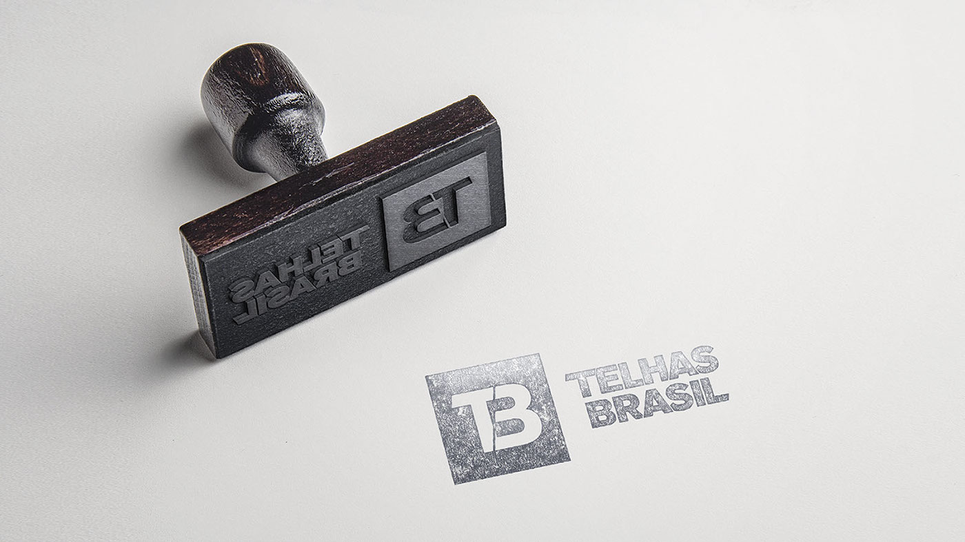
A versão positiva em preto-e-branco.
The black-and-white positive version.

As vezes não podemos fugir dos tons de azul corporativos, utilizado na maioria das empresas, afinal a marca queria esse posicionamento para se encaixar mais facilmente no mercado. Porém eu utilizei um degradê forte para dar um toque moderno e vibrante ao logo.
Sometimes we can't escape the corporate blue tones used in most companies, after all, the brand wanted this position to fit more easily in its target market. So I used a powerful gradient to give the logo a modern touch and vibrance.


Versões horizontais positivas e negativas.
Horizontal positive and negative versions.

Versões verticais positivas e negativas.
Vertical positive and negative versions.
Design by Mauricio Quitero
Client Telhas Brasil
For FG AD Agency


