Balance Water Company
Logotype and Packaging
Balance started with very humble origins in Sydney and is now sold in Australia, Asia, United States and Europe and operates offices in New York, Sydney and Cologne. Since Balance is deeply committed to the environment, natural products and improving peoples well being, the design process had to be a combination of all this things.
FORM FOLLOWS INFORMATION
balance
2.
a situation in which different elements are equal or in the correct proportions.
synonyms:
fairness, justice, impartiality, egalitarianism, equal opportunity;
parity, equity, equilibrium, evenness, symmetry, equipoise, correspondence, uniformity, equality, equivalence, similarity, levelness, parallelism, comparability.
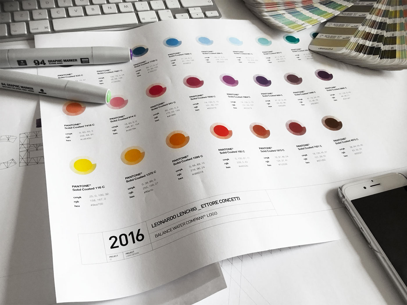
The client asked us to create a colorful brand, we decided against our philosophy to use 21 colors. It was a conscious choice and a challenge.
FEATURED ON PACKAGINGOFTHEWORLD.COM
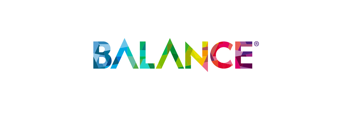

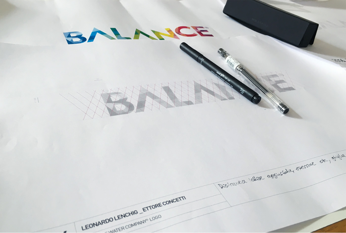
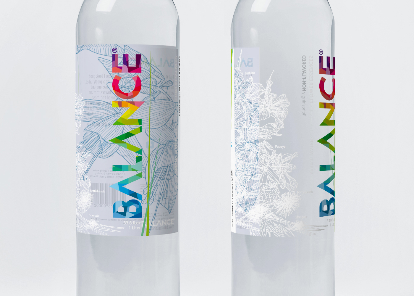
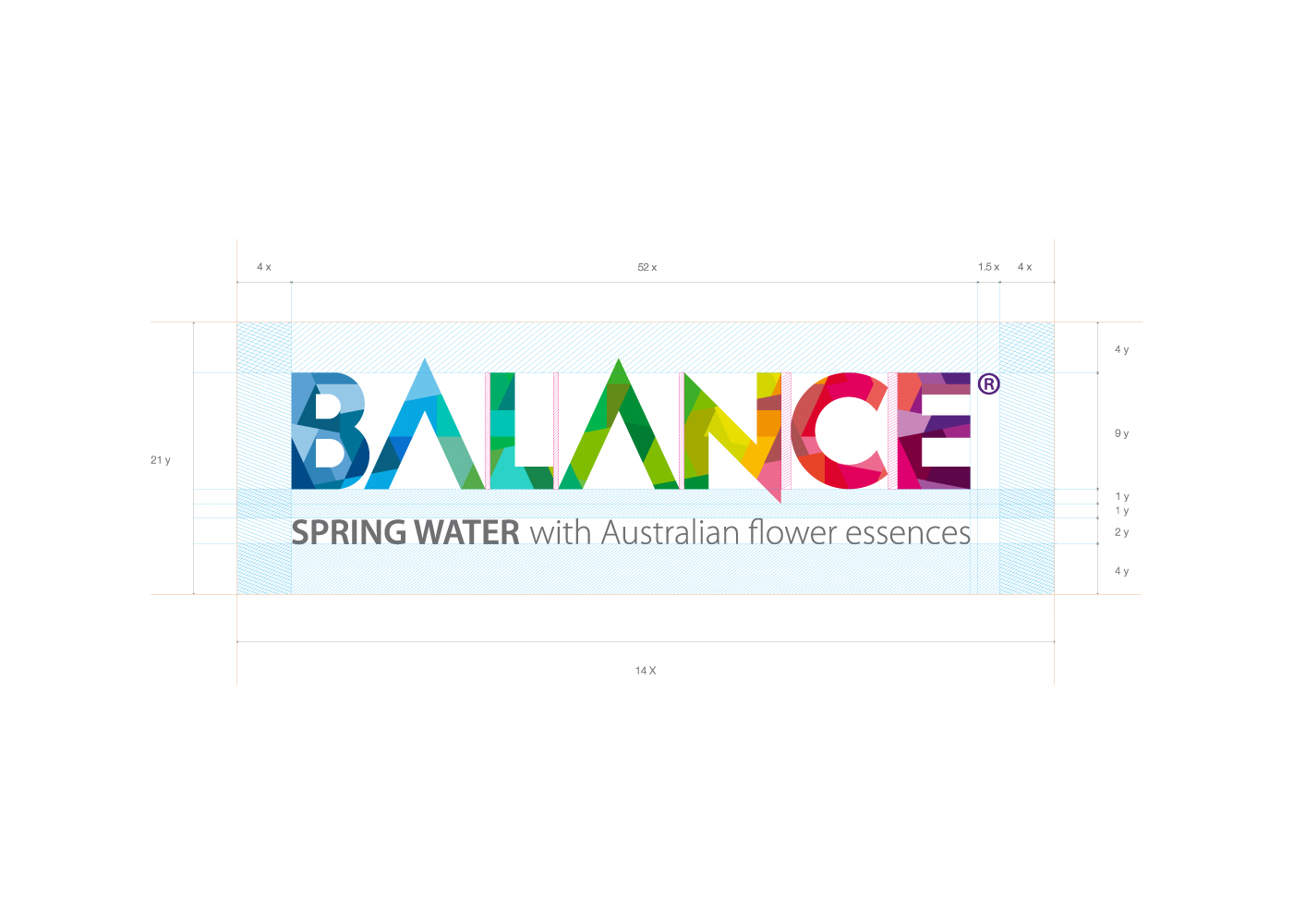
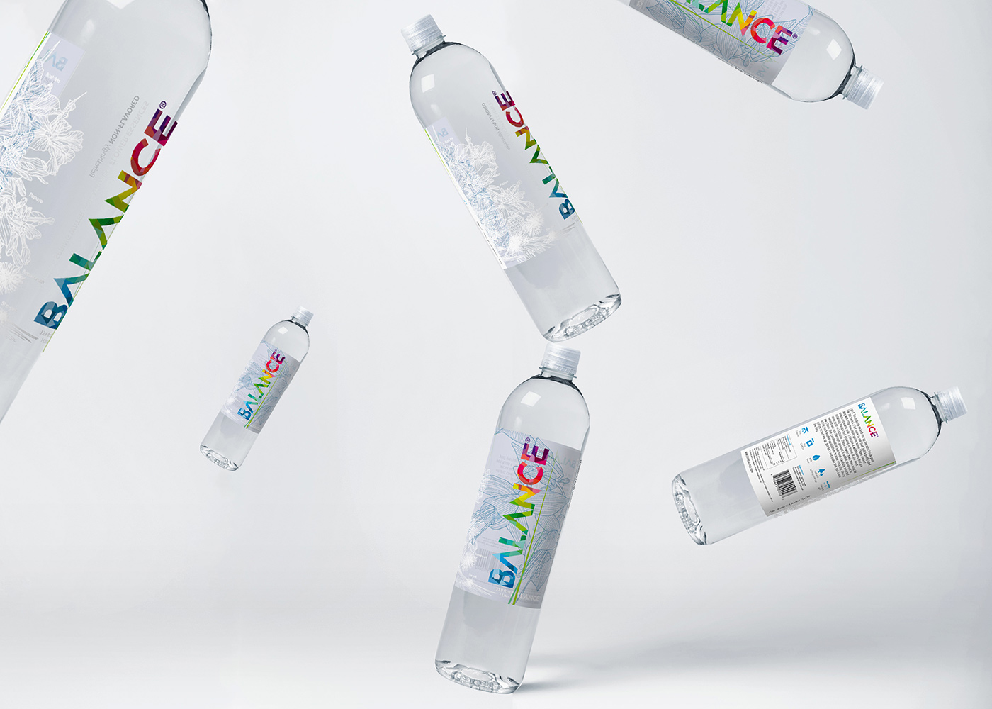
The brand identity is based on a geometrical grid and a modular system, such combination together with the rhythmic movement of the color elements works for the brand recognizability. The brand name is divided into separated elements proportioned between them and each color in the project is connected to the colors of the beautiful flowers infused in the water.
We have hand drawn the flowers on the side and in the inside back panel which we wanted to look like an embroidery.
We have hand drawn the flowers on the side and in the inside back panel which we wanted to look like an embroidery.


Label Printing, Epsen Hillmer Graphics Co, Omaha, United States
Design → Leonardo Lenchig and Ettore Concetti
Project Type → Produced, Commercial Work
Client → Balance Water company (Martin Chalk)
Location → New York, New York, USA
Packaging Contents → Water
Packaging Materials → 2 mil clear Polypropylene, Permanent acrylic adhesive, .92 PET Liner with a UV gloss window varnish
Project Type → Produced, Commercial Work
Client → Balance Water company (Martin Chalk)
Location → New York, New York, USA
Packaging Contents → Water
Packaging Materials → 2 mil clear Polypropylene, Permanent acrylic adhesive, .92 PET Liner with a UV gloss window varnish
________
Beverage World Magazine, Best water Packaging, First Place 2015


