


At&t Redesign Concept
In a workshop with Michael Braley, we were tasked with rebranding At&t. The new mark could not use the same branding elements and needed to include the ampersand.


Strategy
To begin, I thought about why a company would need to rebrand. In recent years At&t has been expanding from just a telecommunications company to include much broader services. Their mission “is to connect people with their world everywhere they live, work and play – and do it better than anyone else.” I wanted to help At&t reach their new audience and regain customers that may have been lost under the old brand identity.
Hoping to draw in the next generation of users, I wanted to give humanistic and friendly characteristics to the giant corporation. A hand-lettered form does just that. I drew inspiration from the shape of telephone lines to create a mark that would tie back to At&t’s telecommunication origins. The forward slant of the letter forms alludes to innovation and forward thinking. The interconnected letters and ampersand speak to At&t’s mission of connecting people. Another positive of the hand-lettered wordmark is that it stands in contrast to all the main competitors.
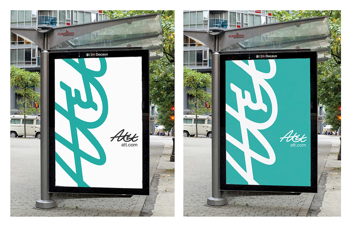
To introduce the market to the new At&t, I created an introductory advertisement and an icon for a mobile application.


