. U&B Grocery Store .
Hung Hom, Hong Kong

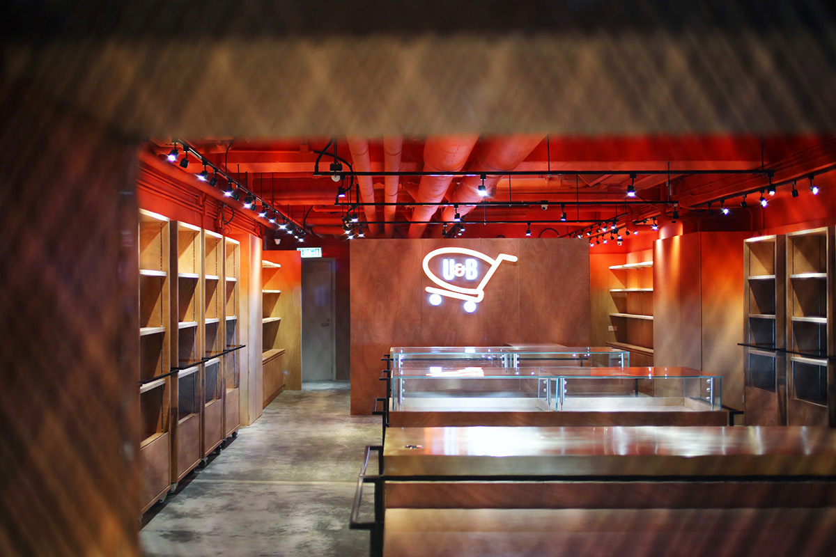
The concept of this project is to transform a local grocery brand – U&B, into a highly flexible and hybrid space with mono material and colour to achieve customers’ attention. It redefines how to spend a low budget to build something creative in systematic design. Given that the brand logo of U&B is a shopping trolley and their corporate colour is in orange, the interior environment embraces all these elements to contribute to its uniqueness.


This grocery store has been delicately designed to comprise for their fast-changing products and blended immaculately with the flexible and responsive components, creating a stylish signature in the store to represent the brand.


