Graffity on paper
Neste projeto irei mostrar como podemos pegar uma fonte tipográfica muito comum, a TIMES NEW ROMAN, e dar a perceber que transformações se podem fazer às letras para criar uma palavra ao estilo de "WRITER".
Nota: Este projeto não é mostrar uma metodologia para executar este tipo de arte, mas sim um projeto exemplificativo.
This project will show how we can take a very common typeface, Times New Roman, and to realize that changes can be made to the letters to create a word-style "WRITER".
Note: This project is not to show a methodology to perform this type of art, but a design example.

Comecei por pegar pelo nome artístico "Fabione". E vou agora começar a fazer alterações.
I started by taking my name "Fabione." And now I will start making changes.
I started by taking my name "Fabione." And now I will start making changes.

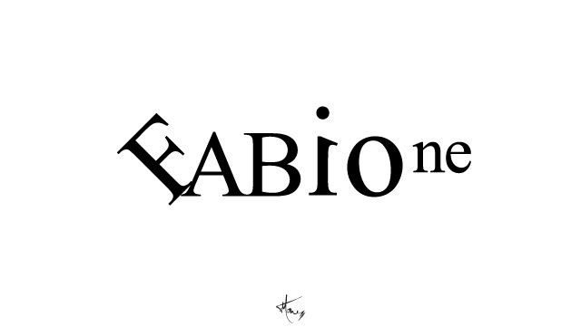
Neste passo, o que fiz foi, rodar o "F" 45º para a esquerda e trocar as "ab" por "AB".
In this step, what I did was rotate the "F" 45 degrees to the left and change the "ab" with "AB".
In this step, what I did was rotate the "F" 45 degrees to the left and change the "ab" with "AB".

Aqui reduziu-se o "AB" até a altura do corpo do "i" e também as letras "ne".
Here, I resized the "AB" to the height of the body of the "i" and also the letters "ne".
Here, I resized the "AB" to the height of the body of the "i" and also the letters "ne".
Portanto este é o aspecto que está a tranformação que fora feita à fonte escolhida, mas para alterar esta fonte para ficar com um estilo de "graffity" teremos de redesenhar por cima, e assim criar a nossa própria fonte para esta palavra.
So this is the aspect by the end of transformation that I made to the font chosen, but to change this font to stick with one style "graffity" we have to redraw on top, and so create our own type for this word.
So this is the aspect by the end of transformation that I made to the font chosen, but to change this font to stick with one style "graffity" we have to redraw on top, and so create our own type for this word.

Á medida que se vai riscando por cima várias formas poderam surgir. A minha preocupação foi sempre manter um estilo coerente, que faça sentido num todo.
As it will scratching over various forms, can they arise. My concern has always been to maintain a consistent style, which makes sense as a "piece".
As it will scratching over various forms, can they arise. My concern has always been to maintain a consistent style, which makes sense as a "piece".

Retirei a fonte base e aproximei as letras que desenhei. E este é o resultado.
Não é o fim mas sim o começo.
I removed the type base and approached all letters . And this is the result.
It is not the end but the beginning.
Não é o fim mas sim o começo.
I removed the type base and approached all letters . And this is the result.
It is not the end but the beginning.

Ora aqui temos já a palavra já quase terminada. Já consta toda a sua forma, apresenta consistência e a relação de formas está coerente. Está também presente a fonte utilizada inicialmente.
Now here we have almost finished the word. Already in all its forms, presents consistency and relationship of forms is consistent. Its all so present the font I used initially.
Now here we have almost finished the word. Already in all its forms, presents consistency and relationship of forms is consistent. Its all so present the font I used initially.

Já está finalizada. Para personalizar ainda mais, adicionei dois elementos, um foi a caracterização do título do "i" e o aplicação de aspas no fim.
Is already finished. To further customize, added two elements, one is the characterization of the title of "i" and the application of quotation marks in the end.
Is already finished. To further customize, added two elements, one is the characterization of the title of "i" and the application of quotation marks in the end.


