The Global Shift
Made in: November 2015 - January 2016
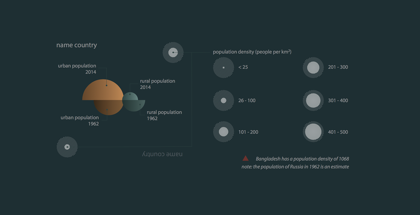
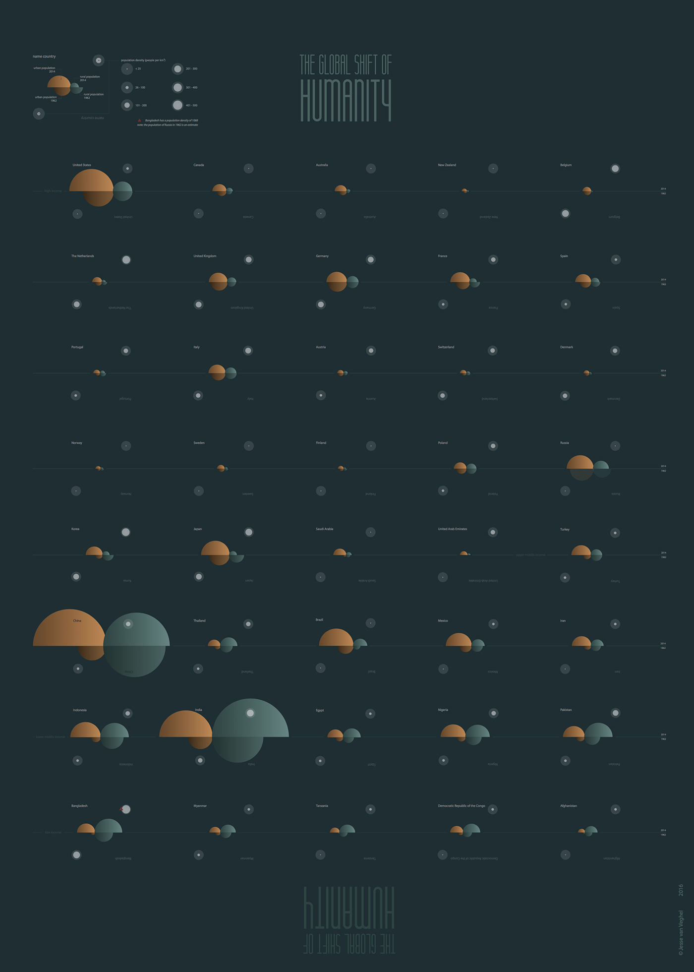
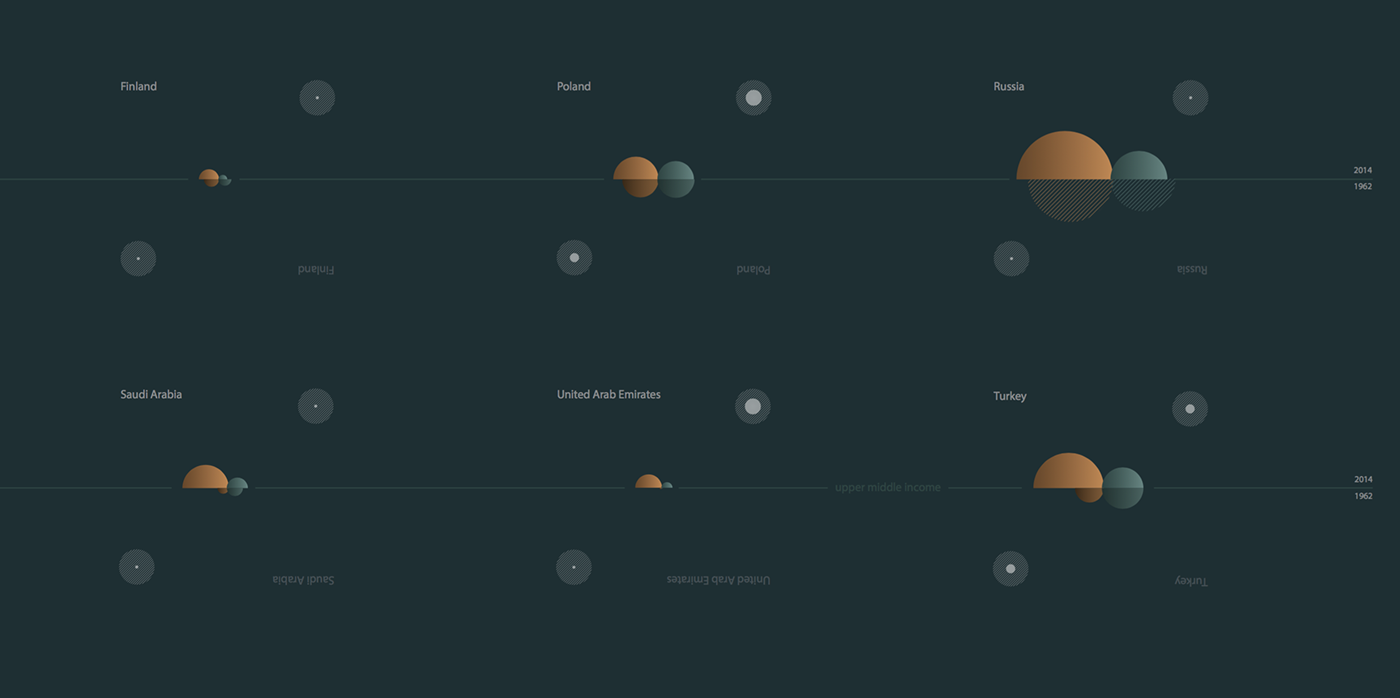
This datavisualization was made as an assignment for my study Geo Media Design at HAS University of Applied Sciences. I wanted to show the differences between 40 countries in urbanization, population growth and population density between 1962 and 2014 (latest values). Besides that, the countries are categorized by level of income according to the FAO.