DASHBOARD
My goal was to simplify process of trading.
I decided to use rearranging elements of dashboard & using key colors to make user understand what is going on. As a palette i used HSB (210,50, x), where x is different for every module. Also I choosed a mountain as a base of layout because trading graphs look so similar to mountain ranges.
So here's what I've got:
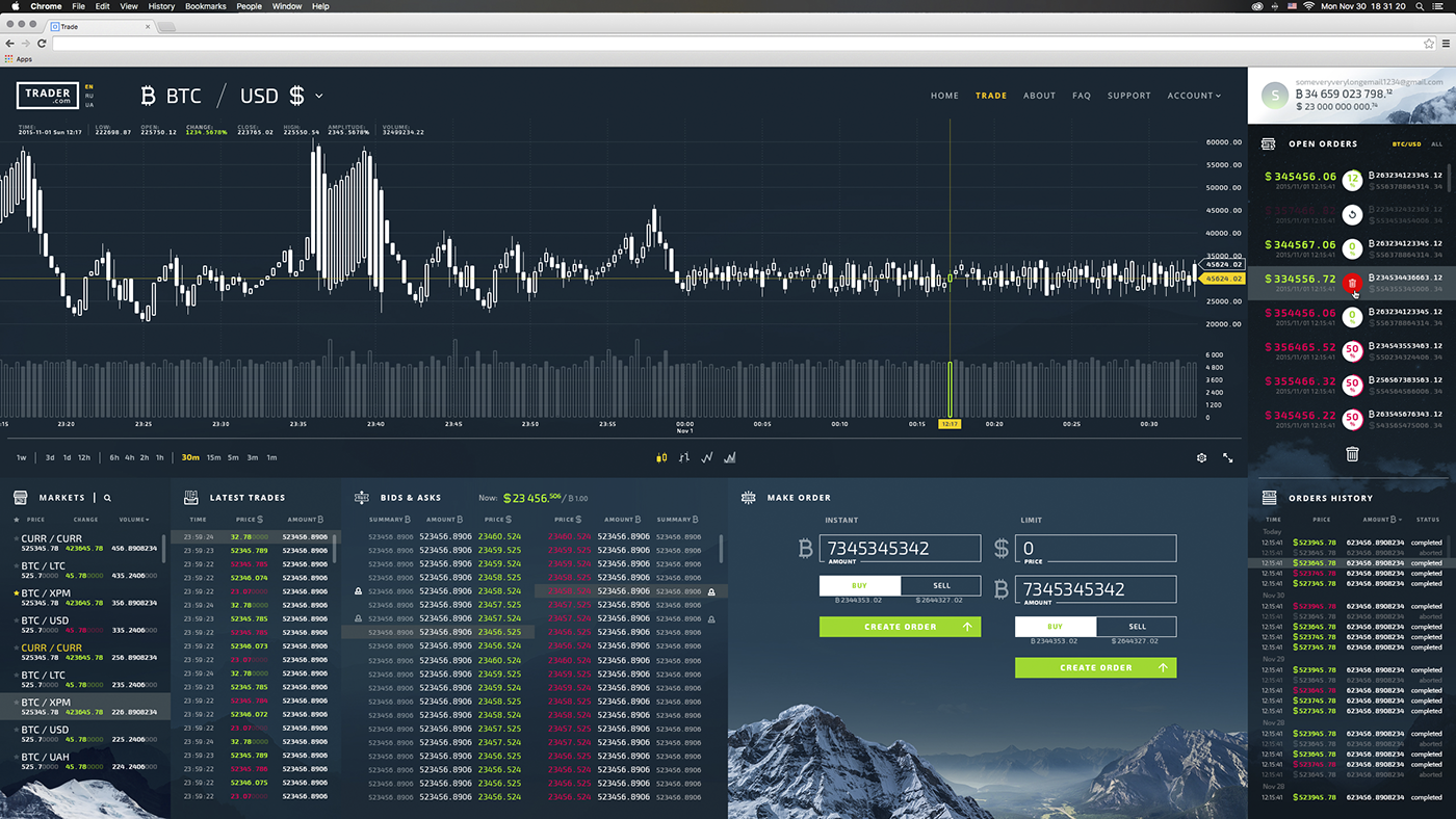
1. GRAPH
I tried to come up with new way to represent a classic "candles". This version can be easy used in red/green color scheme, or just black or white, like on this image.
Detailed info of current candle is represented more convenient than just one long line. Also there's a option to open a graph fullscreen.

2. MARKETS
All information trader needs to know about currency pairs is nicely organized.
All information trader needs to know about currency pairs is nicely organized.

3. LATEST TRADES + BIDS & ASKS
After user choosed a pair, he sees a comprehensive info about a current state of the market, thank to these two tables.
After user choosed a pair, he sees a comprehensive info about a current state of the market, thank to these two tables.

4. MAKING A ORDER
So our hero analized the situationand ready to make his next order. He can istantly choose a bid or ask just by clicking at it. Numbers will paste right in fields.
So our hero analized the situationand ready to make his next order. He can istantly choose a bid or ask just by clicking at it. Numbers will paste right in fields.

5. PERSONAL SIDEBAR
This is the element that can always be with you, no matter on what page of the site you currently are. It shows your current balance + open & completed orders.
This is the element that can always be with you, no matter on what page of the site you currently are. It shows your current balance + open & completed orders.


Here's how it worked in real life (thanx to my colleague Mire for explaining) :
THANK YOU
I hope you've liked the result =)


