Aubree is a Bangalore, India based chocolaterie.
A playful charm, a colorful and cheery ambiance, the most premium breads & chocolates make Aubree a class apart from its own kind. Aubree touches everyone through its soulfulness. Everything that one sees at Aubree is a visual gift. Igniting the dire need to experience what it must all taste like.
'Aubree' is the french name for a girl - Rule with elf wisdom. All that is Aubree, is all that is to know about chocolate.


This is an experiential approach. There is a significance behind each of the textures as sensorial feelings. Sensory Tales is the journey that a person will take when he experiences an Aubree product at their store. It explores the relationship between the mind and body. One of the main concerns of the client was the fact that he wants more people to spend time at their store and "experience chocolate, not just have it. "
How often do we engage all senses while tasting food? Our brain works at a subconscious level to register facts. We go through various levels of tasting chocolate which starts with sight, smell, touch, sound and finally, taste! The sense of touch or tactile perception is what allows the organisms to feel the world around them. To make sense of the stimuli the organism will undergo active exploration, by moving environments or skin-surrounding contact. This sends messages to the brain regarding size, shape, roughness, hardness, stickiness and warmth of the object.
I decided to catagorize the chocolates into types, filling, sources of origin and combination of flavors to come up with complex shapes which will be percieved by people ( based on a short study). the complexity of each texture was simplied and the units were made scalable. These elements were later added to the identity on the request of the client.
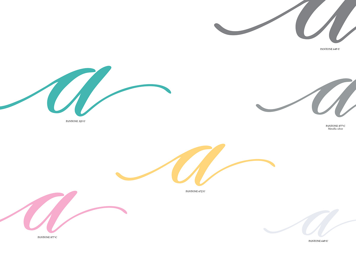
The identity and the visual flow have a strong feminine feel. The visuals are kept extremely subtle and minimal with the use of white and the playfulness element is maintained using the colors chosen. Even though the colors chosen are atypical to a chocolate brand, playfulness was one of the most important aspects to be considered while designing.


As mentioned earlier, this is an experiential approach and the experience extends to details like premium embossed business cards and store opening invites. Also, subtle white on white prints on the packaging extends the same premium language.


