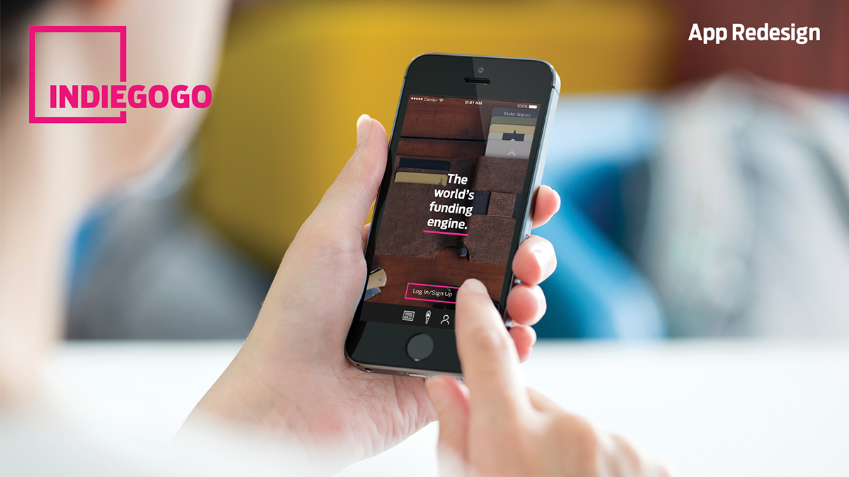
Indiegogo's mobile app is unnecessarily cluttered and hard to navigate. I took this opportunity to create a simplified design that provided a more enjoyable experience for the user. This was part of a design sprint in which I challenged myself to redesign a current app in 2 days.
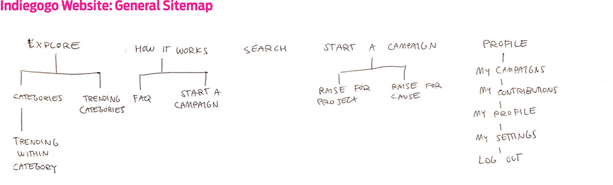
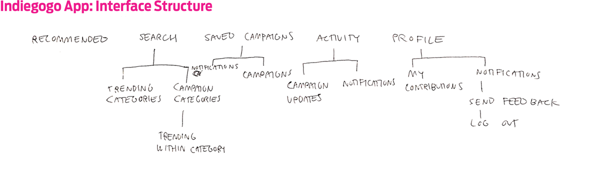
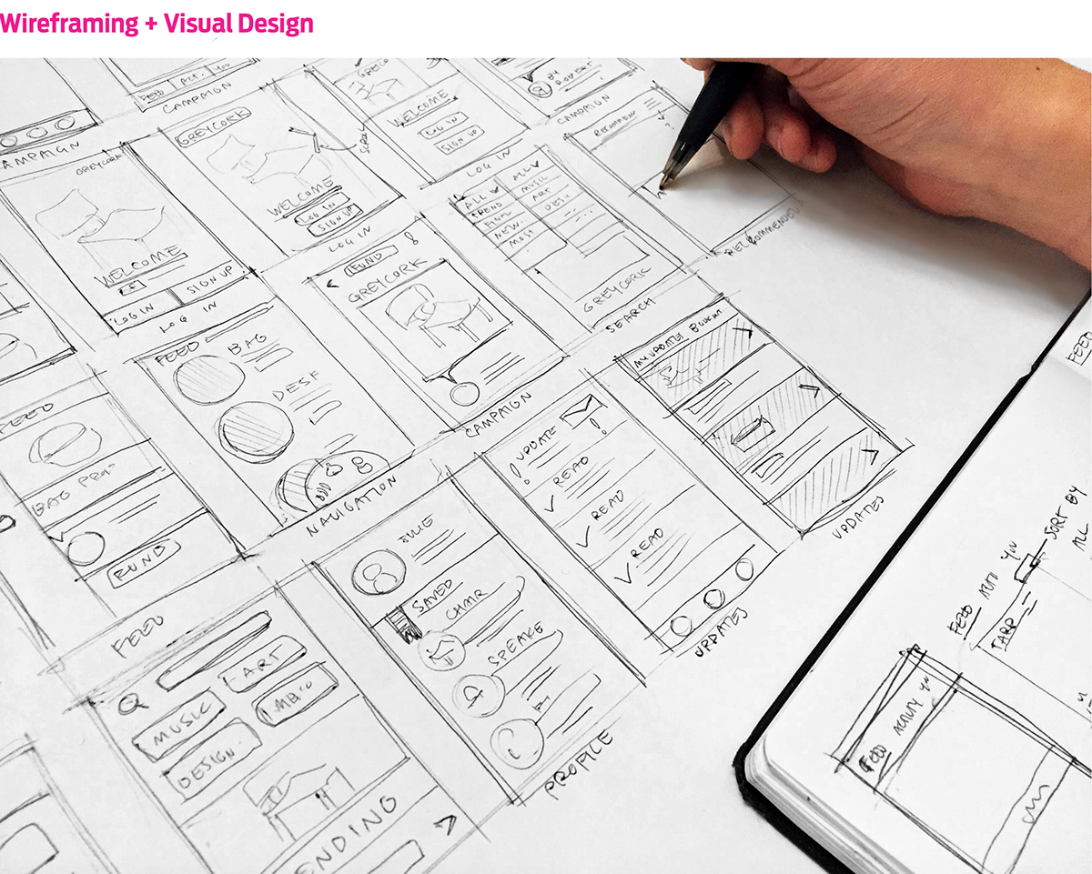
My redesign process started with studying the navigational flow of the current Indiegogo site and mobile app.
The target audience for the app is strictly users who are interested in supporting projects. Starting a campaign can only be done via the Indiegogo website. Since the user motives are clear, I wanted to create an app experience that felt as personal as possible.
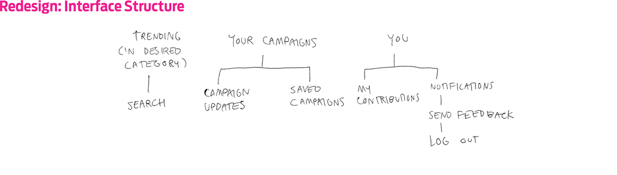
Based on the navigational maps, I sorted out the basic sections the app needed to cover. I shrunk the original navigation bar from five icons to three, making the interface smoother and more enjoyable to use. From there, I created preliminary wireframes for the interface layout.
I focused on simplifying elements without compromising the Indiegogo's brand identity. The fonts, Antennae Condensed, and Benton Sans as well as the color scheme directly match the website.
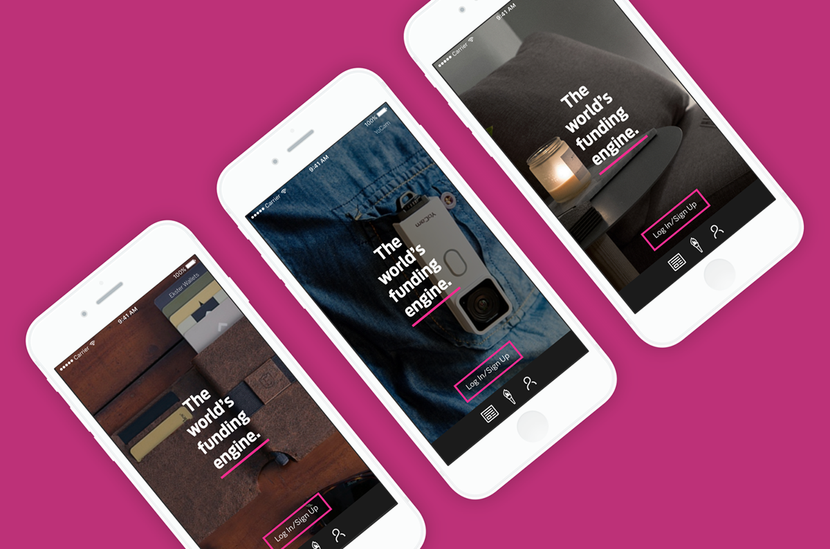
The user is greeted with an opening screen that features an automatic scrolling background with trending campaigns. Although the user is free to use the app without signing up, he/she will always view the "Log In" screen first. This encourages the user to sign up for an account.
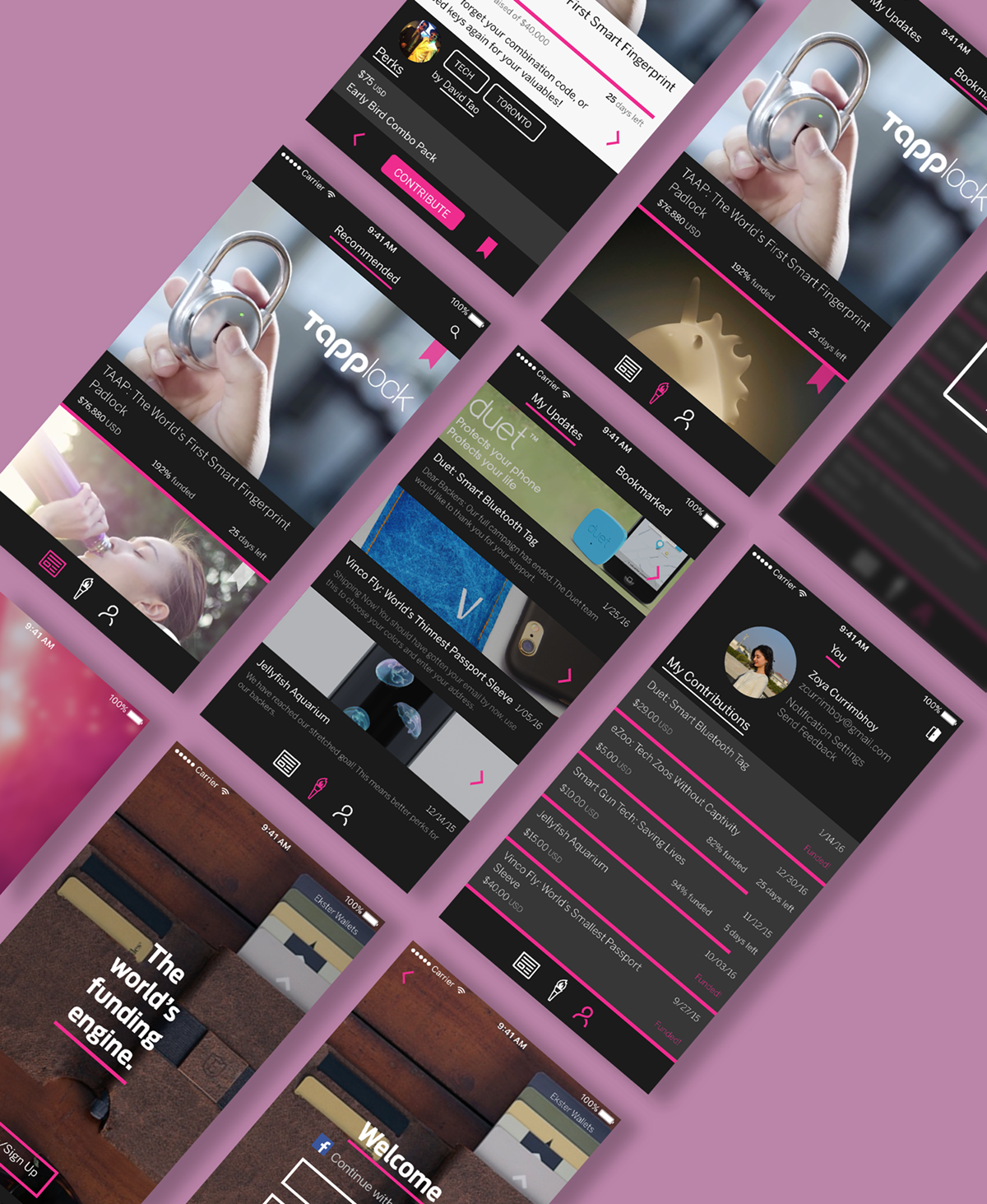
The user is able to effortlessly navigate through the interface. The app puts emphasis on personalization, with two main functions: displaying a curated campaign feed and focusing on user activity.


