Redesign
As a long time appreciator and admirer of Bang & Olufsen design, I wanted to produce a homepage experience that reflects the elegance of their products.
What the current site does well:
Clean and minimal
Use of powerful imagery
What could be better:
Navigation
Removal of the js scroll locking
Make less clunky and more welcoming
Other questions considered:
Who are the targetted users?
Beoplay is clearly targetted towards the younger demographic, with cool, almost sporty designs, But Bang & Olufsen, the parent brand is more focused at the older, more wealthy but equally as style conscious population, and the site should reflect this. It should be clean, elegant, and let the powerful photography speak.
How do we show off our products and help users learn more?
Put the flagships first so they have more visibility. Use beautiful imagery to sell the lifestyle.
The site should be easily navigated (no secret menus) and have intuitively clickable elements through hover interactions.
Just showcase the product without frills.
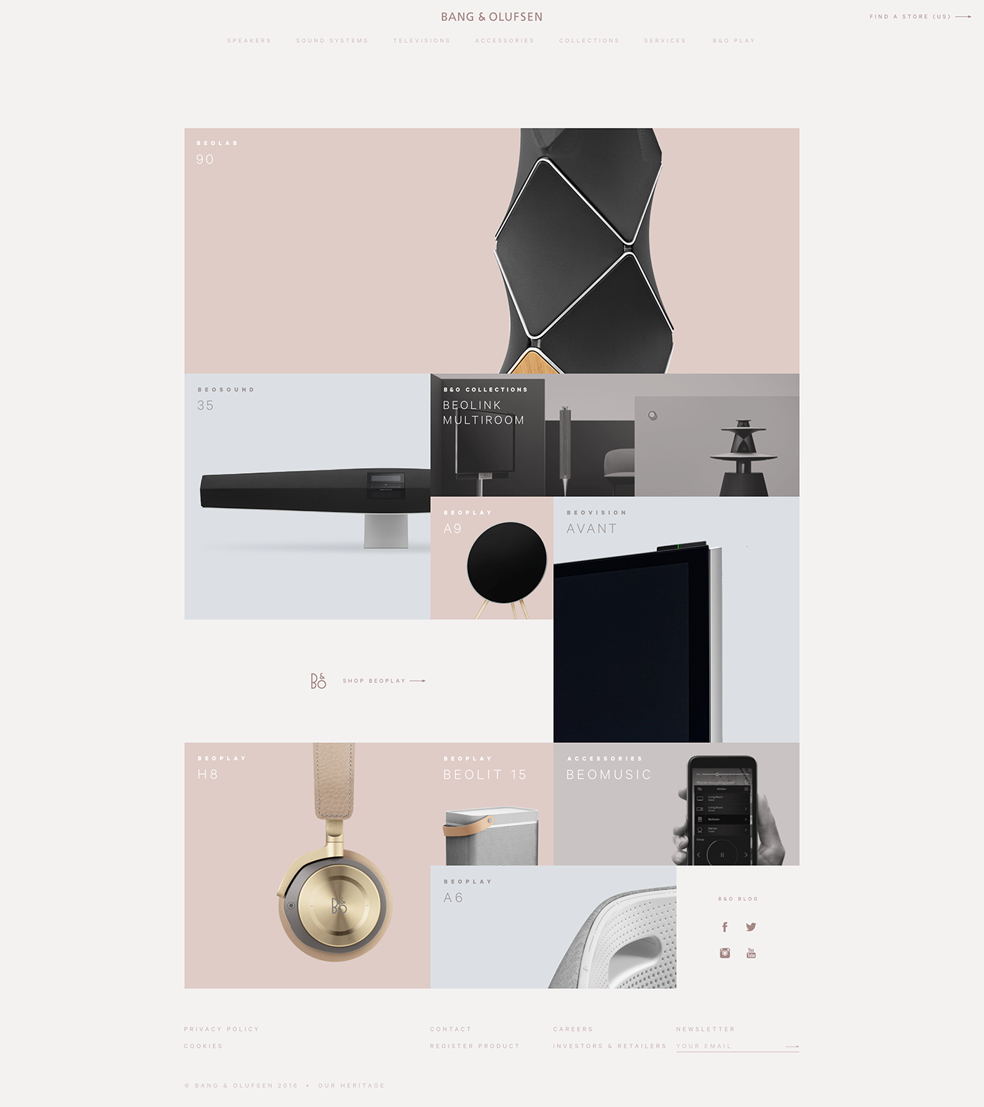
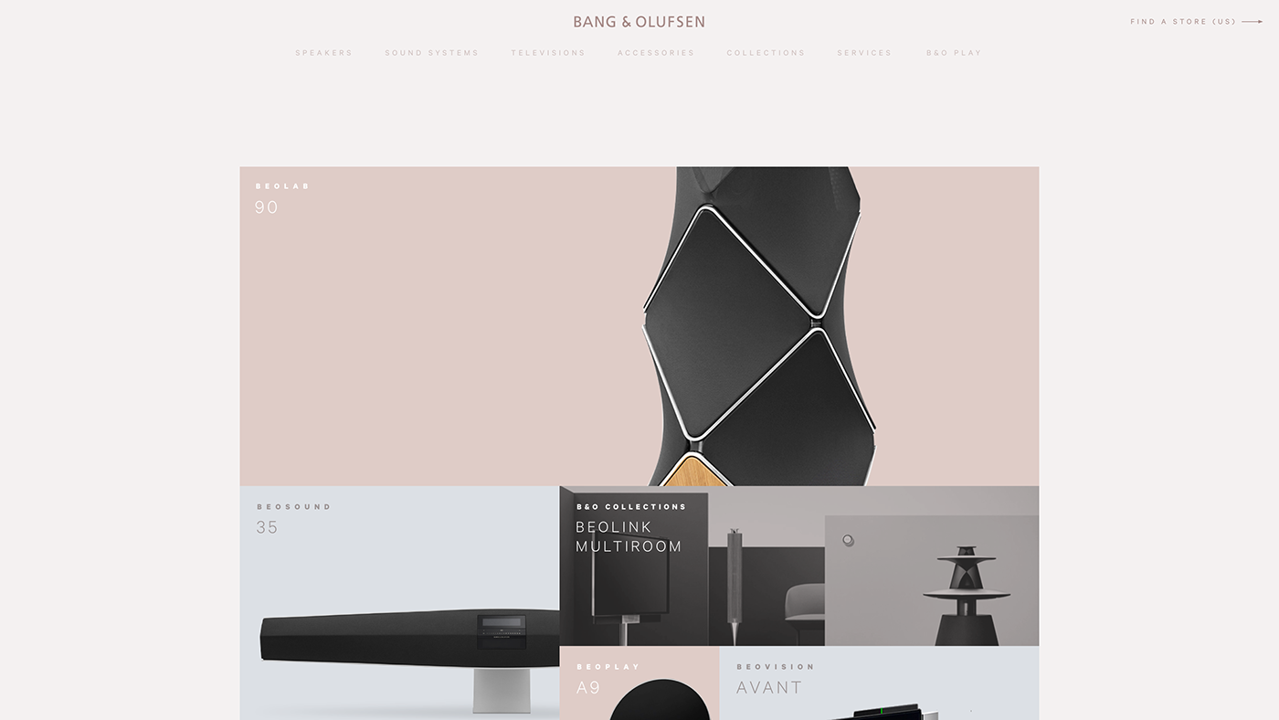
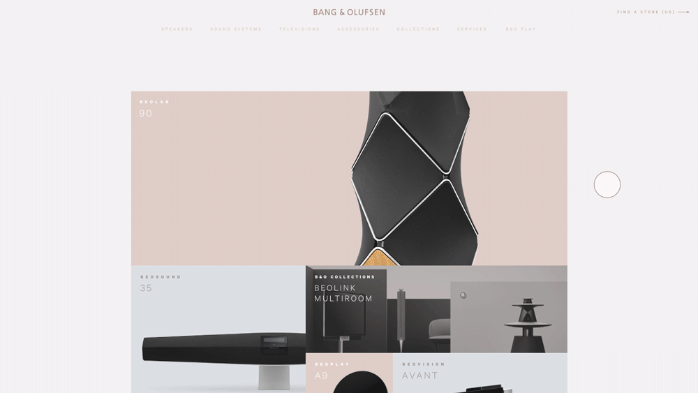
Full Homepage
The design uses a simple grid to showcase the products. The most important flagship product is featured at the top, taking up the most space (10 squares), with other flagship products taking up 4 squares, and so on. This grid shows more of the companie's flagship/popular products, and is also a simpler, more elegant solution than a full page scroll lock.
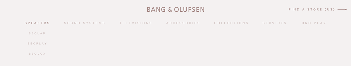
Navigation
Navigation bar • Tablet
Navigation is changed to the solution above from the two inaccessible (white on light background) menu buttons on the left and right side of the page on the current site. Nav bars are much more commonly used on other electronic product sites (Bose, Harman Kardon, among many others), and by bringing the product categories out of hidden menus, users can find what they want more easily and quickly. This style of navigation works for both desktop and tablet breakpoints but is changed to a single menu button for mobile.
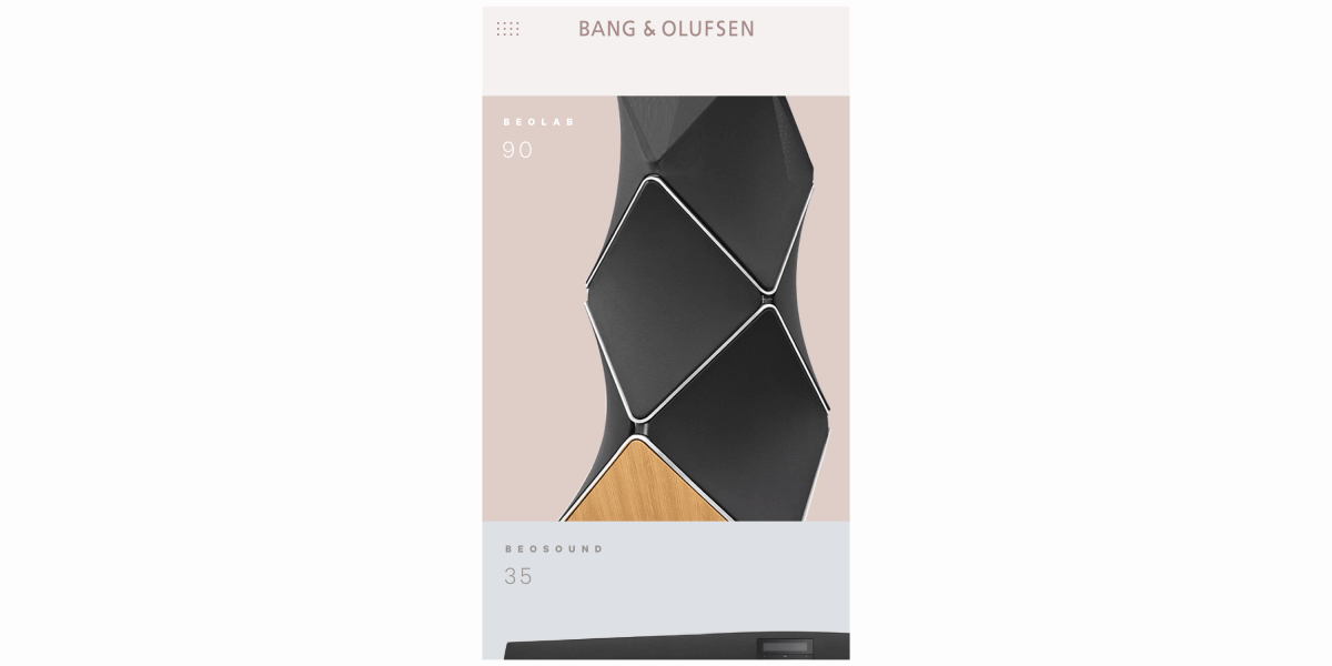
Mobile menu interaction
Mobile still shows off the products with great images and simple layouts but is a more basic experience, with the gridded boxes being condensed to a two column grid, and losing the hover effects since there's no mouse input.
Interactions
Desktop hover interaction
I wanted to keep the hovers simple and functional. The initial product image is a single shot on a colored background, and doesn't tell you much about the size or how to use it (it does show off the great design and details, though). Hovering brings up a photo of the product in context; for instance, the Beolab 90 loudspeakers are shown in a living room setting on either side of a television, letting the user know the relative size of the product, its intended use, and allowing them to visualize owning the product themselves.
Visual Design

Color palette

Typography
The current use of Gotham doesn't quite fit with the feel Bang & Olufsen is going for as the face is rather politically charged. I've opted for Calibre, a modern typeface that looks incredibly elegant in all caps, and pairs nicely with the color palette and product shots. The colors are a step away from the common black and white trend, choosing muted tones based on the sand/gold/taupe colors used on exising product pages instead. The dark brown is used primarily for clickable elements and type on the light gray, while the other 3 lighter tones are used to back the product shots in the homepage grid.


