Created in Art Center at Night Fall 2011
In our initial research on the HipChip concept we analyzed the competitors as a niche food product including Starbucks, Yogurtland, and Popcornopolis. These brands are recognizable and loved across the US and serve as a proof of concept in the market. We found the roots of these unique offerings could be found in the turn of the century ice cream parlours. The ice cream parlor created a common meeting place in each community serving desserts and other popular snacks. As a beloved part of the American history we hope HipChip can create the same atmosphere found in these parlours and their current day counterparts of coffee and yogurt shops.
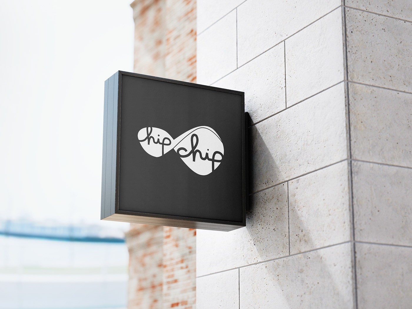
The design of HipChip borrows from the parlour aesthetic with a minimalist modern approach, specifically in the use of repeated patterns and a black and white color pallette. To create a pattern that would be uniquely HipChip we focused on the central feature of HipChip, the physical chip. After research of varying chip shapes and illustrations the HipChip icon was created to allude to the 3D shape with a solid figure and thin gesture line. This shape was created to become an easily recognizable extension of the HipChip brand and is used in combination with the logotype and as a tesselating pattern throughout the stationary system and packaging. The logotype again takes a modern approach to the classic script logo seen from classic brands of the period such as Coca-Cola. To support the logo all other text is set in Helvetica Neue attributes, an update of the classicly modern typeface.
The design of HipChip borrows from the parlour aesthetic with a minimalist modern approach, specifically in the use of repeated patterns and a black and white color pallette. To create a pattern that would be uniquely HipChip we focused on the central feature of HipChip, the physical chip. After research of varying chip shapes and illustrations the HipChip icon was created to allude to the 3D shape with a solid figure and thin gesture line. This shape was created to become an easily recognizable extension of the HipChip brand and is used in combination with the logotype and as a tesselating pattern throughout the stationary system and packaging. The logotype again takes a modern approach to the classic script logo seen from classic brands of the period such as Coca-Cola. To support the logo all other text is set in Helvetica Neue attributes, an update of the classicly modern typeface.