


Stationary Branding Package - I designed all of the branding collateral to clean and simple.
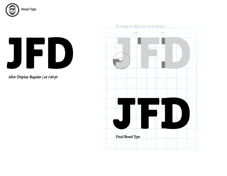
Logotype Development - Using Aller Regular as a base, I added some serifs and extended the curve of the "J" to make it more consistent with the overall brand.

Logomark Development - The final version is based on a previous iteration. I simplified the head outline and used geometrical shapes to create a more visually pleasing form.

Brand Colour Development - I explored several options, narrowing it down to 5 top colour combinations. I chose the blue/grey option because it was less busy, more solid, and simply worked better on an instinctual level.


