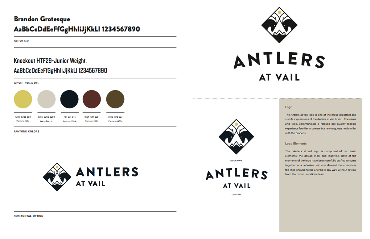
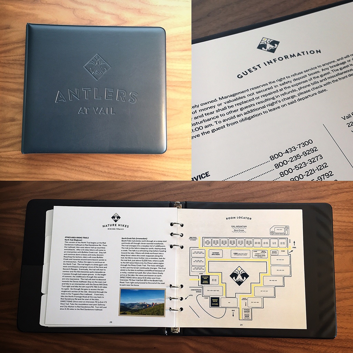
Denver-based Wigwam Creative was asked to create a fresh logo for, Antlers at Vail.
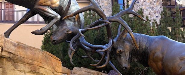
The new logo needed to have a modern feel while incorporating the Colorado mountain resort town’s European vibe. We were also asked to visually capture the hotel’s popular elk antlers theme – most noted by an iconic bronze statue of two clashing elk in the hotel’s courtyard, a favorite photo opp for guests from around the world.
Stylized snow-capped mountains and a yellow sun complete the logo, while offering a hat tip to Vail’s renowned skiing as well as Colorado’s famously sunny weather.

We loved this feedback from the General Manager of Antlers Vail, Rob LeVine.
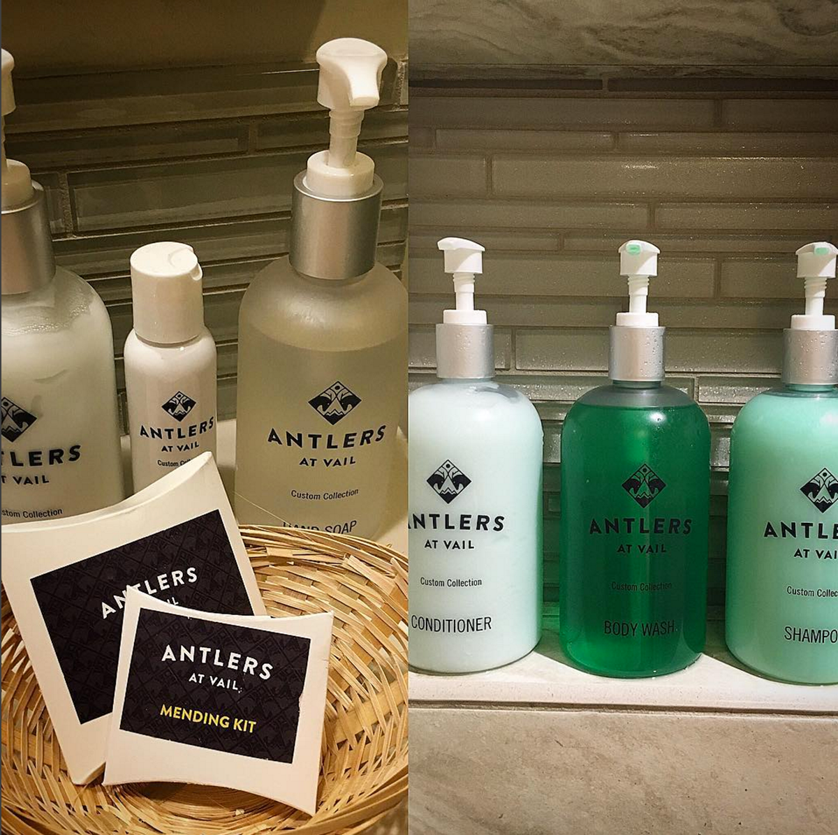
“Our logo and corporate identity was 40 years old, and as comfortable as we were with it – too comfortable, probably – as we began to see the amazing results of our Unit Quality Improvement plan moving us toward becoming an overall Platinum-rated property, we realized it was time for a new logo and visual brand to represent the new Antlers,” says Antlers GM Rob LeVine. “Both because of our name and our well-known courtyard sculpture, we felt it was important to keep the elk and antlers as part of our logo. Plus, we wanted to convey that although we look better, our values remain the same, emphasizing our ‘the answer is yes, now what is the question’ approach to customer service, our family feel and our strong role as a community partner.”