


Logo and Promotional Materials
Chicken Teriyaki Bingo Productions
Chicken Teriyaki Bingo Productions
THE CRUMBLES is an independent film written and directed by Akira Boch. The film is a slice-of-life tragicomedy that follows the humorous hardships of an awkward and awesome indie band struggling to make it out of their own proverbial garage. The film was a true labor of love for everyone involved—low on budget, big in heart.
To carry this independent spirit through the design, I knew the type treatment for The Crumbles logo had to be created by hand. Using a stylized, handwritten font wasn't going to cut it. It had to feel authentically unique, just like the film itself.
To carry this independent spirit through the design, I knew the type treatment for The Crumbles logo had to be created by hand. Using a stylized, handwritten font wasn't going to cut it. It had to feel authentically unique, just like the film itself.
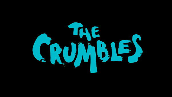
To create an all-encompassing identity, I needed to approach the design in a way that would take into account the different uses, both on screen (the opening credits as well as the website) and off (printed material and other film-related ephemera). Early on, I had the idea to do a stop-motion animation of the title "crumbling" for the opening title sequence. Knowing I would eventually end up with the movie's logo, I set the stop-motion animation as my first task.

I used aluminum foil to create the type and photographed it at different stages of "crumbling." The typography needed to express the true-to-life-DIY sensibility of the movie, so I modified the images in Photoshop, then created a jerky, unrefined movement for the animation sequence. The logo that resulted conveyed the rough-around-the-edges look I was going for.
Here is the opening title and credit sequence, as it appears in the film:
Here is the opening title and credit sequence, as it appears in the film:
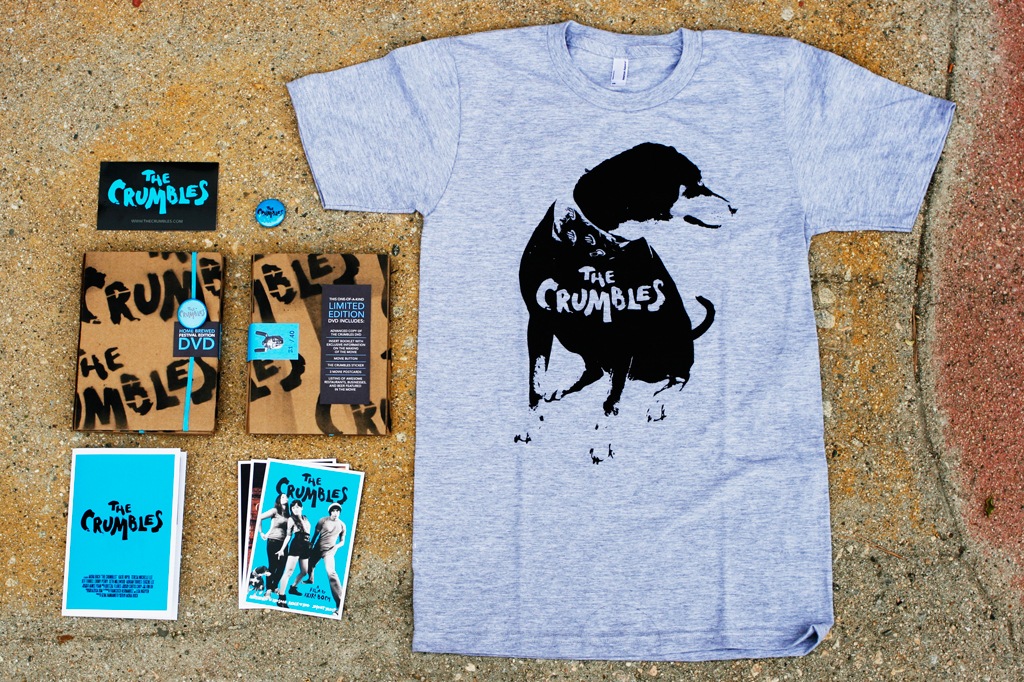
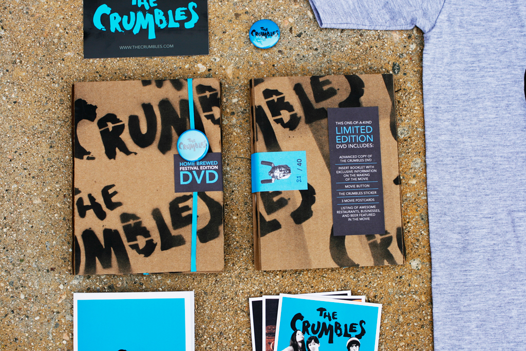
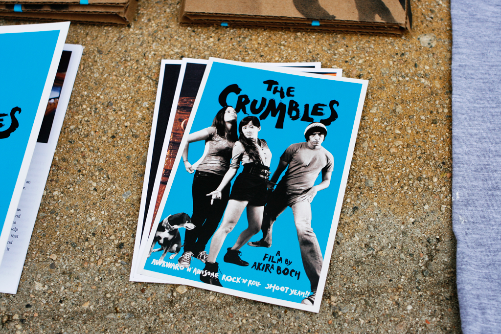
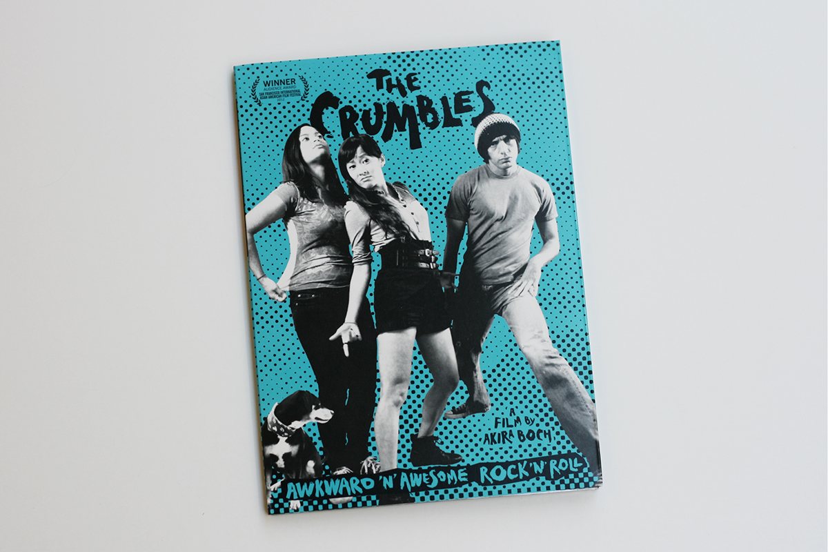
Since the film is about a fictional band, it made sense to take advantage of the marketing methods used by real bands. We made buttons, stickers, and t-shirts to promote the film and sell at screenings and on the website. For festival programmers and media outlets, I designed a limited edition DVD press kit. The edition of 40 was handmade and included the press kit, DVD, and other bonus items like movie postcards and information on the locations featured in the film.


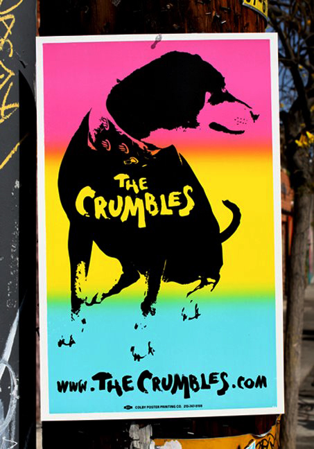
In addition the promotional materials pictured above, our co-producer, Francisco Hernandez, had the brilliant idea of using the iconic LA street posters to promote the film. These posters, with their tri-color gradation, are often seen in Los Angeles promoting anything from concerts to conventions and political campaigns. We took to the streets on a late night and plastered these in key locations around the city.
For more information about the film, get updates on future screenings, purchase a t-shirt or poster, or get a free song download from the film, visit The Crumbles website.
And "like" The Crumbles on Facebook.
Postcards were printed by Next Day Flyers.
Buttons were produced by Busy Beaver Button Co.
T-shirts were screen printed with water-based inks by Blacklava.
Posters were silkscreened by Colby Poster Printing Co.
And "like" The Crumbles on Facebook.
Postcards were printed by Next Day Flyers.
Buttons were produced by Busy Beaver Button Co.
T-shirts were screen printed with water-based inks by Blacklava.
Posters were silkscreened by Colby Poster Printing Co.


