
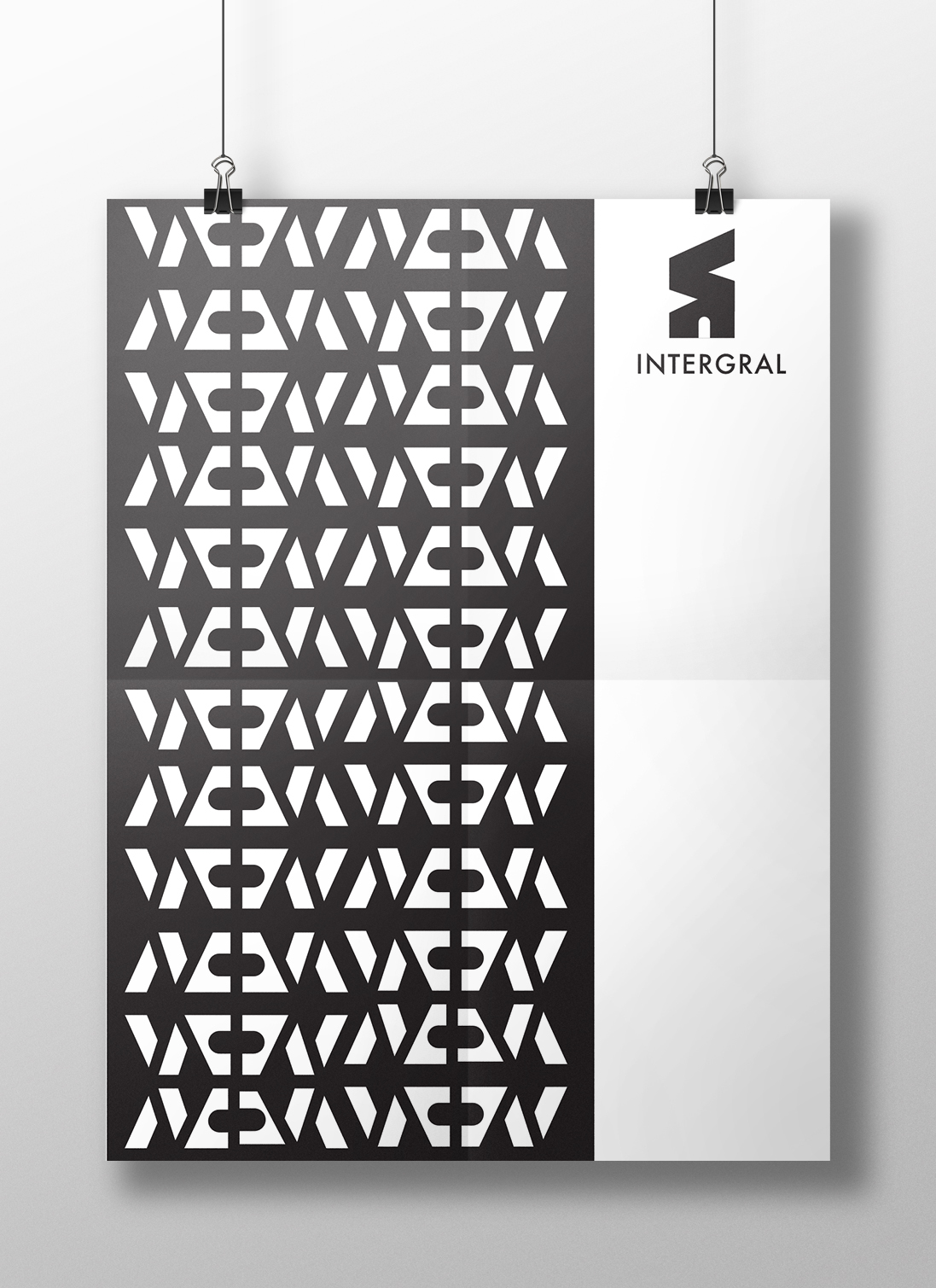
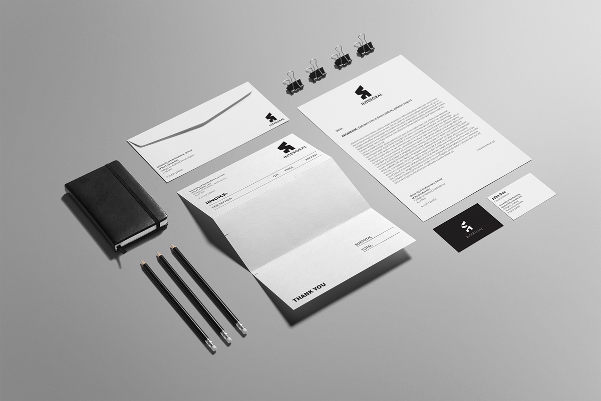
Intergral
The logo is designed after the shape of the Mathematical integral glyph ( ∫ ). The name INTEGRAL was selected as the meaning of this word is essential or fundamental; necessary to make a whole complete. This beautifully fits in line with what the company is doing, designing spaces to make them look complete. The door shows us into the world of architecture, while the rectangular shapes give perspective and can be interpreted to be the walls indoors or outdoors.
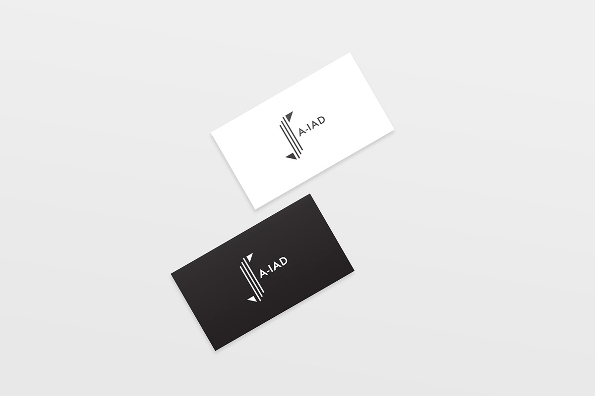
A-IAD
As this logo has to be relevant and representative of the main design logo, it follows the shape of the Mathematical integral glyph. The three lines represent simplicity, modernity and reliability, which is key to any architectural design. The triangles are pointing in different directions, to suggest that the courses in A-IAD push students to expand their boundaries in all directions.
This project was commissioned by University of Hertfordshire, School of Creative Arts

