
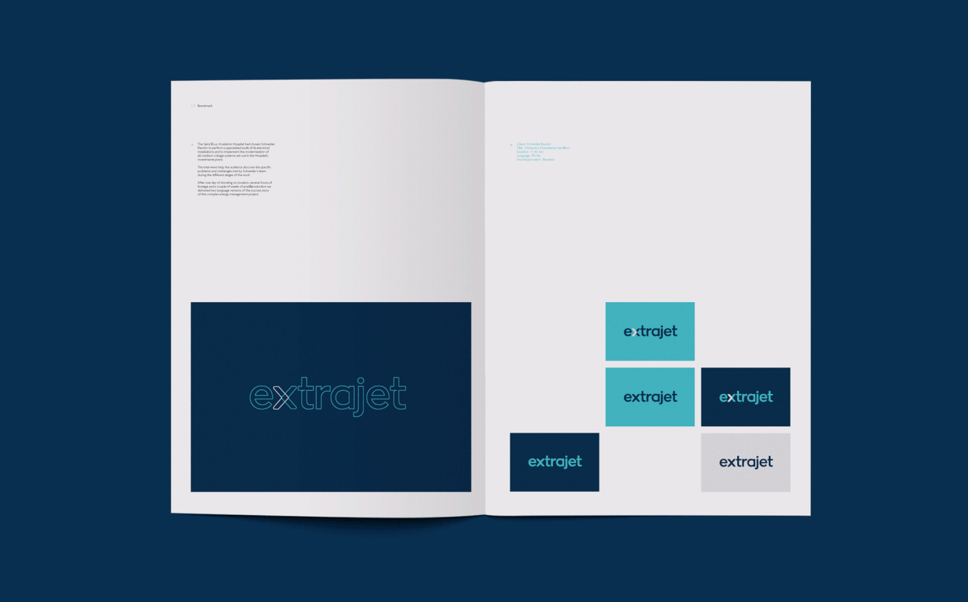
More than an Airline
Set to launch in 2017, Extrajet is a new airline which is focused specifically on the European business traveller sector. Extrajet will offer twice daily, direct, full service flights from Leeds to Copenhagen and Antwerp. The airline is unique in offering a solely Business Class service and experience which is encapsulated by the tagline ‘more than an airline’.

Crafting the Identity
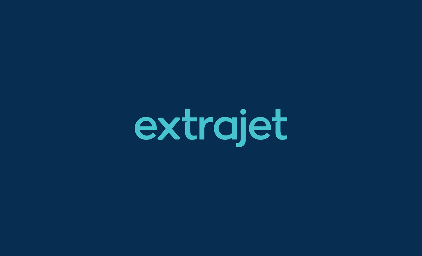
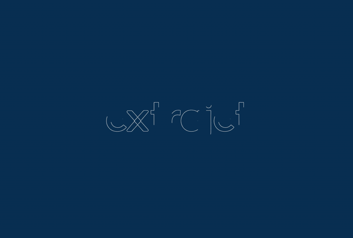
The wordmark has a contemporary, round form which aims to feel modern and friendly, while still maintaining a corporate and reassuring edge. It was important for these qualities to be conveyed across the brand. Small angular cuts in the ‘x’ and ’t’ letterforms reference the shapes and form of the flagship Extrajet aircraft, the Embraer 135 jet.
Building the Brand
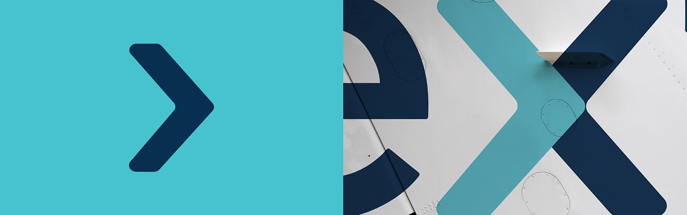
It was important that Extrajet was recognised as being a strictly business airline. Equally important in the crowded airline market was for the brand to own a distinct colour-way. For this reason there is a tight palette of 4 key colours; White, Black, Sky Blue and Navy Blue. The Graphical Device is drawn from the Extrajet wordmark and forms the shape of a forward facing arrow, which references the unbeatable service the brand has to offer and informs the tagline ‘more than an airline’.
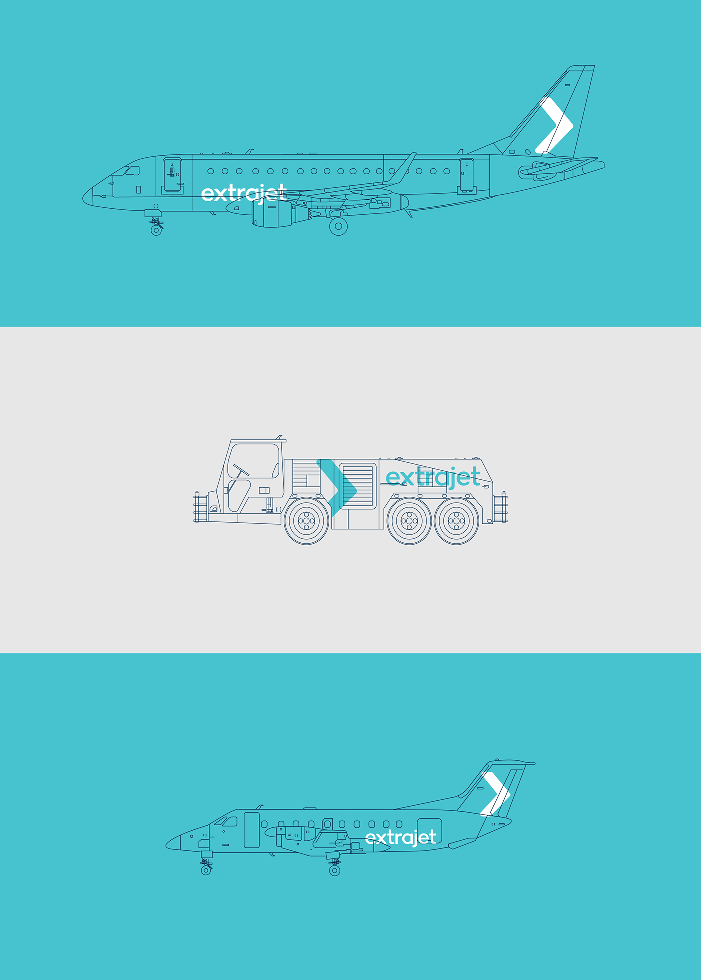
Embraer 135
The Embraer 135 is the primary aircraft in the suite of Extrajet vehicles. Powered by two turbofan engines, the quaint, 37-seater aeroplane emphasises the focus on the brands commitment to quality and service. Fewer people on each flight ensures that the service is bespoke to the individual and everybody is catered for.
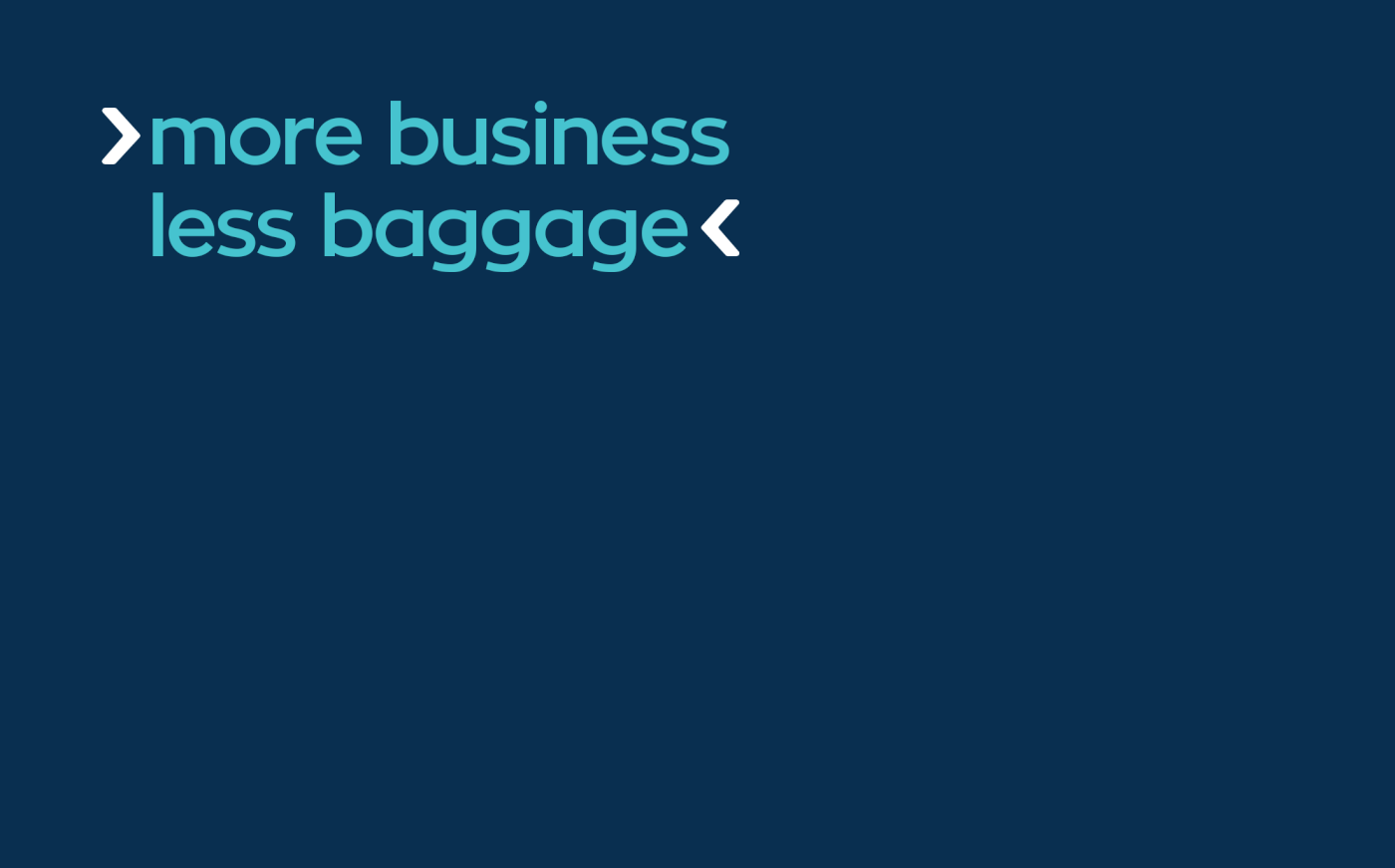
More Business, Less Baggage
It was clear from speaking to the CEO of the company that the brand needed to have a straightforward approach that didn’t beat around the bush. To help push this idea, we developed a messaging platform that is built around the ‘more/less’ concept. The headlines created are purposely witty and a little bit tongue-in-cheek, which is epitomised by the leading headline ‘more business, less baggage’.
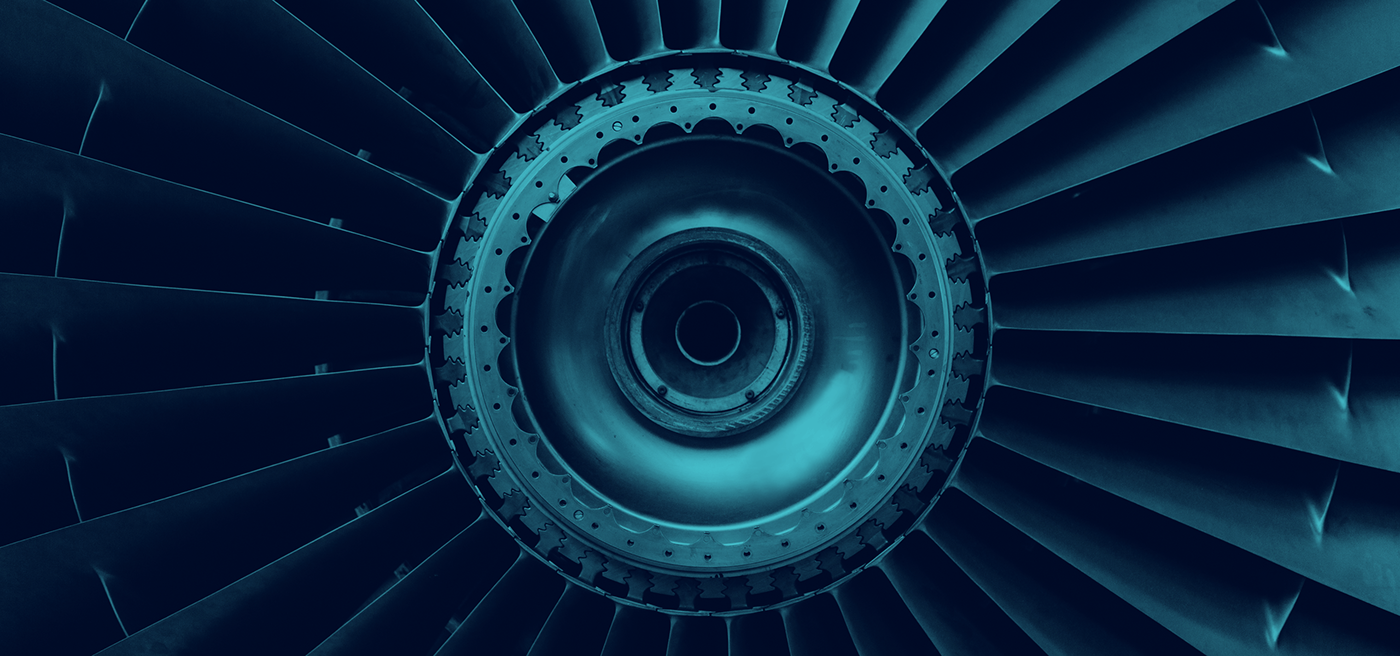
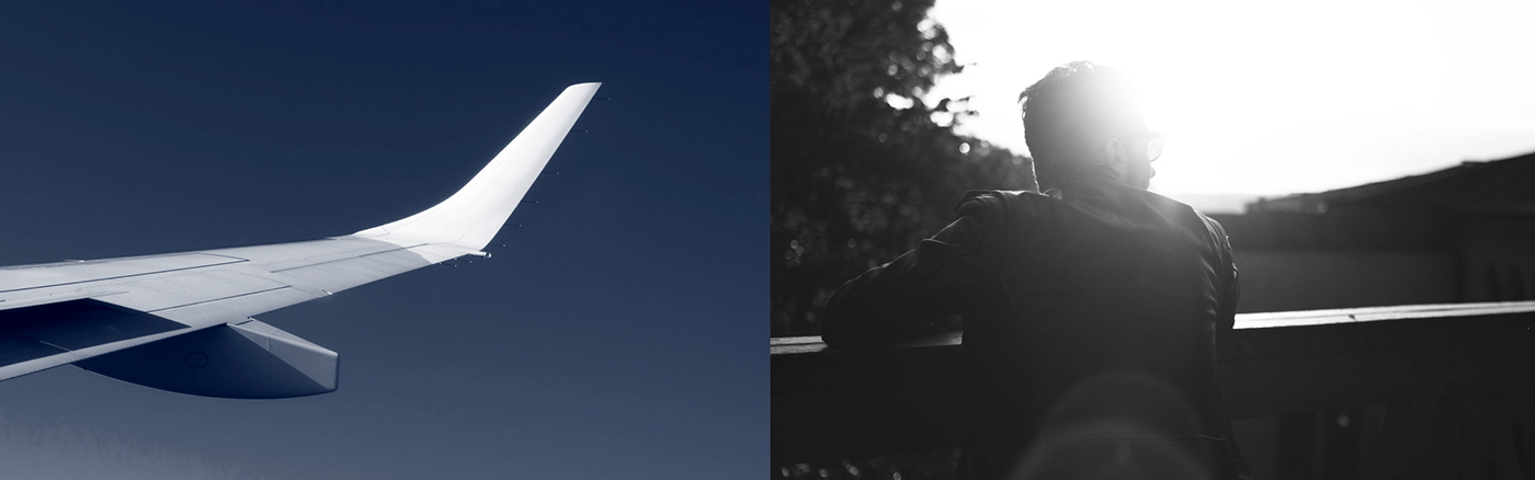
It's all in the Detail
We wanted to take a slightly different approach to the photography than competitors in the same field. To emphasise the premium side of the brand, we focused on close crops and details that lie within the beauty of a well-crafted aircraft and combined these with lifestyle-focused imagery of business travellers.
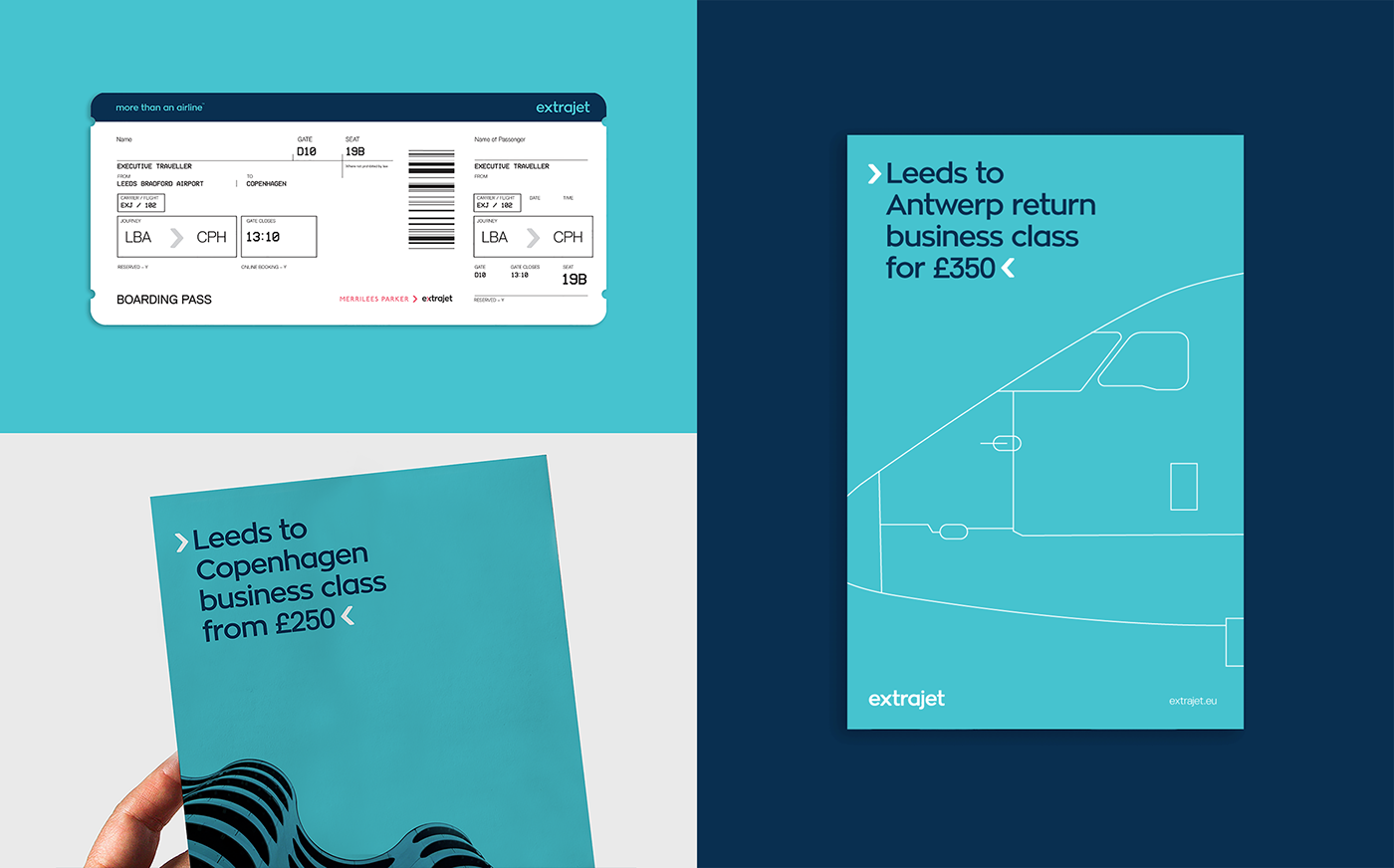
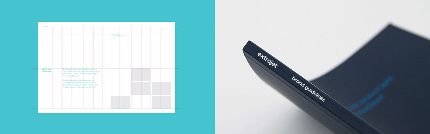
Bringing the Brand to Life
The print material shows basic examples of how the brand starts to come to life through the combination of colour, typography, messaging and imagery.
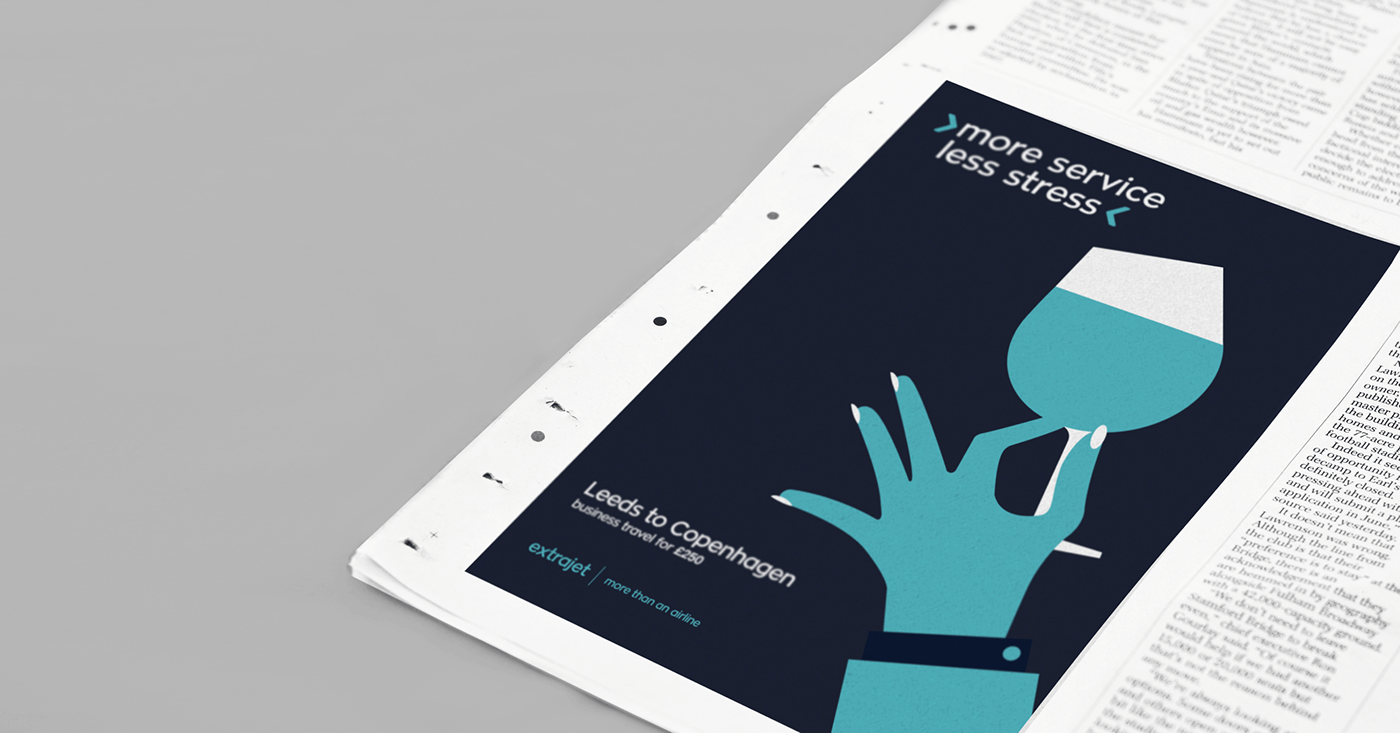

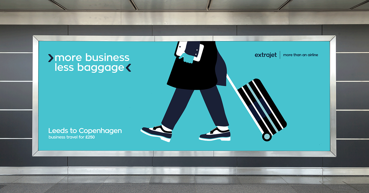
Clean, Corporate & Concise
For the brand launch, we created a series of illustrations that focus on business travellers and the unique service that Extrajet offers them. We opted for a clean and flat style of illustration that emphasises the recognisable brand colours and delivers the message in an instant and clear way.
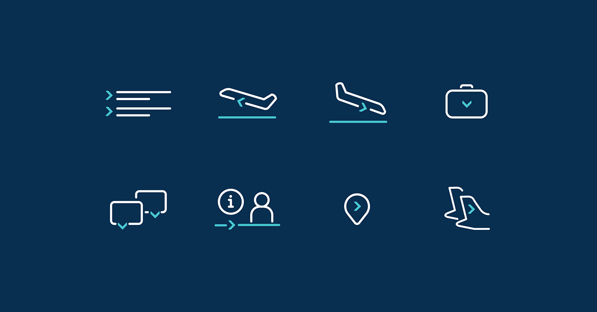
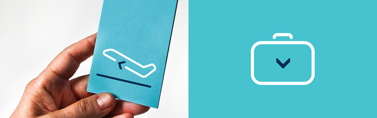
Information is Key
We created an icon suite for the brand that utilises the ‘arrow’ graphical device whilst also creating a clear visual key relating to key areas of the brand. The icons are used as visual aid across all deliverables ranging from informative documents to way-finding systems.
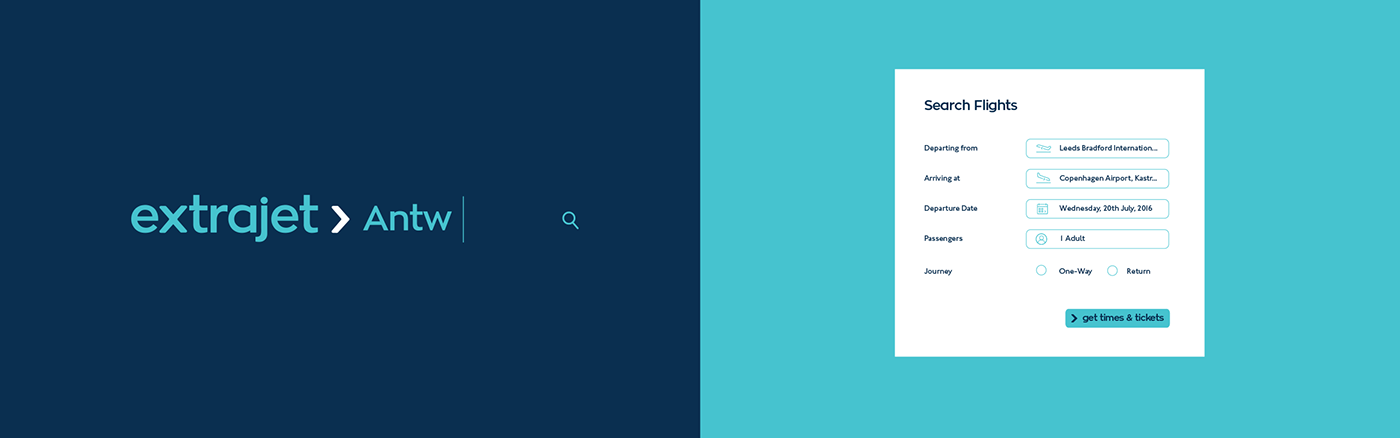
User Interaction
Aimed at business travellers, a simple and clear UI was key to ensure the user experience was fast and efficient. The easily identifiable colour palette, typography and icon suite helped create a user interface for the Website and App that was easy to navigate and clear to understand.

Thanks for scrolling
To see the full case study, visit our website;
madebyalphabet.com
Want to work with us?
Want to work with us?
Copyright Alphabet Design Agency Ltd 2021. All Rights Reserved.