
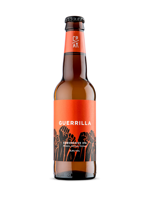
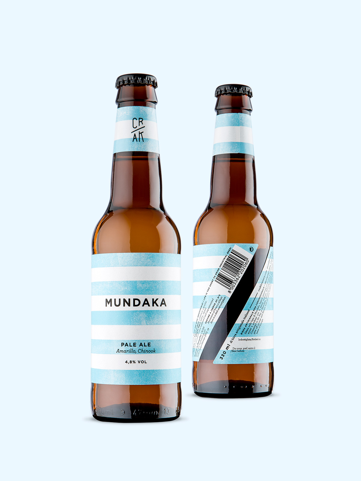
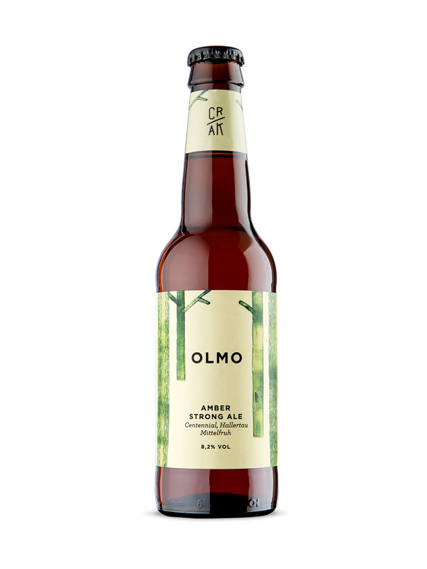
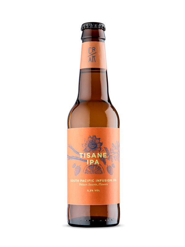
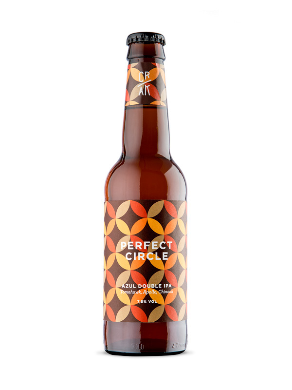
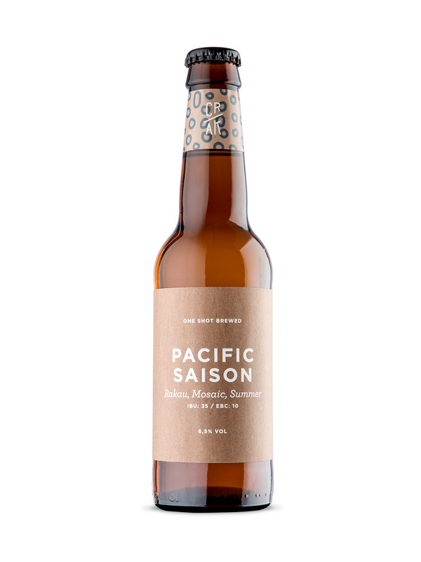
This project is a re-branding of the brewery "OLMO". They decided to change the name in CRAK (Creative Revolution, Alternative Knoledge) and change all the brand identity. the new image had to communicate that they produces nonconformist beers that dare to combine unusual ingredients and massive doses of hops – with no compromises, and only one unwavering commitment: balance and integrity.
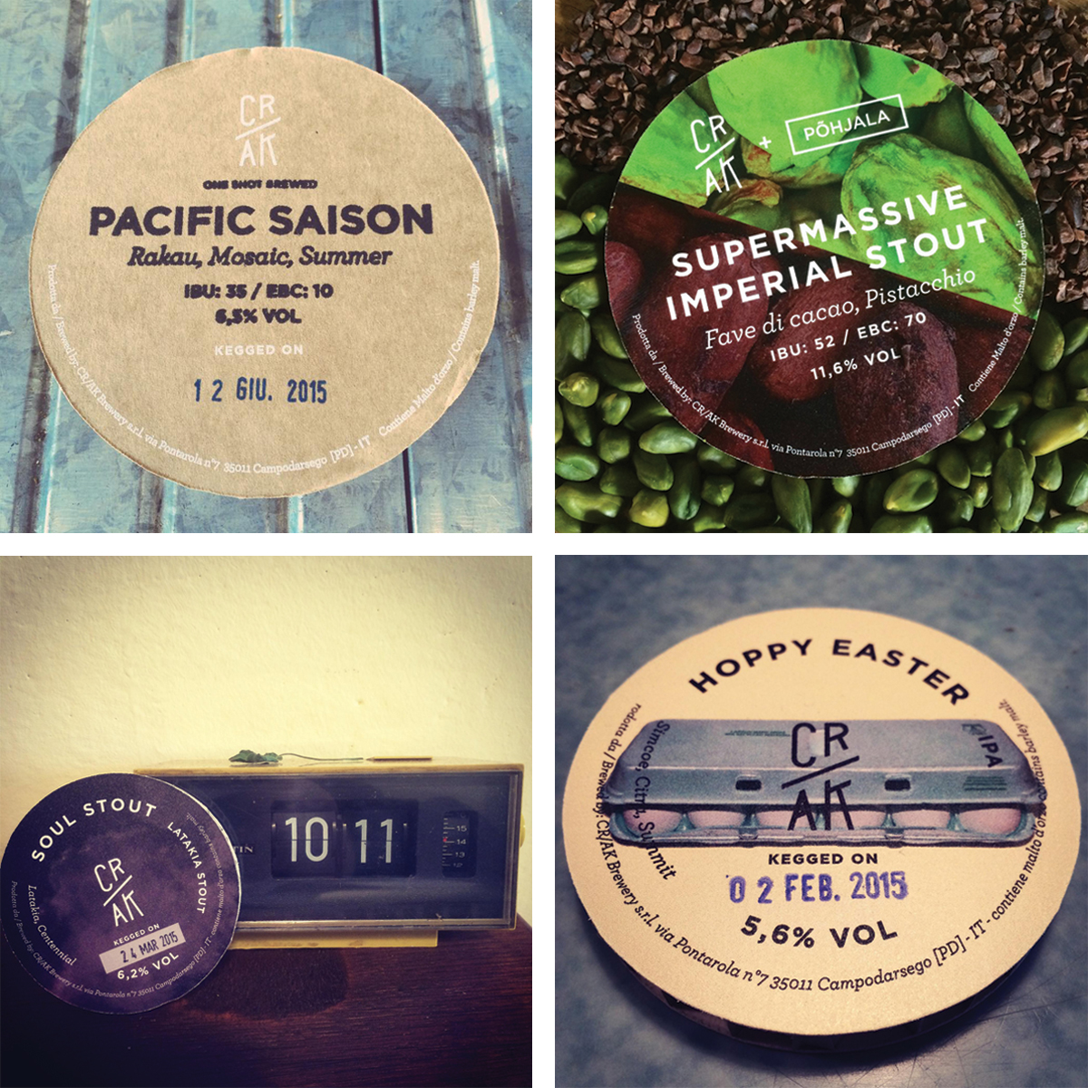
The project was ambitious, the guys wanted a strongly recognizable line of bottles, but in same time they asked for a freely interpretation of each single label (with a photo, an illustration, or anything would evoke that particular beer).
So, to give recognizability, we played with the label shape, which refers to the concept of rupture (cra-c-k), such as the "slash" of the logo. The typography is clean to match with the different styles of each bottle ... Cheers!
website here: http://www.crakbrewery.com/


Bottles still life: Marco Peruzzo


