The members involved with Women in Banking & Finance are a diverse, vibrant and straight-talking group. Their aim of empowering, supporting and celebrating women in the industry is one that has had immense success since their inception in 1980. This is how I worked to overhaul their brand, helping the organisation live up to their formidable reputation.

Homepage visual
MY ROLE
I led the rebrand and website design for WIBF, working with a technical lead to deliver an impactful, modernised responsive website.
THE CHALLENGE
"A group of people in high-powered positions with high expectations."
With members from all levels, including women at the top of their game in high-powered positions, WIBF work for and with a group of women who have high expectations, offering networking, educational events and mentorship. Their brand however, didn’t live up to these expectations. Their look and feel was dated and bland, the messaging didn't say anything in particular, and the website was a piecemeal affair that led to confusion. I was tasked with revamping their brand and website, creating a look and feel that would invigorate their current members and entice new, and a website that would streamline their offering.
THE DISCOVERY PHASE
I worked with a great team at WIBF who were keen to share as much insight into their organisation as possible. We kicked off with an in-depth briefing session with stakeholders, and I then moved onto a concise research phase which included user and member surveys, a brand review, competitor research and audience profiling. I also ran a brand workshop with some key members which enabled me to get a good insight into how they saw the WIBF brand and organisation.

Competitor positioning

Brand workshop exercises

Example audience profile
CONCEPTS
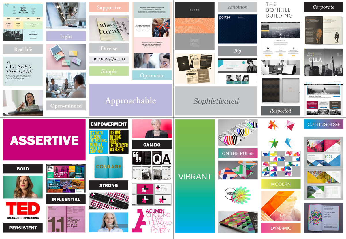
Working with an organisation such as WIBF where there are a number of stakeholders and agreement on direction has to be across the board, means that care has to be taken in bringing everybody along with the branding process. As a designer this means that you get to interact with a broad range of decision makers much more, breaking the project down into smaller phases to ensure everyone feels involved. So for the conceptual phase of this project I first presented not a set of brand visuals, but a discussion on values and personality, alongside visual mood boards. This allowed me to distill the research into distinct categories, summarising the brand in a number of ways, and meant we could have a lively chat on where we should position the brand.
My chats with WIBF soon revealed that they needed a brand that summarised their dynamism, inclusiveness and supportive nature, but that also showed them as a forceful organisation with real influence.

Mood boards
THE BRAND
"Leading the industry"
The brand that I developed is all about the strong women (and the men championing women), from all career levels, who are at the heart of the industry. They are not afraid to say what needs to be said. They strive to go the furthest. They lead from the front. They drive change. They encourage solidarity. Confident, challenging and straight-talking, these women are proud of their acheivements and how WIBF have helped them get where they are, wherever that be. They inspire others with their stories, encouraging other women to join WIBF and help lead the industry.

Concept sketches and notes

The logo

Visual marketing concepts
As part of the branding phase, I developed the new WIBF logo, visual concepts, copywriting and photography style. To give them a head start, I produced concise brand guidelines and document templates for their internal use.

Brand guidelines
THE WEBSITE
Having established a solid grounding for the new brand and having gained a good understanding of the organisation in previous phases, I began work on the online part of the project. Firstly I documented what already existed using information architecture and user journeys, which revealed a disparate website with content that didn’t sit in any part of the navigation and processes that were convoluted.
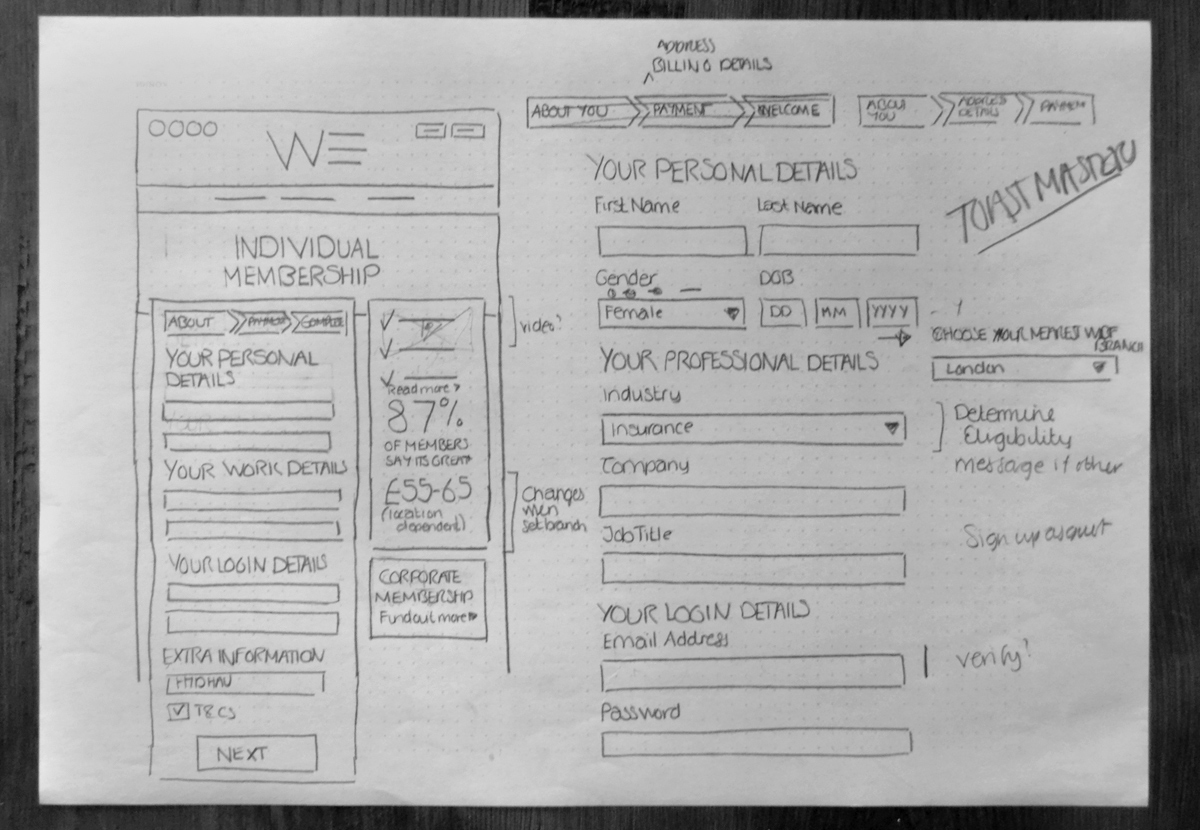
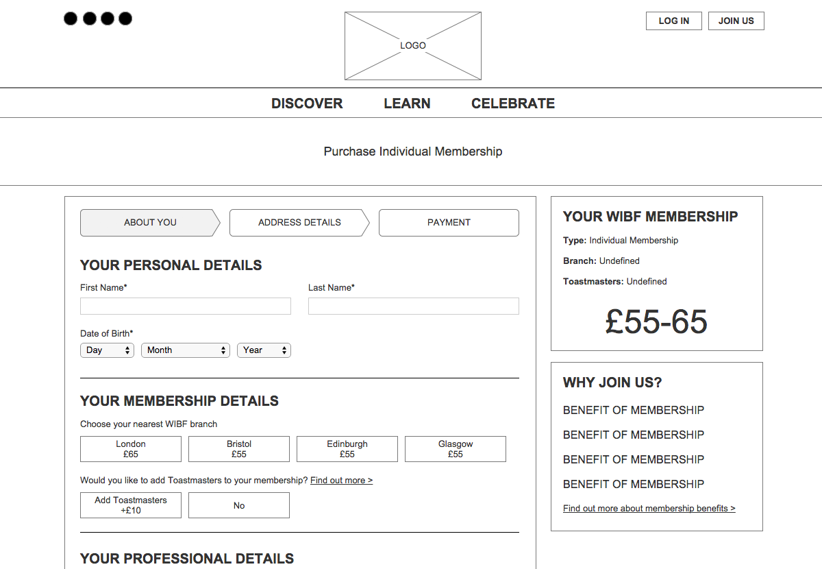
Taking what I had learnt and alongside the personas developed previously, I started to put together refined information architecture and user stories in order to establish the key features that the new site required. These were discussed and refined with the WIBF team so that we ended up with clear goals for functionality. With a structure in place, some initial visuals were developed in order to communicate website look and feel with WIBF, with full processes detailed using wireframes.

User stories

Information architecture

Low fidelity wireframes

Wireframes
WEBSITE LOOK AND FEEL
The website that I designed makes use of impactful member imagery, a vibrant colour palette and encouraging copywriting. Putting women at the heart of their organisation, using their own stories of success to encourage new and prospective members to get involved. See more at www.wibf.org.uk

Website

Website


