Concept
Emulating architecture, the notions of volumes and light, substances and materials are its founding principles.
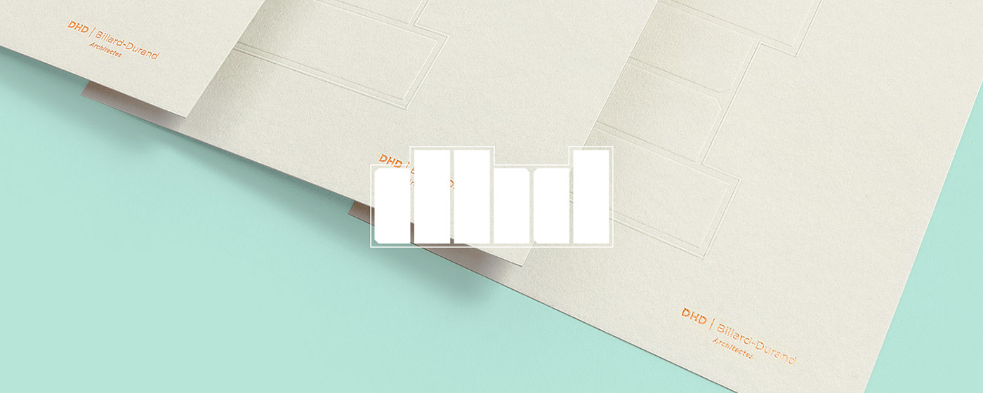
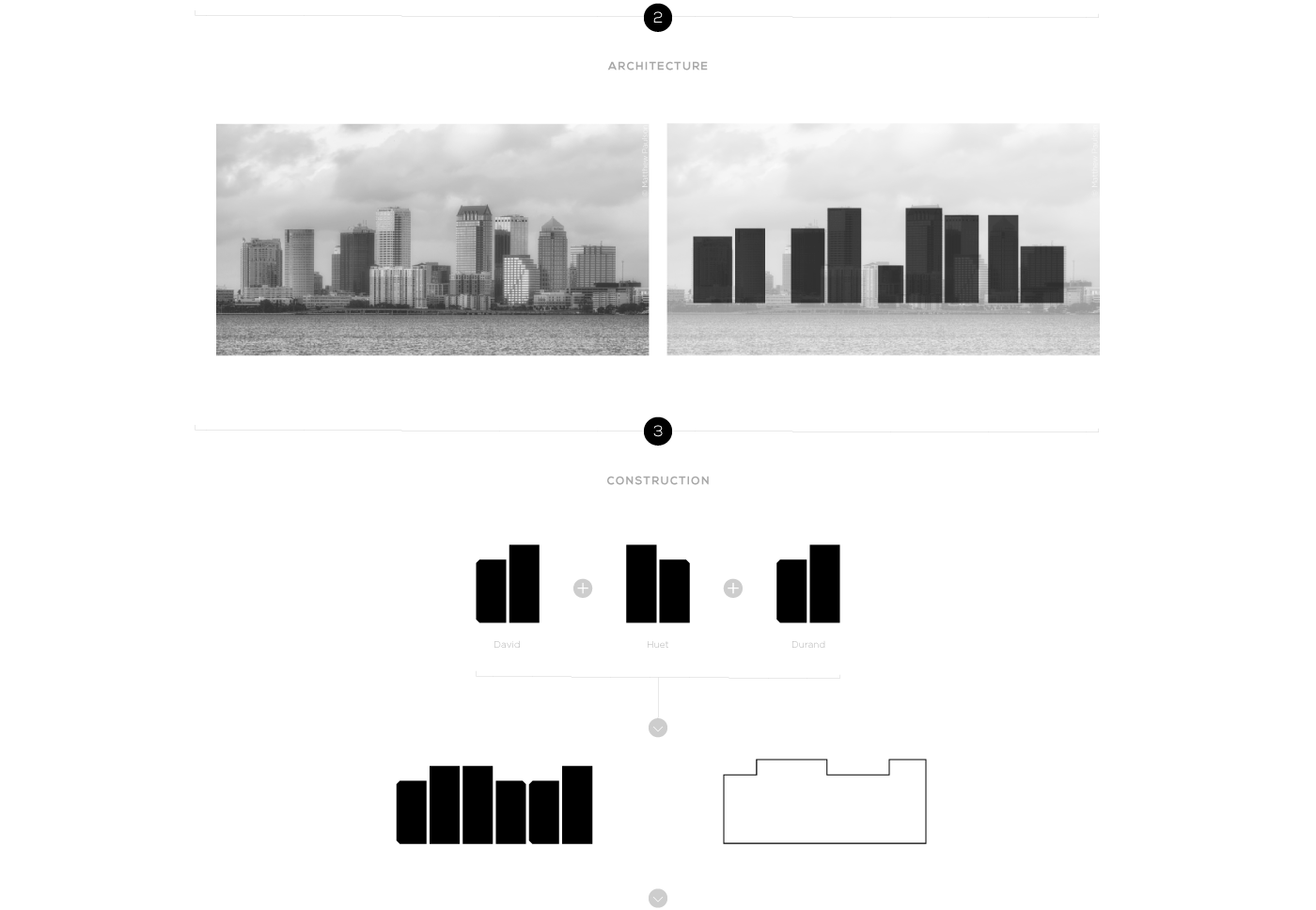
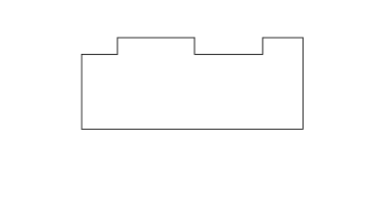
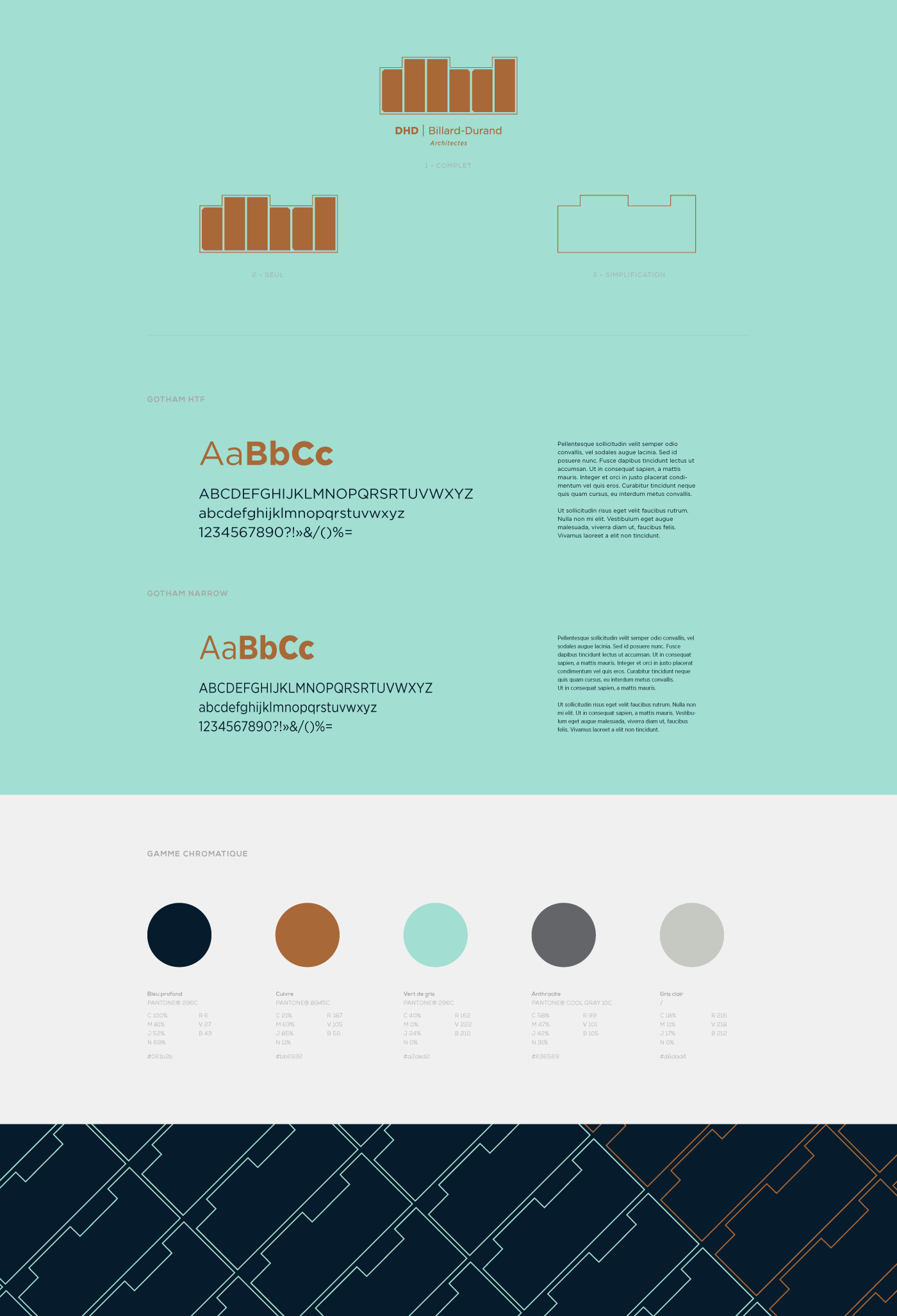
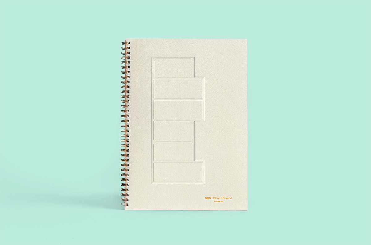
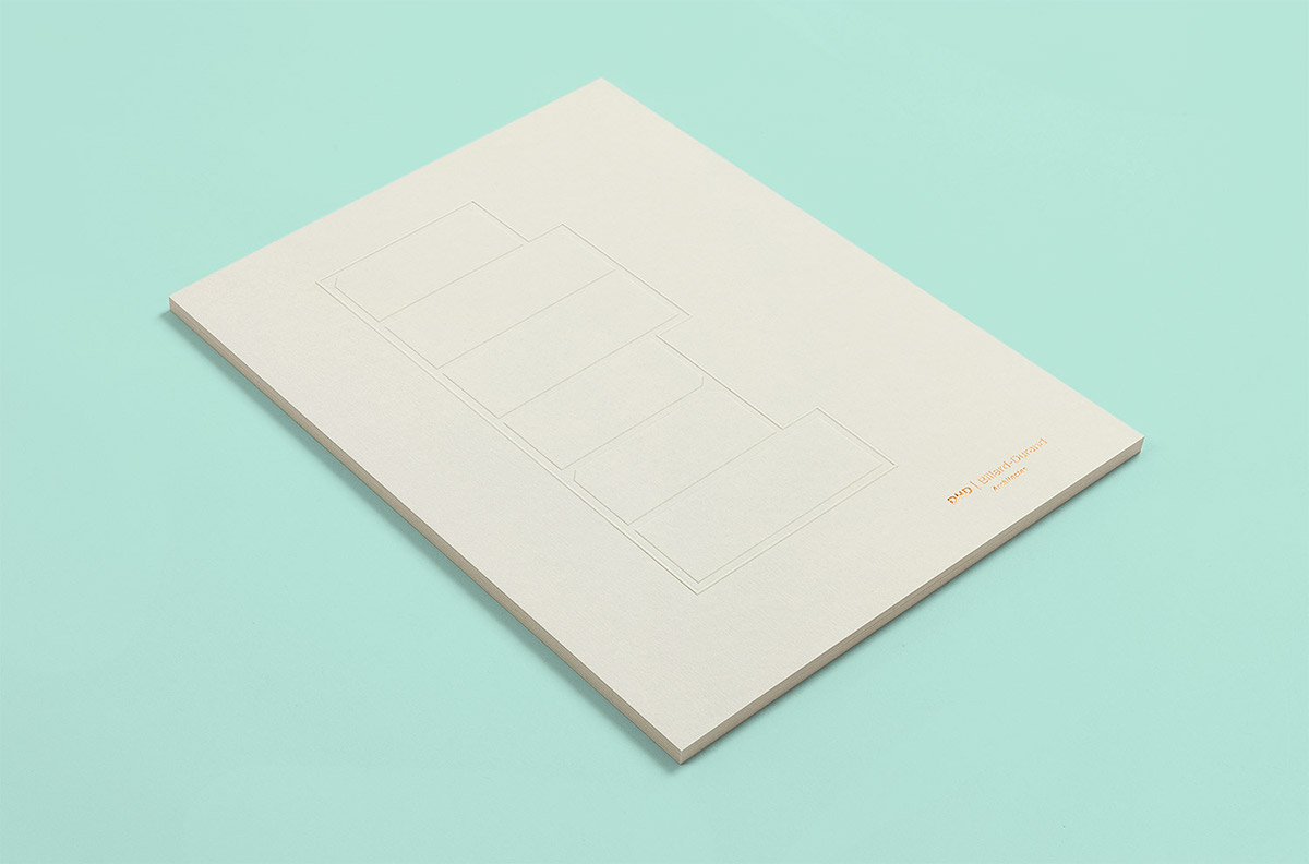
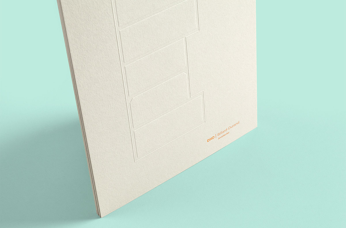
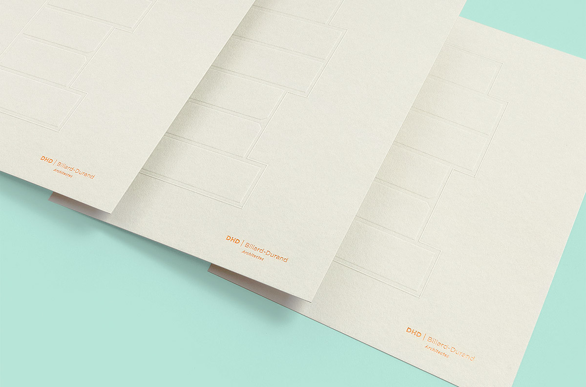
Supported by three architects who are driven by strong and singular characters, we came up with a logo using the first letter of all 3 associates’ names; forming the DHD acronym. We developed a logotype with powerful architectural and urban overtones, enabling us to bring into play those rhythmical notions that assert this new identity within its corporate identity and visual style. Deconstructing the logo enables you to reveal its potential and architectural connotations, whilst exploring its construction principle.

Visual identity
Our aim: to design a strong and singular identity featuring obvious architectural notions.
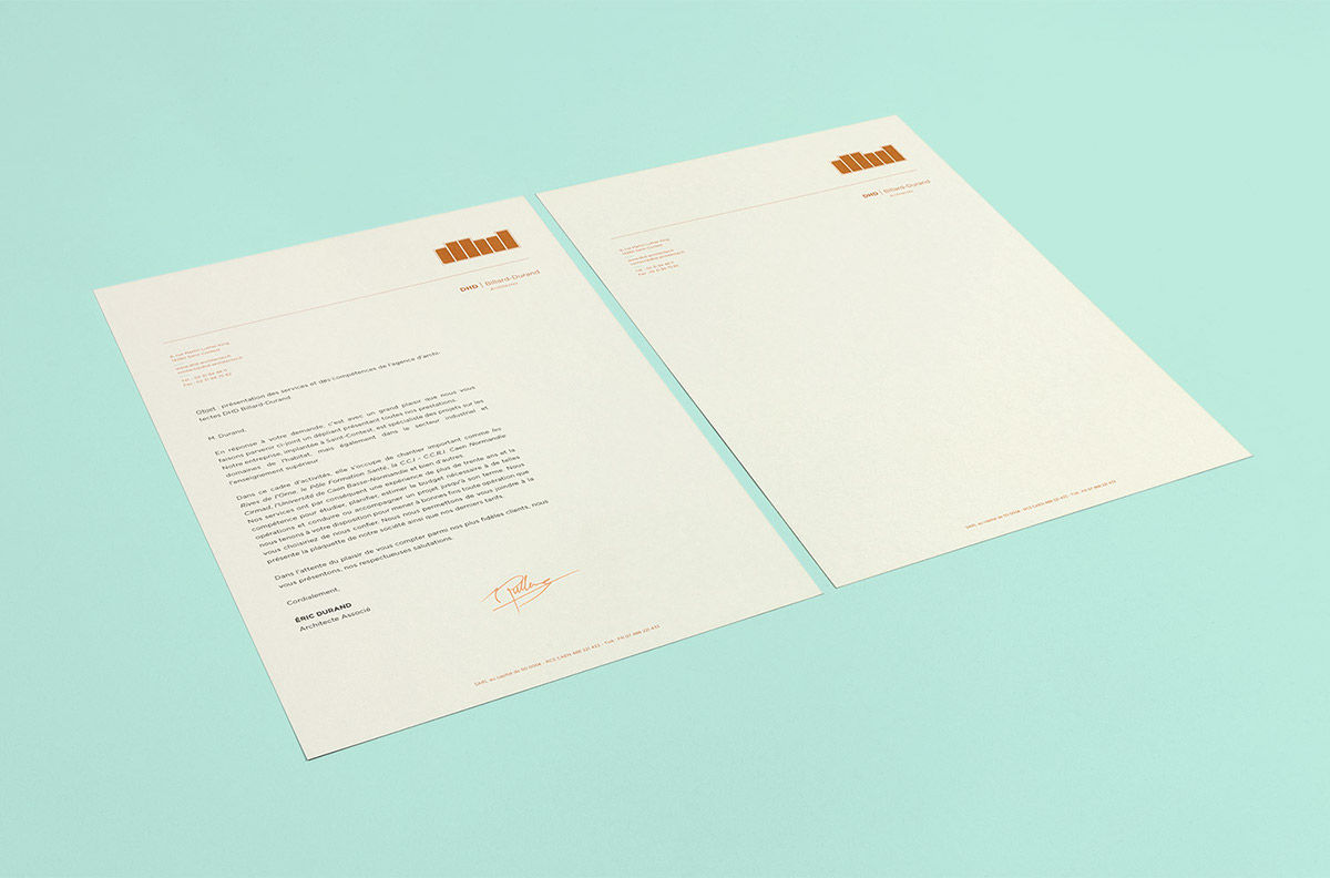
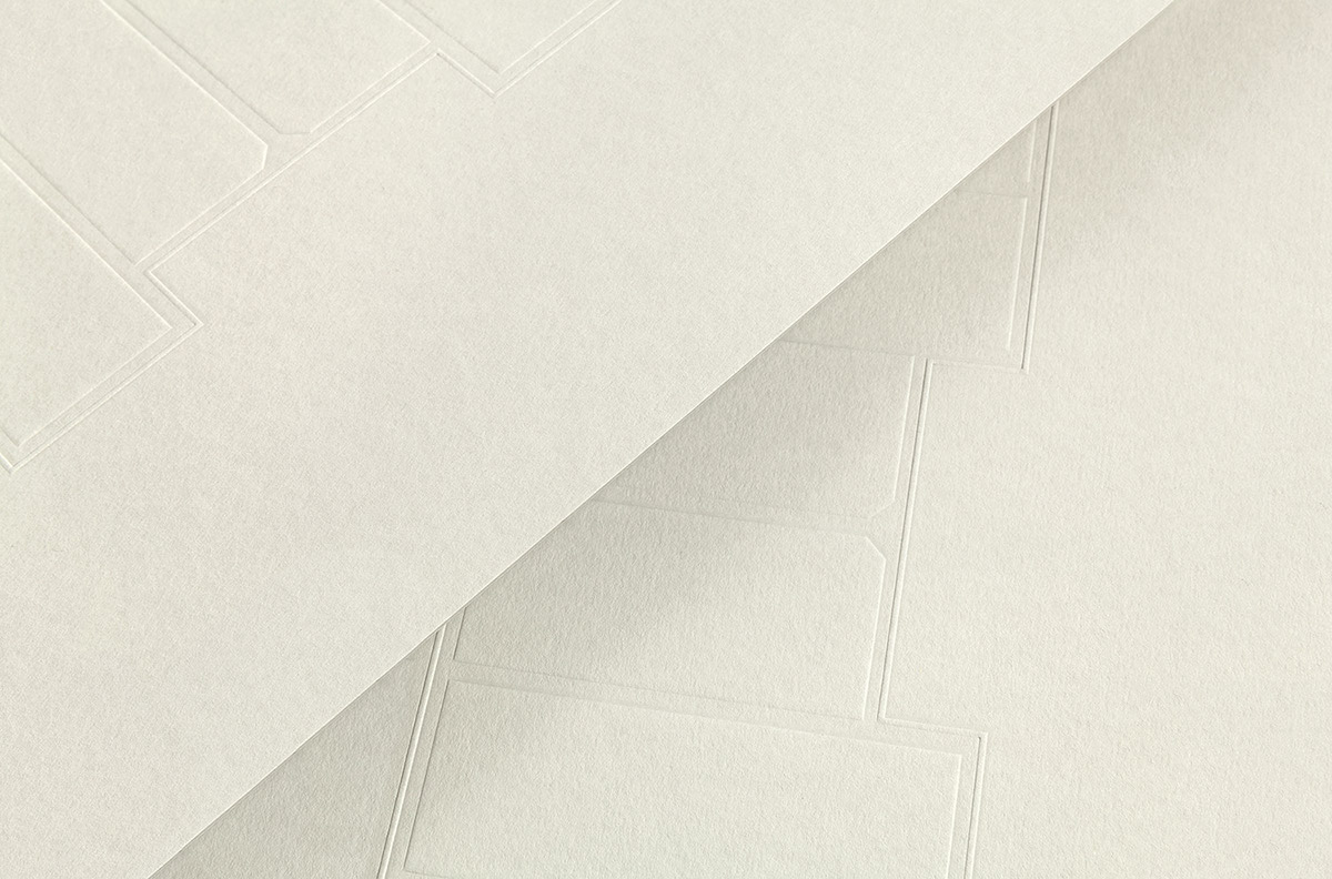
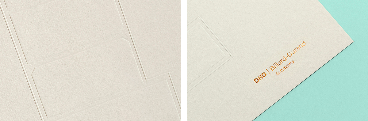
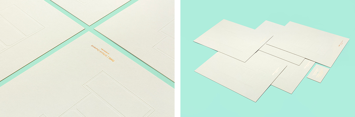
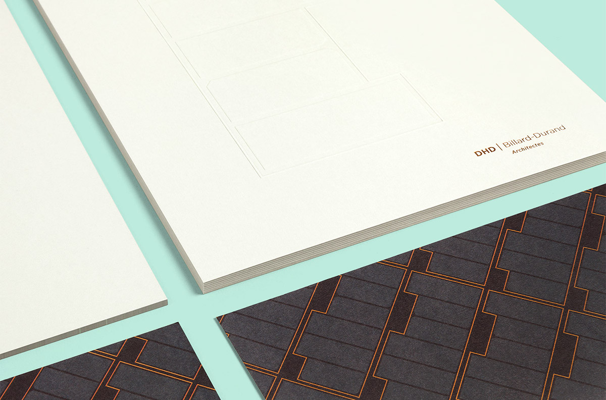
We studied the paper and forces to which it can be subjected using our various printing methods and techniques. We worked on colours and their natural complementarities to erect a highly meaningful graphic universe. Special attention was paid to the feel and subtle play on volume-drawing using light. Paper, as a construction material, was subjected to resistance notions. GF Smith’s Colorplan Pale Grey, mass-dyed in a 700 g format, fully met our expectations both regarding its aesthetic aspect and its required resistance to our letterpress techniques. We favoured embossing and copper hot foil as techniques enabling us to enhance volumes, with a feel that added depth and elegance. The choice of a metallic copper Pantone, and its natural complementarity with grayish-green, highlights contrasts between substances and volumes using light.
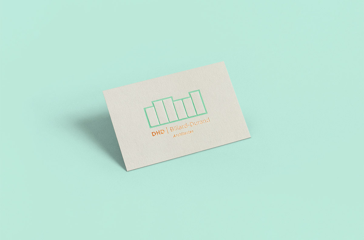
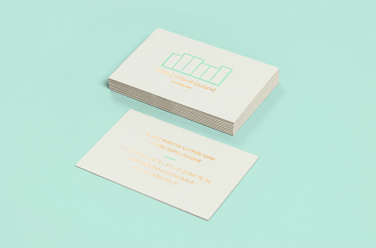
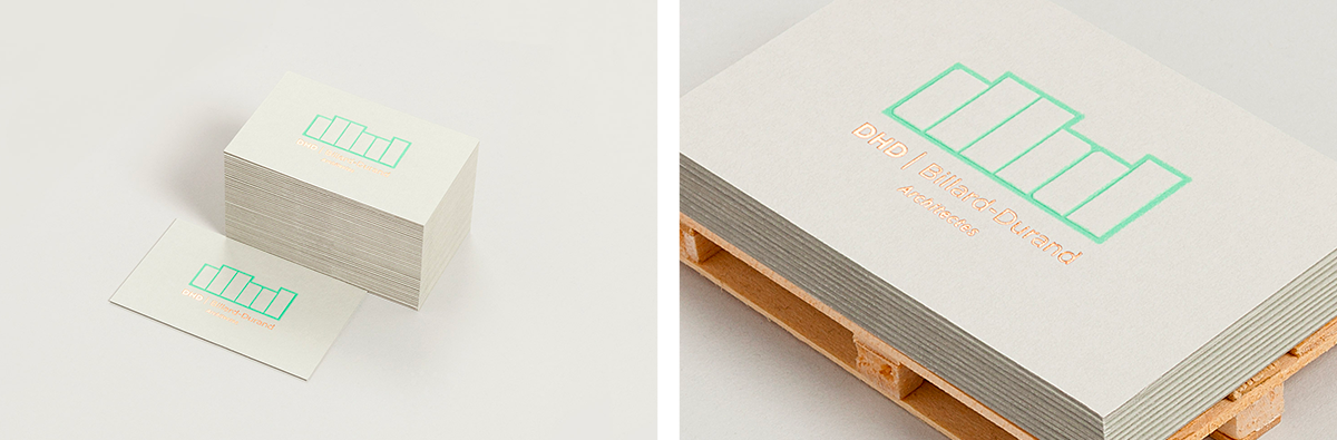
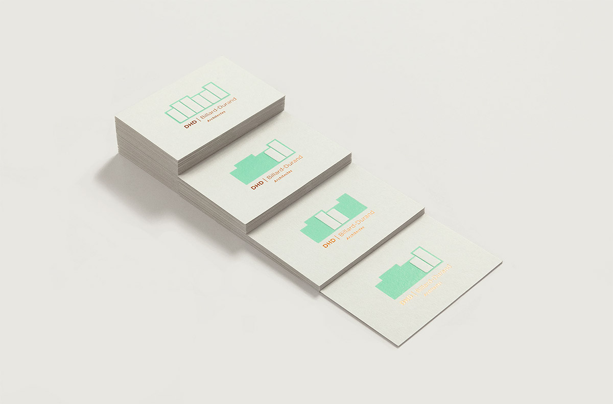
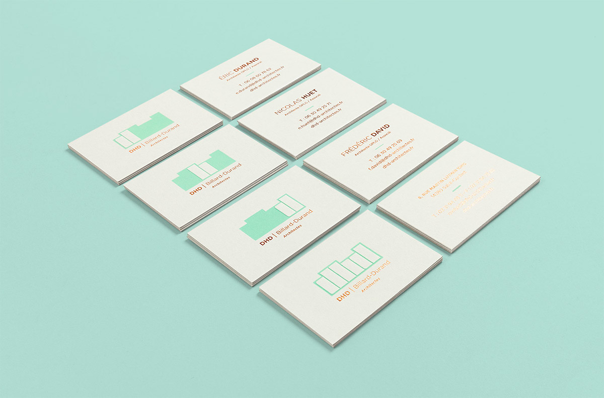
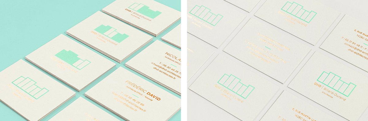
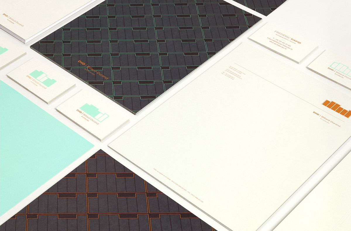
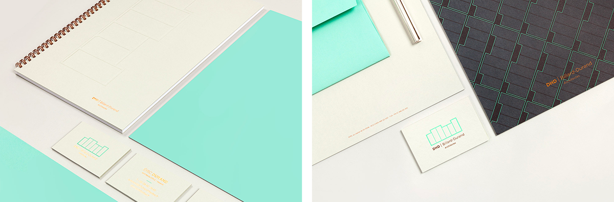
Business cards
A business card, more than any other communication medium, is an absolute contact and proximity tool.
We came up with four models: one model for the agency featuring the full logo, then one model per architect. We wanted to pay special attention to its pleasantness to handle, touch and resistance, essential factors for a communication medium which is subjected to wear and tear. On the front, we favoured embossing as the technique which would enable us to enhance the logo’s volume and feel. The overall composition is underlined by a copper hot foil which adds depth and elegance to the medium. On the back, information is entirely hot-foiled. Only a touch of colour, sea-green, adds lightness and complementarity to this composition.
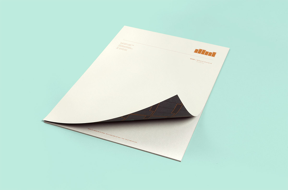
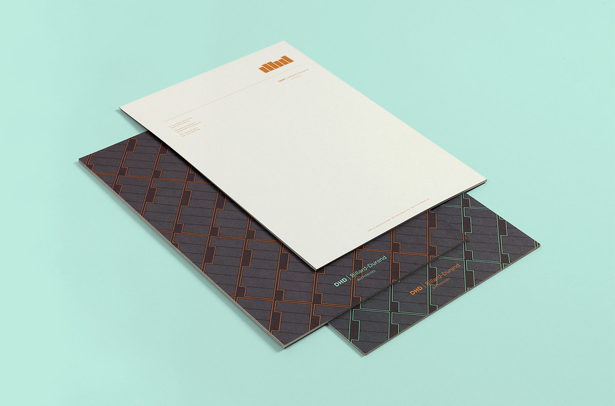
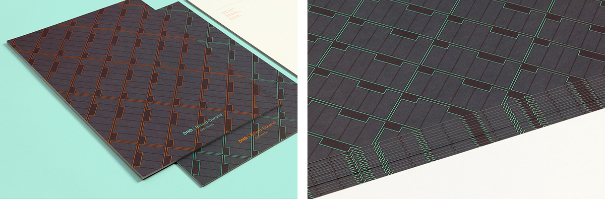
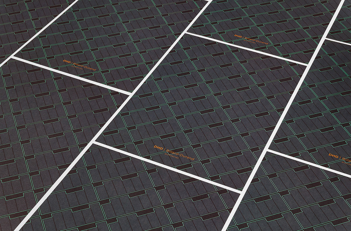
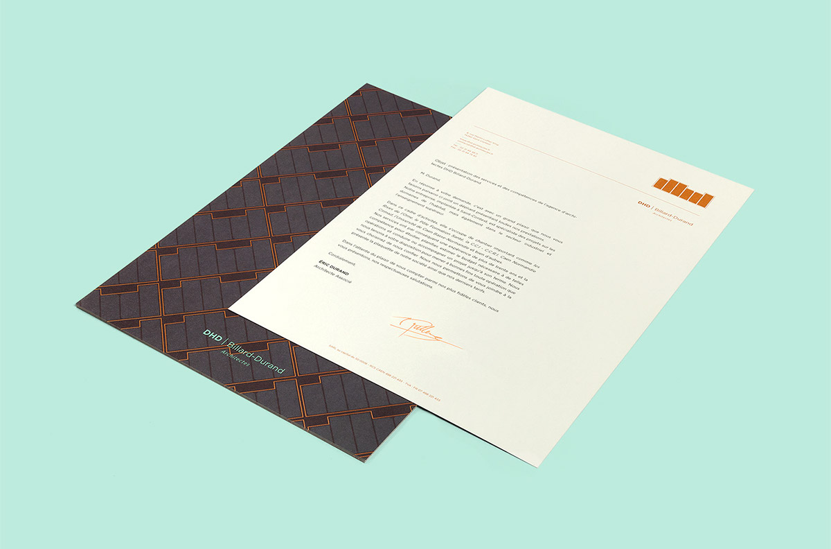
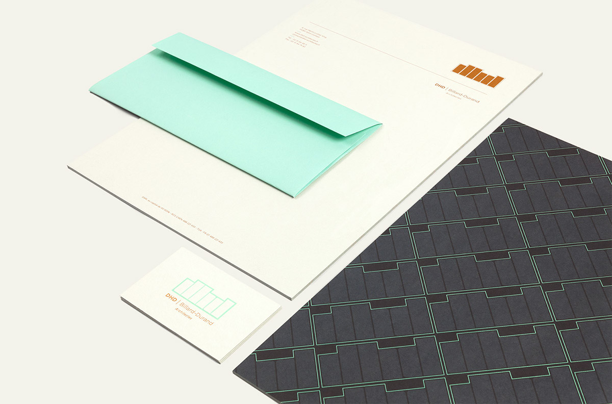
Stationery
Using the strength of the colour contrast between both sides, we privileged a graphic pattern on the reverse side, the side used for communicating, and the copper pantone straight onto the colorplan, leaving this informative side its primary role and the quality of this paper range for what it is.
Portfolio
For an architecture firm, a portfolio, more than any other medium, is a privileged communication tool.
Print
Inventing and adapting the graphic design of each piece of communication material based on its format, diffusion method and use is the guarantee of an effective, coherent and rich visual identity.
Digital
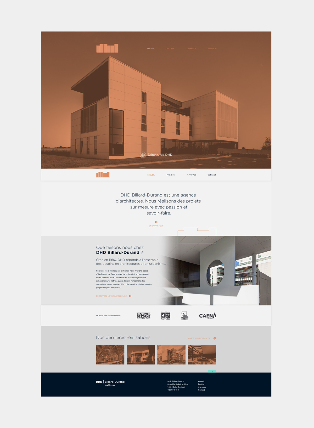
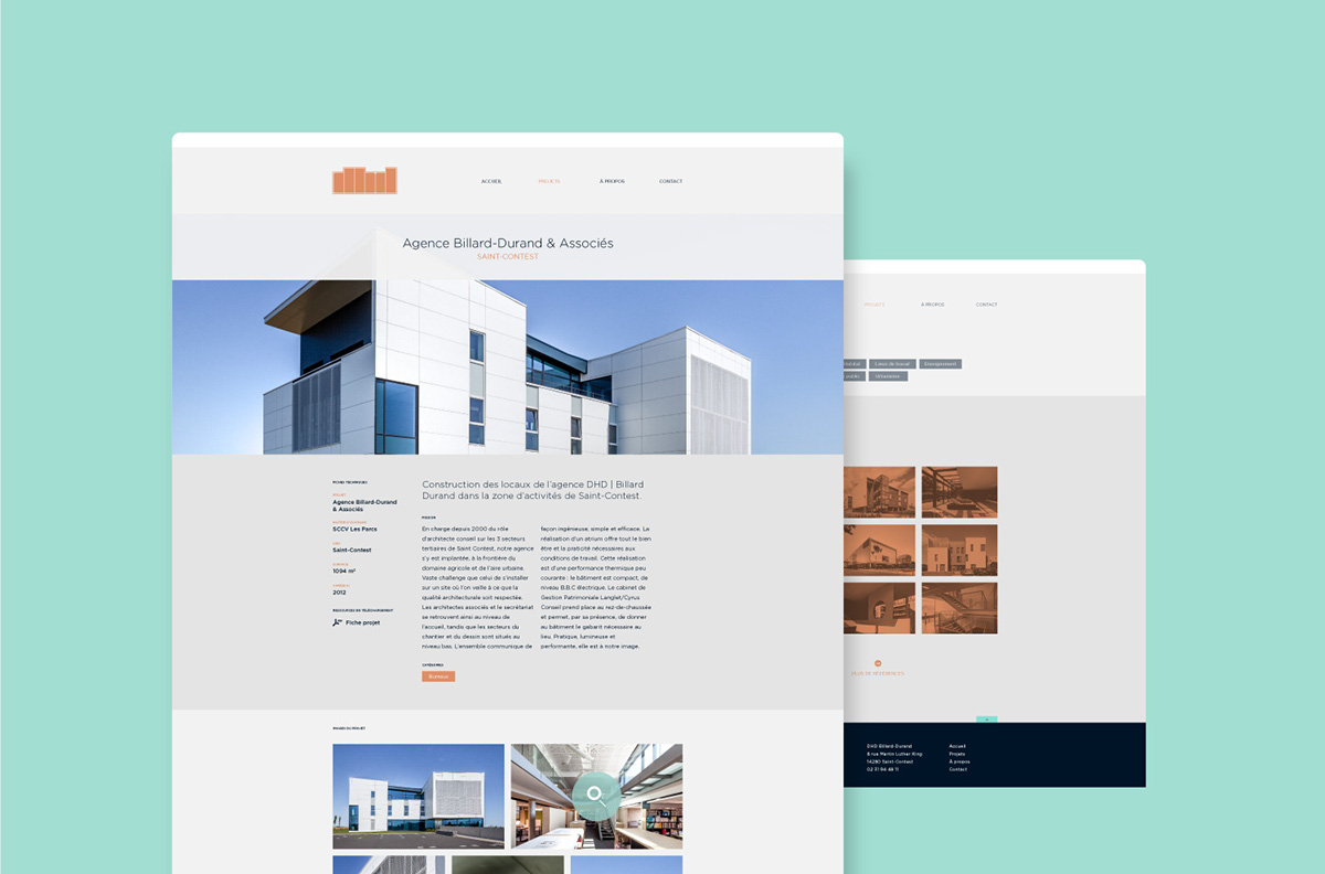
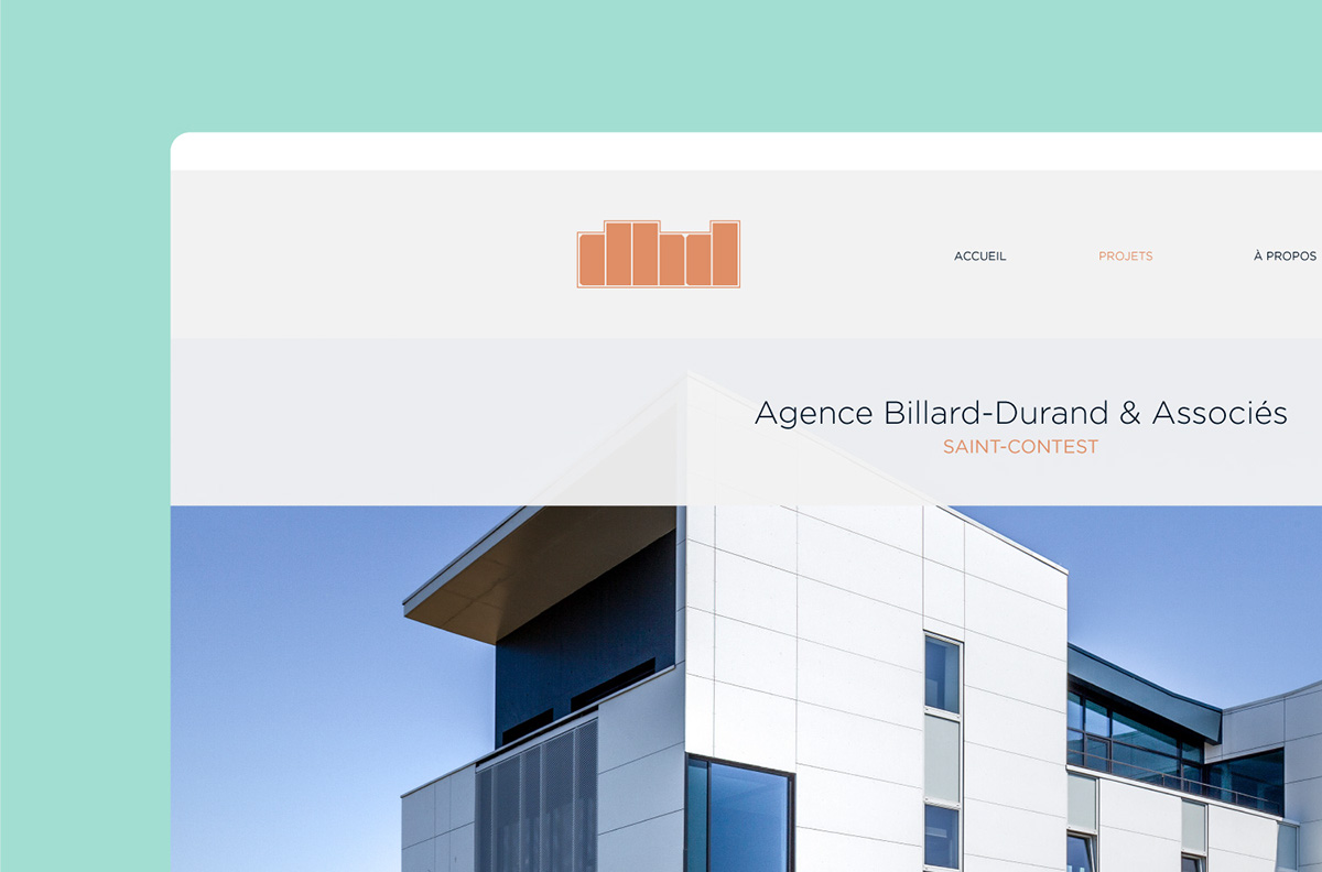
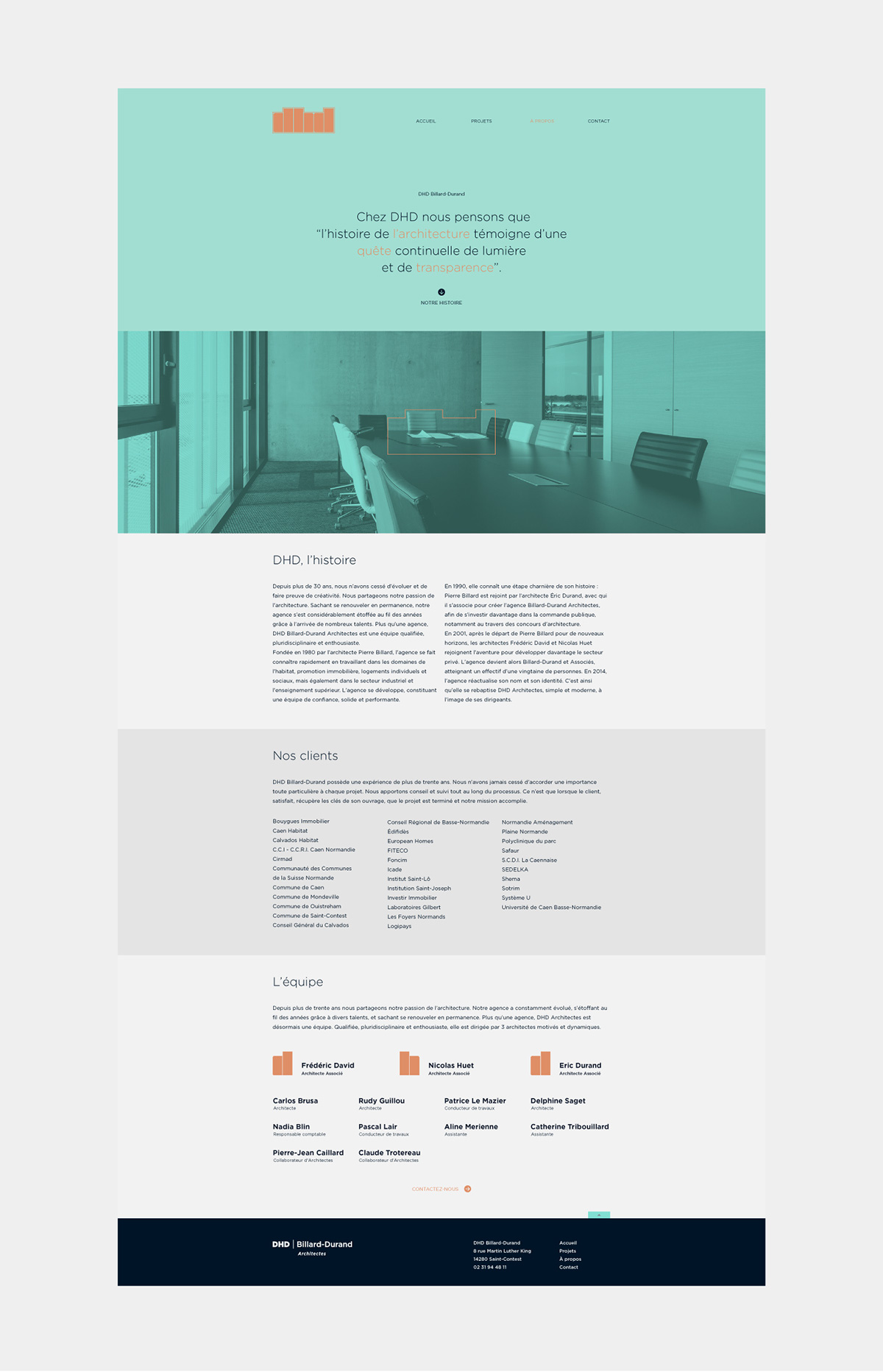
Acting as the agency’s genuine storefront, the DHD website had to be in perfect harmony with the new identity that has been set up. We have developed a website which is resolutely clean and minimalist, in which ergonomics and information are at the heart of its design.